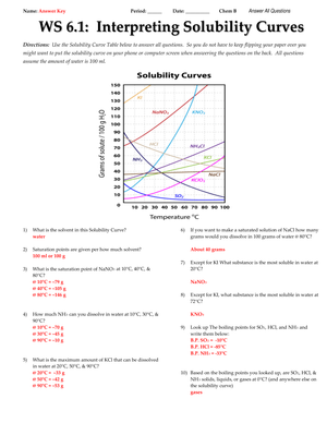
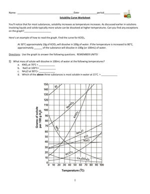
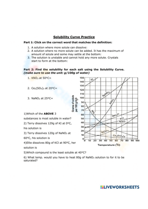
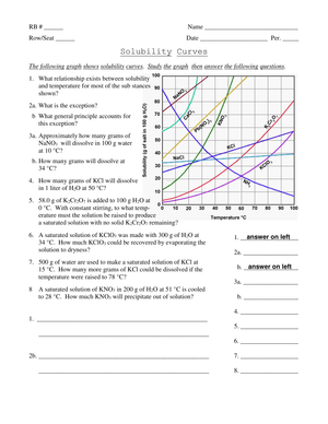
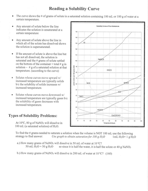
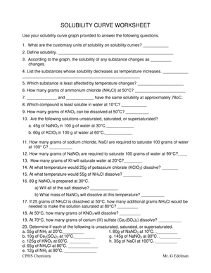
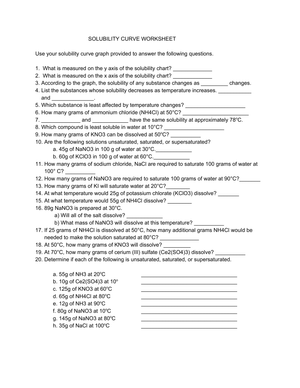
A solubility curve plots temperature in degrees Celsius on the x-axis against solubility on the y-axis, usually measured in grams of solute per 100 grams of water. When your students work through a solubility curve worksheet, they're not just memorizing a definition of saturation. They're pulling specific numbers off a graph, comparing substances, and reasoning about what happens to a solution when the temperature changes. That's exactly the graph-reading skill the solutions unit is supposed to build.
These worksheets fit squarely in a high school chemistry sequence, typically grades 9 through 12, during the unit on solutions and saturation. The best sets give students several tasks in a row: identify the most soluble substance at a given temperature, decide whether a described solution is saturated or unsaturated, and calculate how much solute crystallizes out when the beaker cools. Each task reuses the same graph, so students get repeated practice reading a single dense figure instead of jumping between unrelated problems.
Reading saturated, unsaturated, and supersaturated from the curve
The single most useful move a solubility curve worksheet makes is turning three abstract vocabulary words into positions on a graph. A point that sits exactly on the curve line is a saturated solution: the water holds the maximum solute it can at that temperature. A point below the line is unsaturated, because the water could still dissolve more. A point plotted above the line is supersaturated, an unstable state holding more solute than it normally could.
Have students mark a plotted point and then trace it to the line rather than guessing. Ask, "Is this dot on, above, or below the KNO3 curve at 40 degrees?" That one question forces them to read both axes and compare against the correct substance's line. Students who can answer it reliably have the core skill the rest of the unit depends on.
The three question types worth prioritizing
Not every solubility curve worksheet is built the same way, and a few question types carry more instructional weight than others. When you're choosing or building a set, look for these three and make sure each shows up more than once.
- Direct reads. Students find the solubility of one substance at one temperature. These build the habit of tracing from an axis to the line and back, and they're the foundation everything else rests on.
- Comparisons. Students decide which of several substances is most or least soluble at a set temperature. This forces them to distinguish between lines on a crowded graph, a skill standardized tests lean on heavily.
- Classification and calculation. Students label a solution as saturated, unsaturated, or supersaturated, or compute how much solute crystallizes on cooling. These are the highest-value items because they combine reading with reasoning.
A worksheet that hits all three, rather than drilling one type ten times, gives you a cleaner read on where each student actually breaks down.
Solid versus gas solubility: the trend students get backward
Most solubility curve worksheets show several solids whose solubility climbs steeply as temperature rises. Potassium nitrate is the classic example, jumping from roughly 13 grams per 100 grams of water near 0 degrees to well over 200 grams as the water approaches boiling. Students internalize the pattern quickly: hotter water dissolves more.
Here's where the misconception hides. Dissolved gases do the opposite. Warmer water holds less dissolved gas, which is why a curve for a gas slopes downward while the solids slope up. If a worksheet only shows solids, students walk away with a rule that is wrong for half of chemistry. Pick a set that includes at least one gas line, or add a quick discussion question about why a warm soda goes flat faster than a cold one. Naming the contrast directly, on the same graph, is far more effective than correcting it later.
Calculating how much solute crystallizes on cooling
The calculation questions are where a solubility curve worksheet moves students past simple graph reading. The setup is always the same: a saturated solution is cooled from a higher temperature to a lower one, and students find how many grams of solute drop out. Read the solubility at the starting temperature, read it again at the ending temperature, and subtract. The difference is the mass that crystallizes.
For example, if a saturated solution of potassium nitrate at 60 degrees holds about 110 grams per 100 grams of water and only about 32 grams at 20 degrees, then cooling that solution drops roughly 78 grams of crystals out. This is the same logic behind recrystallization, a real purification technique, so it's worth telling students they're modeling something chemists actually do at the bench.
Walk students through the subtraction explicitly the first time. Many will try to average the two values or read only the starting point, so model the two separate reads on the board. Once they see that the crystallized mass is simply the gap between two points on the same line, the calculation stops feeling like a new formula and starts feeling like more graph reading, which is exactly what it is.
Pairing worksheets with a standardized reference table
If you teach anywhere that uses the New York State Regents Chemistry exam, the solubility curve is not optional practice. The exam ships with a standard solubility curve reference table, and students have to read it cold on test day. Practicing on worksheets built around that same table format pays off directly.
The New York State Education Department publishes the official reference tables used on every Regents Chemistry exam, and its solubility curve chart plots at least five substances, including KNO3, NaCl, KCl, NH4Cl, and sugar. Because students must interpret this exact graph under timed conditions, worksheet practice mirroring the table builds real test fluency.
Even outside New York, the reference-table format is a useful teaching tool because it standardizes the substances and layout, so students compare the same curves every time instead of relearning a new graph on each worksheet.
Classroom Implementation
A short solubility curve worksheet works well as an exit ticket right after a saturation lab. Once students have watched solute stop dissolving in a beaker, three or four graph questions ask them to connect what they saw to what the curve predicts. Ten minutes is usually enough, and the responses tell you who can read the graph before you move on.
For small-group intervention or a pre-test review, scaffold the same worksheet in stages:
- Start with single-point reads: what is the solubility of KCl at 50 degrees?
- Move to comparisons: which substance is most soluble at 10 degrees?
- Add classification: label a plotted point saturated, unsaturated, or supersaturated.
- Finish with a cooling calculation once the reading skills are solid.
Most solubility curve questions on standardized tests sit at DOK Level 2, asking students to interpret and apply rather than recall, so give them repeated interpretation reps rather than more vocabulary drills. A well-built worksheet from a source like Chemistry Learner already sequences problems this way, which saves you from writing every item yourself.
Frequently asked questions
1. What is a solubility curve and what do the axes represent?
A solubility curve is a line graph showing how much of a substance dissolves in water at different temperatures. The x-axis shows temperature in degrees Celsius, and the y-axis shows solubility in grams of solute per 100 grams of water. Each line represents one substance.
2. How do you tell if a solution is saturated, unsaturated, or supersaturated?
Plot the solution's amount and temperature, then compare to the curve. On the line means saturated, below the line means unsaturated, and above the line means supersaturated. This on-line, below, or above check is the fastest way for students to classify any solution.
3. Why does gas solubility decrease with temperature while solid solubility usually increases?
For most solids, higher temperature gives water molecules more energy to break apart and surround more solute, so solubility rises. Dissolved gases behave oppositely: warmer water holds less gas because the gas molecules escape more easily, so their curves slope downward.
4. How are solubility curve worksheets used in Regents Chemistry prep?
New York's Regents Chemistry exam includes a solubility curve reference table students must read on test day. Worksheets that use the same substances and graph layout build the timed graph-reading fluency the exam expects, making them a standard part of review.
5. What grade level or course covers solubility curves?
Solubility curves typically appear in high school chemistry, grades 9 through 12, during the unit on solutions and saturation. Some accelerated middle school courses touch on them, but the calculation-heavy versions belong in a full chemistry course.