Core Functionality
Teaching Workflow
Target Learners

 Text to Ready-to-print Worksheet in just ONE click
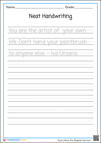
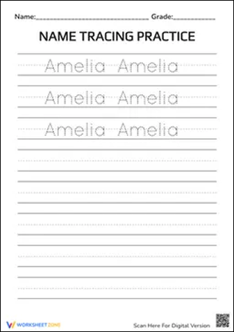
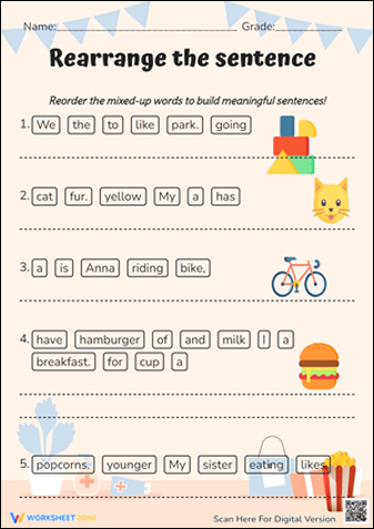
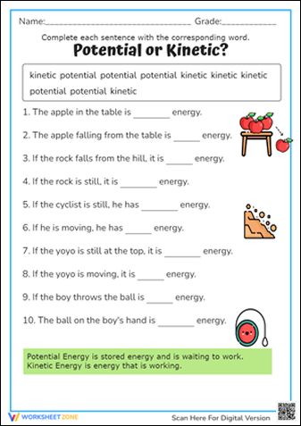
Design, customize, and generate high-quality educational worksheets for any subject. Whether it's Math, English, or Science, our all-in-one tool handles it all.
Maximum size: 5MB
Stop switching between different generators. Worksheetzone's Worksheet Maker integrates every specialized tool you need into one seamless interface: