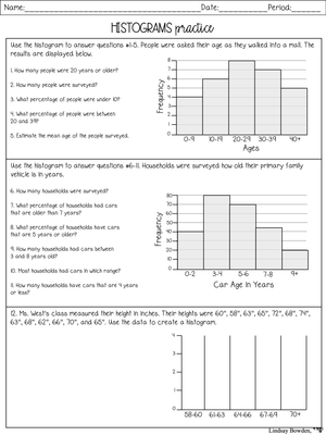
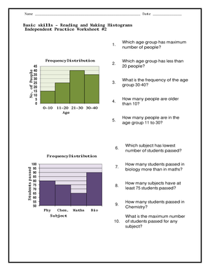
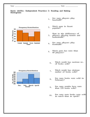
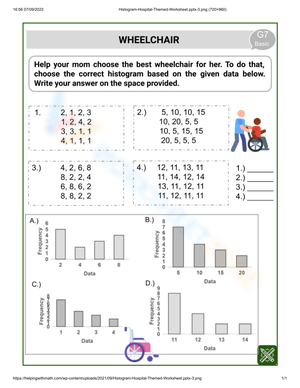
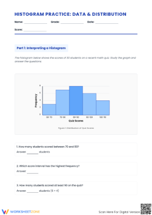
Histograms usually enter a US math classroom in grade 6, when students start organizing numerical data into visual displays rather than just listing numbers. Under CCSS.Math.Content.6.SP.B.4, grade 6 students are expected to display numerical data in plots on a number line, including dot plots, histograms, and box plots. That standard sets the stage for everything that follows: students first learn to read a histogram, then to build one, and eventually to compare distributions across data sets. If you teach middle school math, histogram worksheets give you a controlled way to practice each of those stages separately instead of asking students to do all three at once.
The work does not stop in middle school. CCSS.Math.Content.HSS.ID.A.1 extends histogram use into high school statistics, where students represent data distributions as part of broader work on shape, center, and spread. That means a well-designed histogram worksheet can serve two purposes in your building: reinforcing an introductory skill in grade 6-8 classrooms, and providing a review or intervention tool for high school students who need to shore up their statistics foundation before tackling more complex distribution questions.
Teaching Histograms Versus Bar Graphs Before Students Build Their Own
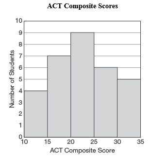
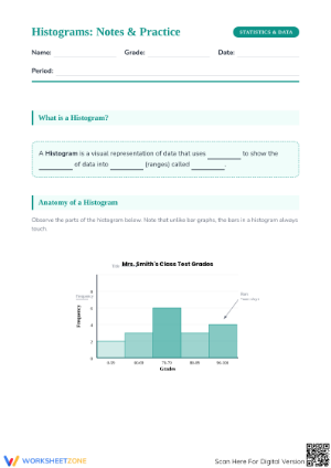
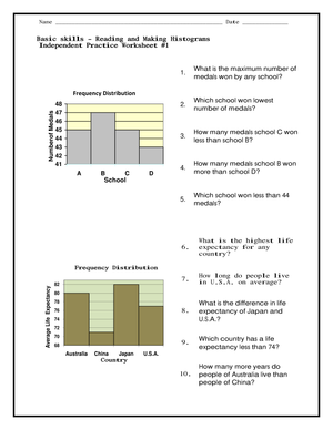
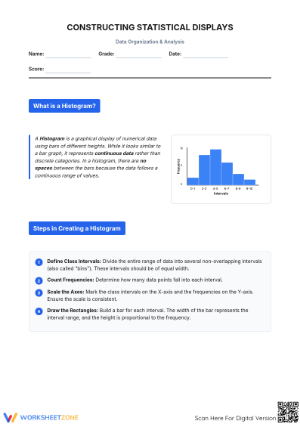
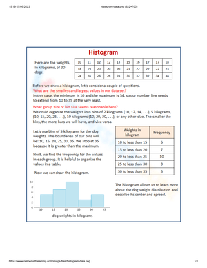
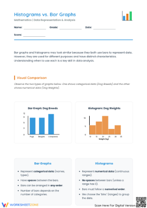
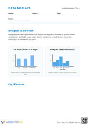
One of the most useful things a histogram worksheet can do early in a unit is force students to notice what makes a histogram different from a bar graph. A histogram groups continuous numeric data into intervals, or bins, and shows frequency as bar height, with no gaps between the bars. A bar graph, by contrast, displays categorical data with gaps between bars because the categories are not continuous. Students who have only seen bar graphs in earlier grades often carry that model forward without adjustment, which causes confusion once bins and continuous data enter the picture.
A simple worksheet routine works well here: give students a set of pre-made displays and ask them to sort which ones are histograms and which are bar graphs, then justify the choice in one sentence. This sorting task is low-prep and takes ten minutes, but it surfaces the misconception before students are asked to construct anything themselves. Fixing this early saves reteaching time later in the unit.
Using Worksheets for Formative Assessment of Bin and Interval Selection
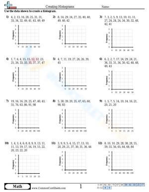
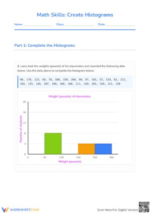
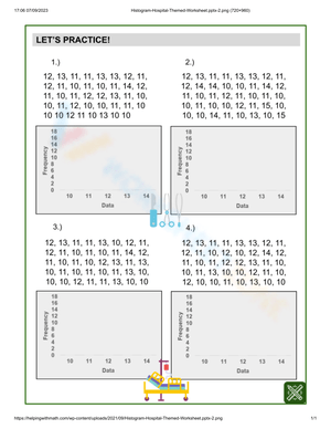
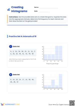
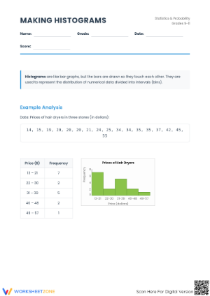
Interval, or bin, selection is one of the more difficult skills tucked inside histogram construction, and it is easy to skip over if you move straight from reading histograms to building them. A worksheet that gives students a raw list of numbers and asks them to choose their own bin width, then justify why they chose it, tells you a lot about whether students understand that bin choice changes what the histogram shows. Students who default to bins of 1 for a data set that spans 0 to 100 will end up with a chart that is unreadable, and that error is a useful teaching moment rather than something to avoid.
Because this step is conceptual rather than purely procedural, it works well as a formative check partway through a unit. You do not need every student to get a perfect answer; you need to see whether they can explain the tradeoff between too many bins and too few. Worksheets built around this single skill let you check for understanding without grading a full construction task for every student.
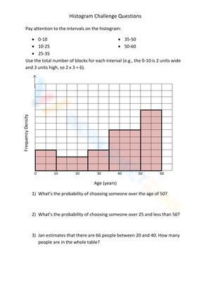
Research on the LOCUS assessments found that many students misread histograms by treating them as if they displayed categorical data the way a bar graph does, missing that bar width can vary in a histogram and that width affects the area represented, not just the height. This is a specific and persistent error pattern, not a one-off mistake, and it shows up across grade levels when students are not explicitly taught to attend to interval width alongside frequency.
Addressing the Bar-Height Versus Distribution-Shape Misconception
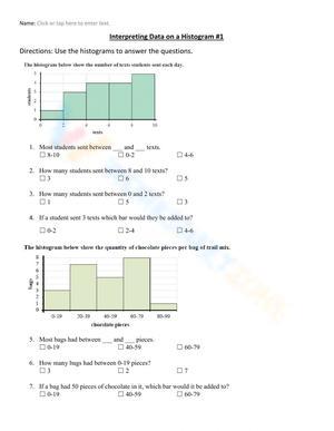
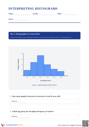
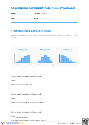
A commonly reported misconception is that students judge data variability from bar height alone rather than from the overall shape and spread of the distribution. A student might look at the tallest bar in a histogram and assume that interval represents the entire data set's behavior, without considering how spread out or clustered the rest of the bars are. This misreading becomes a real problem once students move into comparing two distributions, because they need to reason about spread, not just peak frequency.
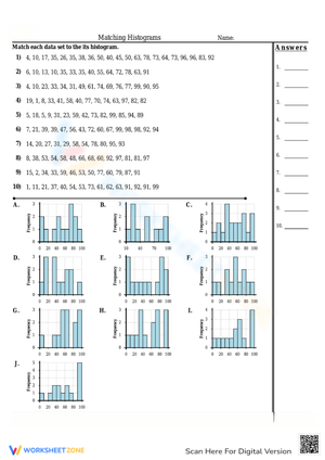
Investigating Student Understanding of Histograms reports that students often struggle to connect the visual shape of a histogram to the underlying data behavior it represents, treating the chart as a static picture rather than a summary of variability. For classroom use, this means a worksheet question like which of these two histograms shows more spread and why is more diagnostic than a question asking students to simply identify the tallest bar. Building a few spread-comparison questions into every histogram worksheet you assign keeps this skill in front of students instead of letting it get skipped.
Pairing Histogram Worksheets With Real Classroom Data
Histogram worksheets built around invented number sets work fine for a first pass at a skill, but engagement tends to improve when the data comes from something students recognize. Test scores from a recent quiz, daily attendance counts over a month, or measurement data from a science lab all make good raw material for a histogram construction worksheet, and they let you tie the math skill to something happening in your own building. A worksheet using last week's quiz scores, for example, gives students a reason to care about bin choice, because the resulting chart tells them something true about their own class.
This approach also works well as a cross-curricular tie-in. A science teacher collecting measurement data, or a PE teacher tracking fitness test results, can hand that data to the math team as raw material for a histogram worksheet, which reinforces the skill in more than one classroom context during the same week.
Frequently Asked Questions
1. What grade level typically introduces histograms in US classrooms?
Histograms are typically introduced in grade 6 under CCSS.Math.Content.6.SP.B.4, which asks students to display numerical data using plots on a number line, including histograms, dot plots, and box plots. The skill is then revisited and extended in high school statistics under CCSS.Math.Content.HSS.ID.A.1.
2. How are histograms different from bar graphs for students?
A histogram displays continuous numerical data grouped into intervals, or bins, with bars touching to show that the data is continuous. A bar graph displays categorical data with gaps between bars. Students often carry bar graph habits into histogram work, which can lead to the misconception that bar width does not matter, when in a histogram it affects how much data each bar represents.
3. How can teachers use histogram worksheets for intervention or reteaching?
Use a small set of worksheets focused on one skill at a time, such as bin selection or reading frequency, rather than a full mixed-skill worksheet. Talking through bin-width reasoning with a small group directly targets the bar-height versus distribution-shape misconception that research has linked to histogram misreading.
4. What data sets work best for practicing histogram construction?
Real classroom data, such as recent quiz scores, attendance counts, or science lab measurements, tends to work best because students already have context for the numbers. This makes bin selection and interpretation feel connected to an actual outcome rather than an abstract exercise.