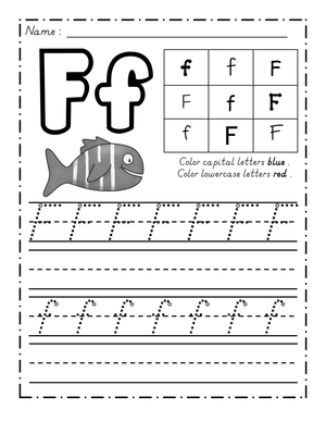
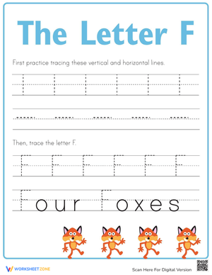
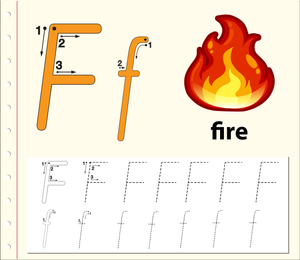
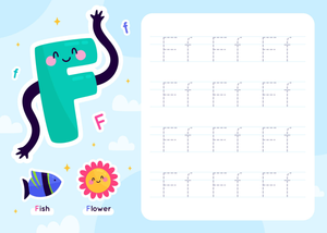
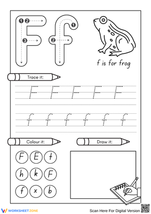
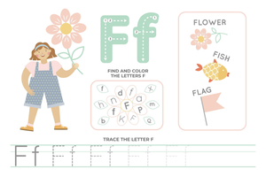
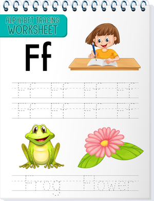
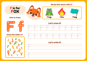
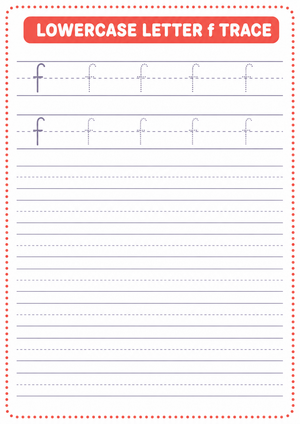
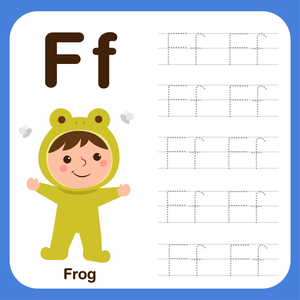
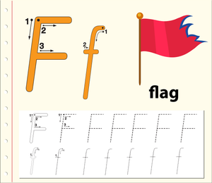
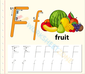
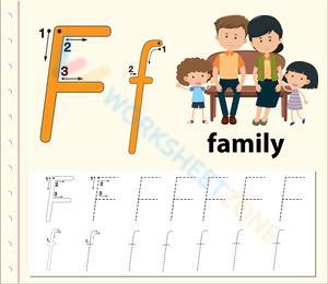
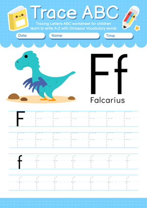
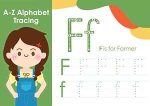
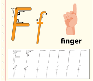
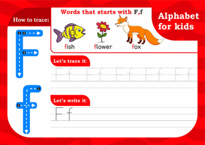
Letter F tracing worksheets in this set address one of the genuine oddities of early handwriting instruction: two forms of the same letter that share almost no visual DNA. The uppercase F is built from three straight strokes; the lowercase f is a curved form with a crossbar that arrives at a different height and requires a completely different pencil path. Teachers who have introduced both in the same week know the confusion students carry between them.
The Specific Skills Targeted
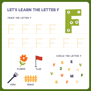
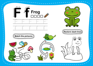
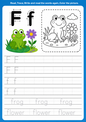
Each worksheet in the set isolates a particular component of letter F formation, so students are not just repeating lines — they are practicing a named movement at a named part of the letter. The set covers:
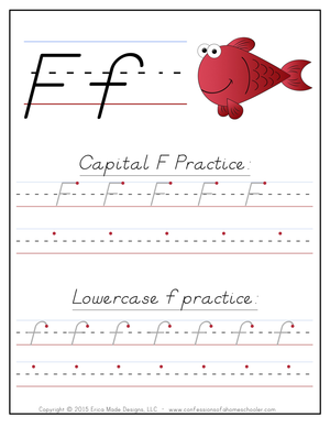
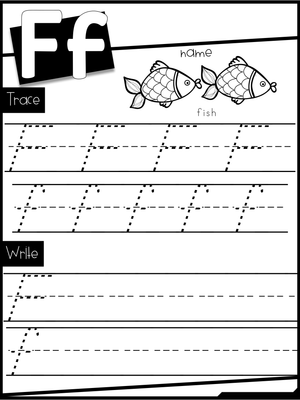
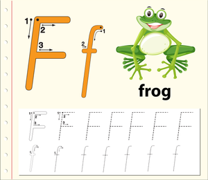
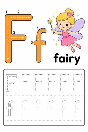
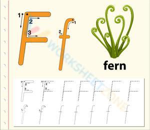
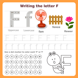
- Uppercase F stroke sequence: vertical pull-down from the top line, horizontal stroke across the top, shorter horizontal stroke at the midline — in that order, every time
- Lowercase f formation: the backward curve at the cap line, the vertical drop through the midline to the baseline, and crossbar placement at the midline
- Starting points and directional arrows: bold starting dots with numbered strokes so students know where the pencil enters and which direction it travels
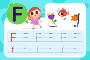
- Phonemic pairing: illustrations of familiar /f/ words — fish, fox, feather — placed beside the tracing lines to connect the letter's shape to its sound
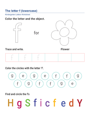
- Letter discrimination: brief comparison exercises that place F beside E and T, helping students identify exactly what makes each letter visually distinct
What Makes the Lowercase f Harder Than It Looks
Most five-year-olds can approximate the uppercase F on a first attempt. Three straight lines, predictable directions. The lowercase f is a different situation entirely. It begins with a backward curve at the top — a movement that runs against the left-to-right sweep students have been reinforcing since they first picked up a crayon. That curve has to arc backward, come forward, and then continue straight down past the midline to the baseline. Students who have not built that motor pattern yet will let the curve collapse, or skip it entirely and produce something closer to a lowercase t.
Crossbar placement is the second sticking point. Students who get the curve right frequently set the crossbar too high — up near where the curve starts — producing a form that reads more like a plus sign than a letter. Each worksheet includes a clear midline indicator on every lowercase f exercise so students can anchor the crossbar before they draw it, not after.
Building These Worksheets Into Your Week
The most effective placement for letter F tracing worksheets is the short practice window right after explicit whole-group modeling — the 8 to 10 minutes while students are still at the carpet, before they disperse to centers. Running the tracing immediately after the teacher demonstrates the stroke sequence keeps the motor pattern fresh and lets you circulate while students still remember the demonstration. If you laminate a class set, those same worksheets pull double duty in your writing center later in the week, where students practice with dry-erase markers without burning through paper.
For students who need repeated exposure before reaching independence, these work well as Monday warm-ups in the week following the letter's introduction. The repetition is not redundant — for a child still building the fine motor pattern, hitting the same strokes three mornings in a row is precisely what closes the gap between guided tracing and independent writing.
Student Errors to Catch Before They Harden Into Habits
The most predictable error with the uppercase F is the middle stroke. Students who correctly place the top horizontal stroke will often draw the middle stroke at the same length, producing something that looks like a capital E with a missing bottom arm. The letter loses its identity because the middle horizontal should be noticeably shorter than the top one. This error is easy to overlook on a quick scan because the letter still looks roughly right from a distance — but it shows up consistently in authentic student writing samples across the kindergarten year.
With the lowercase f, the error pattern shifts. Students frequently begin the letter from the bottom rather than the top, drawing a straight vertical line first and then attaching the curve as an afterthought. The resulting shape is structurally backward and difficult to unlearn once it has been repeated a few dozen times. Letter F tracing worksheets with numbered stroke indicators interrupt this habit before it solidifies — the "1" sits at the top of the curve, and students cannot miss it.
Tailoring the Set for Different Fine Motor Starting Points
Students with limited fine motor control benefit from starting with the bold, solid-line versions of each worksheet before moving to the dashed-line versions. The solid lines provide stronger visual contrast and a clearer boundary, so students spend less cognitive effort tracking where the line is and more effort executing the stroke itself. Reducing that decision-making load is what allows physical practice to actually happen.
Students who are ready to move beyond tracing can use the blank practice rows at the bottom of each worksheet to attempt independent letter formation without a guide. For early finishers, have them circle the letters they wrote that most closely match the model — that brief act of self-comparison builds the self-monitoring habit that carries handwriting development forward over the rest of the year.
Standard Alignment
These worksheets address CCSS.ELA-LITERACY.L.K.1.a, which requires kindergartners to print many uppercase and lowercase letters. In classroom terms, this standard sits at the core of the kindergarten writing sequence — introduced during the first letter-specific units and revisited as a formative checkpoint before end-of-year assessments. Students who reach this standard have moved from approximated letter shapes to consistent, recognizable formation, and structured tracing practice is the most direct path to that outcome for letters with demanding stroke sequences like F and f.
Frequently Asked Questions
Is the uppercase or lowercase F harder for kindergartners to learn?
The lowercase f presents more difficulty for most students. The uppercase version uses straight strokes that align with the top-down, left-to-right movements practiced from the start of the year. The lowercase f requires a backward curve before the pencil drops to the baseline — a movement that runs against the directional habits students have already built. Plan to spend more instructional time on the lowercase form and expect to see wider variation in student attempts.
My students keep confusing the uppercase F with E. What helps?
The E-versus-F confusion is almost always about the middle stroke. In uppercase E, three horizontal strokes are present; in uppercase F, only two — and the bottom stroke is absent entirely. Pointing to the "missing bottom arm" on F gives students a memorable anchor. Some teachers use a brief verbal cue — "F forgot its bottom arm" — during early lessons. The letter discrimination exercises in the set place the two letters side by side to give students the direct visual comparison that clears up the confusion faster than repeated tracing alone.
How many practice sessions do students typically need before writing independently?
Most kindergartners need five to seven guided tracing sessions before reproducing the letter reliably without a model. That range varies based on fine motor development and prior experience with pencil work. Using letter F tracing worksheets across multiple short sessions — rather than one extended sitting — produces stronger retention because distributed practice gives the motor pathway time to consolidate between attempts. Once a student can name both strokes and execute them in sequence without checking the model, they are ready for independent writing lines.