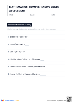
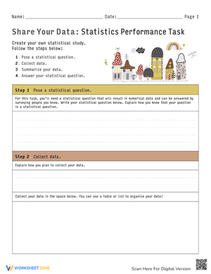
These interpreting graphs worksheets give teachers structured, print-ready practice across every major graph type students encounter from third grade through middle school — bar graphs, line graphs, pie charts, pictographs, and histograms — with questions that move from basic value-reading all the way to trend analysis and evidence-based inference. The set spans a wide range of difficulty so a single classroom can draw from one resource without hunting for separate materials for different learners.
The Specific Skills Being Built
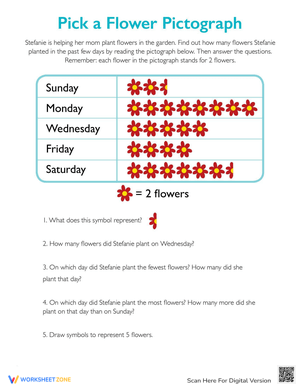
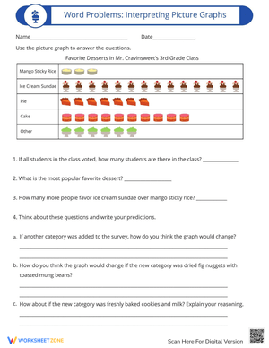
Each page targets a concrete subskill, not graphing in general. Depending on the graph type and difficulty tier, students do one or more of the following: read a specific value off an axis, calculate a difference between two categories, describe a trend in their own words, interpret what a symbol represents using a pictograph key, or evaluate whether a scale choice affects how data appears. Those last two skills — pictograph keys and scale interpretation — are worth calling out specifically. Pictograph keys trip up students who can read a bar graph fluently, because the multiplication step is implicit rather than shown. Scale interpretation, usually introduced in grades 6–7, asks students to notice that a graph starting at 500 instead of 0 can make a small change look dramatic. Both appear in the question sets here.
How Difficulty Scales Across Grade Levels
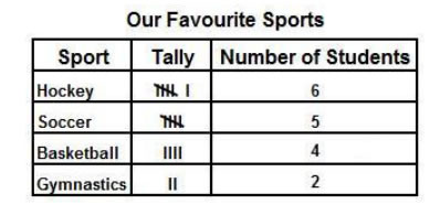
Third and fourth grade pages use small data sets, whole-number values, and familiar survey contexts — favorite sports, classroom pets, books read per month. Questions at this level stay in the literal tier: identify the tallest bar, find the category with the lowest count, read a specific point off a line. The goal is accuracy and axis fluency, not inference.
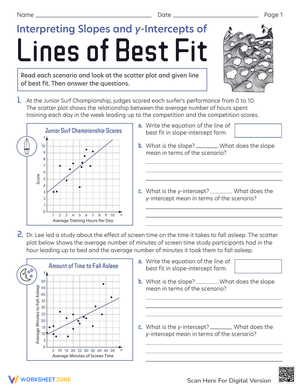
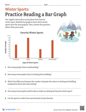
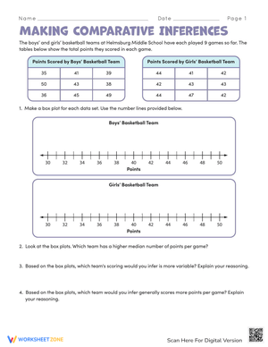
By grades 4–6, the questions shift toward computation and comparison. A student might read two bars, subtract to find the difference, then write a sentence explaining what that difference means in context. Line graph pages at this level introduce real-world scenarios — weekly rainfall, monthly savings, temperature change over a school year — so students practice connecting a visual trend to a meaningful real-world interpretation rather than describing the line shape in isolation.
At the upper range, grades 6–8, the written-explanation prompts become the center of the work. Students are asked to predict a value beyond the range shown, justify a claim using two specific data points, or identify whether a circle graph segment is consistent with a given percentage. These questions parallel the reasoning demands of standardized assessments, where partial-credit items often reward students who can explain their thinking even when arithmetic contains a minor error.
Where These Fit in the School Day
The most reliable use is the five-minute warm-up at the start of math class. Project one graph on the board, hand students a half-sheet with three questions, and collect it before the lesson begins. The routine activates graph vocabulary — axis, interval, scale, data set — right before students need it in new instruction. Teachers who run this consistently for a unit typically see written explanations become more precise within two weeks, because students stop reaching for vague language like "it went up" and start writing "the value increased by 40 between March and April."
Math centers are another strong fit. A folder of mixed-graph pages at one station, with an answer key clipped inside the back cover, lets students self-check and move on without waiting. This works best when the center folder holds pages slightly below grade-level challenge — center time rarely goes long enough for a student to slow down and wrestle with an unfamiliar format. Save the harder inference pages for whole-class or small-group instruction where you can address confusion in the moment.
For homework, two to three pages per week covering different graph types is a manageable pace. Because the PDFs print cleanly with clear axes and readable labels, families do not need to zoom in, reprint, or wrestle with formatting — a small thing that removes friction for students completing work independently at home.
Errors That Show Up Consistently in Student Work
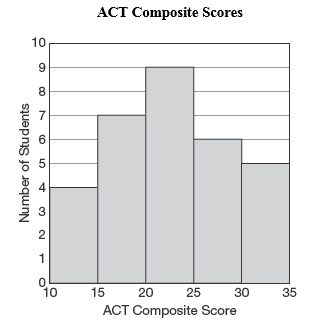
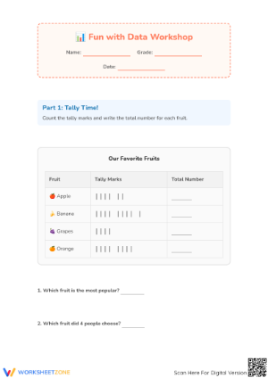
One of the most predictable mistakes appears when students read a bar that lands between two labeled intervals. A bar stopping halfway between 40 and 50 gets recorded as 40 or 50 rather than 45, because students have learned to read labeled tick marks and haven't yet internalized that unlabeled midpoints still have values. The question sets here include several items that require reading between intervals precisely because this skill does not develop without direct practice on it.
A second common pattern involves line graph trends. Students who can correctly identify that a line "goes up" will often struggle to describe when the rate of change is steepest, or whether a plateau between two points indicates stability or stagnation. The intermediate and advanced pages include paired questions that ask students to identify a trend and then locate the specific interval where the change was greatest — separating the two demands so teachers can see exactly where a student's reasoning breaks down.
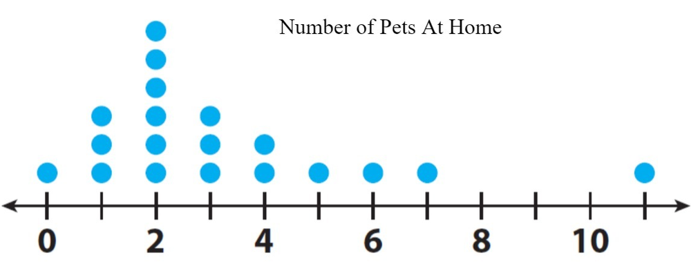
With pie charts, the recurring error is treating a larger-looking slice as always representing a larger absolute quantity, without accounting for what the whole represents. A page showing two different pie charts — one representing a school of 200 students, one representing a school of 800 — and asking which school had more students in a given category is a reliable diagnostic for this misunderstanding.
Alignment to Standards
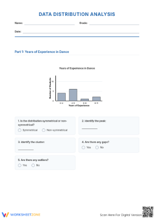
In the Common Core framework, interpreting graphs sits primarily under the Measurement and Data domain in grades 3–5 (standards 3.MD.B, 4.MD.B) and the Statistics and Probability domain beginning in grade 6 (6.SP.A, 6.SP.B). The progression is deliberate: the early grades focus on representing and reading categorical data, while grade 6 shifts toward describing distributions, identifying clusters and gaps, and summarizing data sets numerically. The worksheets here span both phases, so they serve as review at the start of a 6th grade statistics unit just as well as they serve new instruction in 4th grade.
State standards that follow CCSS closely will find direct alignment across the range. Teachers working in standards frameworks that diverge from CCSS — particularly in upper elementary — should scan the question types on each page against their own progression, since histogram work in particular appears at different grade levels depending on the state.
Adjusting Pages for Different Learners
For students who freeze when a graph uses an unfamiliar context or a scale they haven't seen before, the most effective scaffold is a labeled reference sheet — not a completed example, but a diagram of a generic graph with parts labeled and a one-sentence description of what each part shows. Students who can orient themselves to the structure of an unfamiliar graph before reading the data make fewer errors on value-reading questions and spend more mental effort on the actual analysis.
For students who are ready for more challenge, the advanced pages can be extended by asking them to construct a second question that could be asked about the same graph but isn't on the page. Writing a question requires understanding what the graph does and doesn't show — a higher-order task that surfaces gaps in comprehension more clearly than answering another ready-made prompt.
Frequently Asked Questions
1. Do these work as a formative check before a unit test?
A mixed-graph review page — one of each graph type, one or two questions each — functions well as a pre-assessment or mid-unit check. Scanning student responses takes about ten minutes and quickly shows which graph formats still need reteaching versus which are solid. The pattern to look for is not isolated wrong answers but clusters: if most students misread the histogram but handle the bar graph cleanly, that's a targeted reteach, not a full unit review.
2. Are answer keys included?
Yes. The PDF set includes a key for every page. For open-response questions asking students to explain a trend or justify a conclusion, the key provides a sample response with the key elements a complete answer should include, so grading written explanations stays consistent across a class.
3. How should these be sequenced with direct instruction?
The worksheets are practice tools, not introductory ones. Students who encounter a histogram for the first time on a worksheet, without prior instruction on frequency distributions, will often misread the bars as categorical data and answer accordingly. The stronger sequence is: introduce the graph type with a shared example, discuss what each axis represents and why, then release students to the worksheet. The pages work best as the independent-practice phase of a gradual-release model, not as the discovery activity that precedes it.