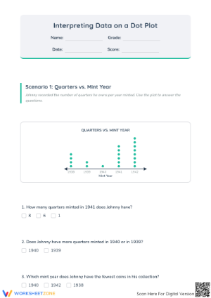
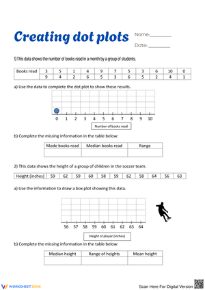
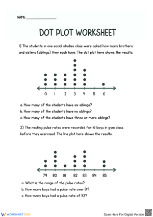
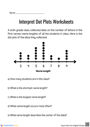
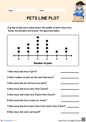
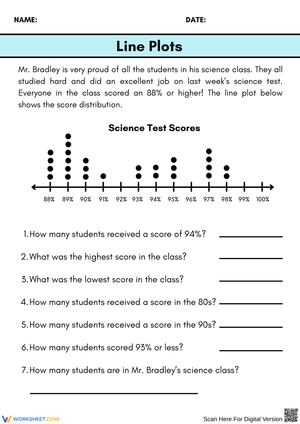
If you teach grade 3 through grade 6 math, you already know that data and graphing standards ask students to do more than color in bars. Dot plots worksheets give students a simple, low-prep way to build a numerical data display by hand, then read it back for clusters, gaps, peaks, and outliers. Because each dot represents one data point stacked above a number line, students see the raw data and the summary at the same time, which makes dot plots one of the most transparent entry points into statistics instruction.
For a 6th grade classroom, dot plots worksheets support a standards-based statistics unit. For a 3rd grade classroom, the same visual logic previews scaled picture graphs and bar graphs. Either way, a well-sequenced set of dot plots worksheets lets you move from concrete counting to abstract summary statistics without switching materials.
How Dot Plots Fit Into the 6th Grade Statistics Unit
CCSS.MATH.CONTENT.6.SP.B.4 asks students to display numerical data in plots on a number line, including dot plots, histograms, and box plots. In practice, most 6th grade curricula introduce these three displays together because they represent the same data set in different levels of detail. A dot plot shows every individual value. A histogram groups values into intervals. A box plot summarizes the data into five key numbers. Dot plots worksheets are a natural starting point in that sequence because students can literally count dots to check their own summary statistics later.
When you plan the unit, consider sequencing dot plots before histograms and box plots. Students who can already locate the median and range on a dot plot will have an easier time interpreting the same values on a box plot, since they can mentally overlay one display onto the other.
Using Dot Plots to Teach Mean, Median, and Range
CCSS.MATH.CONTENT.6.SP.B.5 requires students to summarize numerical data sets in relation to their context, including measures of center and variability. Dot plots worksheets are especially useful here because the visual clustering of dots makes mean and median feel less abstract. Students can locate the median by counting dots from either end of the plot, and they can estimate the mean by looking for a balance point before calculating it with the formula.
One instructional move that works well in small groups is asking students to predict where the mean will fall on a dot plot before they calculate it, then check their prediction against the actual value. This single step turns a routine calculation worksheet into a discussion about how outliers pull the mean away from the median, which is exactly the kind of reasoning 6.SP.B.5 expects.
Introducing Dot Plots in Grade 3 as a Bridge From Picture Graphs
Dot plots also connect to CCSS.MATH.CONTENT.3.MD.3, where 3rd graders solve one- and two-step problems using scaled bar graphs and picture graphs. While 3rd grade standards do not name dot plots explicitly, many teachers use a simplified dot plot, sometimes called a line plot with whole-number scales, as a stepping stone before introducing scaling. Because each dot in a grade 3 dot plot still represents one unit, students practice one-to-one counting and simple comparison questions before they have to reason about a scale where one picture equals five or ten items.
If you teach grade 3, dot plots worksheets can serve as a quick formative check before you move into scaled graphs. A student who can accurately build and read an unscaled dot plot has the counting and comparison skills needed to handle the added complexity of a scale.
Teacher Tips for Getting the Most From Dot Plots Worksheets
- Start with a shared data set the whole class helped collect, since students engage more with a plot built from their own answers.
- Have students label the number line scale first, before placing any dots, to reduce plotting errors.
- Pair dot plot construction worksheets with a short interpretation worksheet so students practice both building and reading skills in the same lesson.
- Use color-coded dots for two-group comparisons to make variability differences easier to spot at a glance.
- Revisit dot plots when you introduce histograms and box plots so students see the progression rather than three unrelated skills.
Frequently Asked Questions
1. What grade level are dot plots typically taught in US classrooms?
Dot plots are most directly addressed in grade 6 under CCSS.MATH.CONTENT.6.SP.B.4 and 6.SP.B.5, where students display and summarize numerical data. Many grade 3 teachers also use a simplified version of dot plots to build toward scaled bar and picture graphs required by CCSS.MATH.CONTENT.3.MD.3.
2. What is the difference between a dot plot, a line plot, and a histogram?
In most US classrooms, dot plot and line plot describe the same display: dots or Xs stacked above a number line, with each mark representing one data point. A histogram instead groups data into intervals and shows frequency as bar height, which means individual data points are no longer visible once the data is grouped.
3. How can teachers use dot plots to teach mean, median, and range?
Students can count dots directly on the plot to find the median and range, then calculate the mean and compare it to the visual balance point of the data. This combination helps students connect a hands-on visual with the formal calculations required by CCSS.MATH.CONTENT.6.SP.B.5.
4. How do dot plots worksheets support formative assessment in math class?
Because dot plots are quick to construct and interpret, they work well as short exit tickets or warm-ups that reveal whether students can both build a numerical data display and describe its shape using terms like clusters, gaps, peaks, and outliers.









 Interactive Worksheet Maker
 Quiz Maker
 Word Search Maker
 Crossword Puzzle Maker
 Word Scramble Generator
 Sentence Scramble Generator
 Handwriting Worksheet Generator
 Name Tracing Generator
 Fill In The Blank Generator