These box plot worksheets give grades 6–8 teachers a full instructional sequence for one of the most skill-dense graphs in the middle school statistics curriculum — from ordering raw data and calculating quartiles through drawing finished plots and comparing two distributions side by side. Each page is built around the specific steps students actually stumble on, not just the endpoint of a labeled graph.
The Specific Skills Each Worksheet Targets
Box plots compress more prerequisite knowledge into a single graph than almost anything else in the grade 6–8 standards. Before a student draws the first line, they need to order a data set, locate a median correctly, split the ordered set into halves, find the median of each half independently, and place five distinct values on a scaled number line. Worksheets that skip steps — handing students a partially built graph and asking them to fill in the box — produce students who can copy a procedure once but cannot reconstruct it from scratch on an assessment.
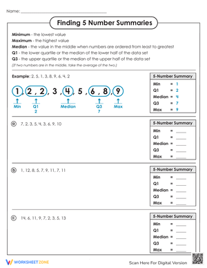
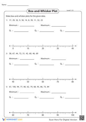
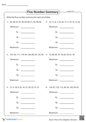
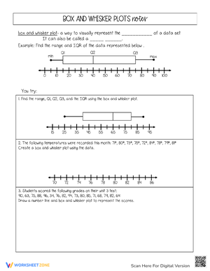
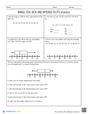
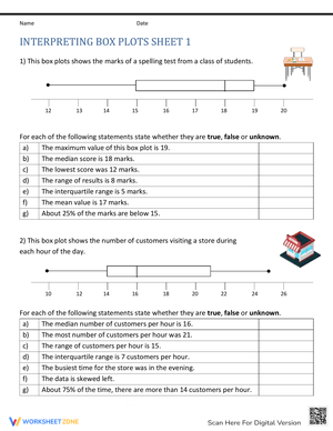
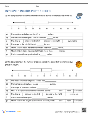
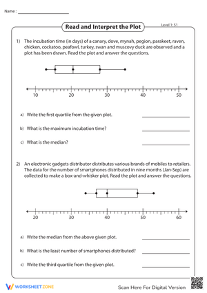
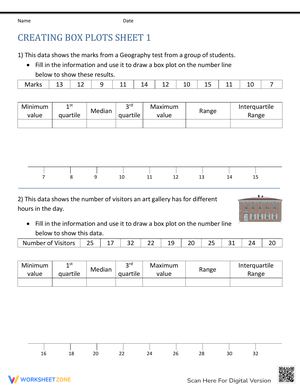
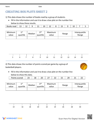
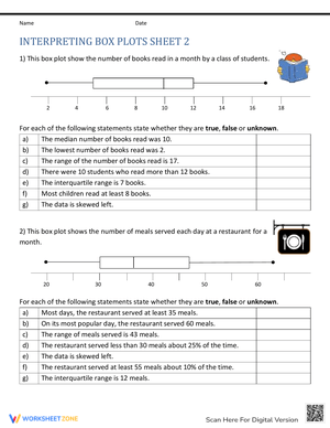
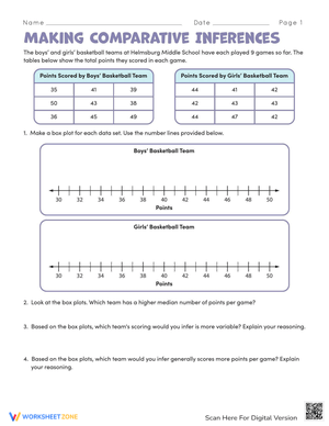
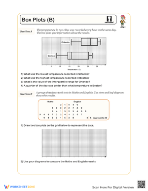
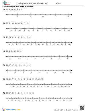
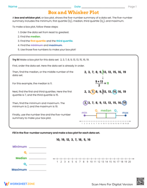
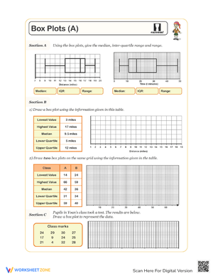
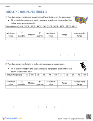
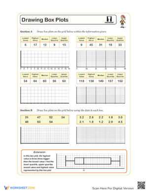
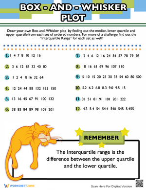
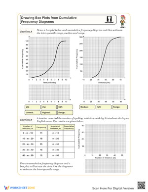
The set here builds each component separately before combining them. Early pages focus entirely on the five-number summary: students receive an unordered set, arrange the values, and identify the minimum, Q1, median, Q3, and maximum before any graphing occurs. Later pages ask students to go from a raw data set all the way to a finished, labeled plot on a pre-drawn number line. Interpretation pages reverse the task — a completed box plot is provided, and students answer targeted questions about spread, center, and what the whisker lengths suggest about the data. Double box plot pages place two distributions on the same axis and ask students to compare medians, interquartile ranges, and overlap in writing, not just by circling an answer.
More advanced pages introduce outlier identification using the 1.5 × IQR rule. Students calculate the IQR, multiply it, establish the fences, and check each extreme value against those boundaries before deciding what the whiskers should actually reach — a step many introductory treatments skip entirely.
Where These Fit in a Statistics Unit
A standard 45-minute period structure accommodates these pages across four to five days without rushing the conceptual work. On the first day, the five-number summary sheets work well as guided practice — small data sets, numbered steps, and space to show each calculation so both the teacher and student can see exactly where the process broke down. Day two moves to the full construct-from-data pages. Pairing students here pays off: one partner handles the median and quartile calculations while the other independently checks them before either student touches the number line. Catching a quartile error before graphing saves the entire page.
By the third or fourth day, double box plot pages anchor a meaningful comparison task. Pairing them with real-world data — points scored by two teams across a season, daily high temperatures in two cities over a month — gives students something to actually argue about in the written comparison sentences. That writing component matters: 6.SP.B.5c expects students to describe spread and center in context, not just identify values. The worksheets build in sentence-frame scaffolding on early comparison pages and remove it on later ones.
The interpretation-only pages are the most flexible format in the set. They work as a Monday warm-up after a weekend break, as a formative check after the graphing lesson, or as a quick exit ticket — three targeted questions about a single completed plot take about eight minutes and tell you immediately whether students understand what the box and whisker lengths actually represent.
Patterns You'll Recognize in Student Work
The most persistent error in student box plots involves quartile calculation on odd-numbered data sets. When a data set has, say, 11 values, the median is the 6th value. Students who understand that correctly will then include that 6th value in both halves when they go to find Q1 and Q3 — producing quartiles that are slightly off and a box that is visibly too wide or narrow. The worksheets address this directly by having students physically cross out the median before locating each half, which forces the correct split without requiring a lengthy re-explanation.
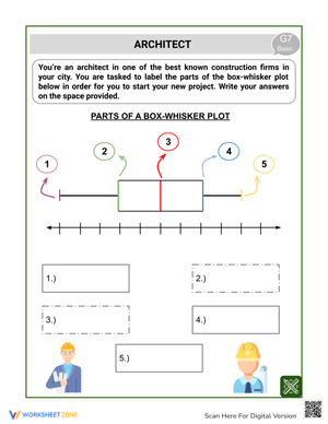
A second error appears consistently on interpretation pages: students read the right endpoint of the box as the maximum rather than as Q3. They confuse the box boundary with the whisker endpoint because, in their mental model, the line on the right is the last line they drew. Pages in this set label the five-number summary values directly below the finished plot on early interpretation exercises, then fade that scaffold on later pages so students have to name the parts themselves.
There is also a conceptual error worth watching for on comparison worksheets: students who describe a data set with a longer whisker as having "more data" in that region, when what the longer whisker actually signals is greater variability in that portion of the distribution — not a larger count of values. Each data set in a box plot represents exactly the same number of observations in each quarter. That misconception shows up in written responses even when students draw the plots correctly, and the comparison pages here include a targeted question that surfaces it directly.
Standards Aligned
The primary standard driving box plot instruction is CCSS 6.SP.B.4, which asks students to display numerical data using box plots (among other representations), and 6.SP.B.5, which adds the expectation that students summarize and describe distributions in terms of center and variability. Box plots sit in grade 6 because students at that level have already worked with median and range in earlier grades and are ready to extend those concepts into quartiles and a five-number summary. The IQR as a formal measure of variability is a grade 6 introduction, and these worksheets treat it as a primary learning target rather than a side calculation.
Grade 7 and 8 teachers revisit box plots when students are comparing distributions from statistical samples — 7.SP.B.3 specifically names comparing two data sets using measures of center and variability, which is exactly what the double box plot pages here address. High school teachers covering exploratory data analysis under the Statistics and Probability standards will find the outlier identification pages useful as review material.
Adjusting for the Range of Learners in the Room
For students who are still consolidating median-finding, the five-number summary pages work as a two-day task: median practice on day one using simple odd-numbered sets, then the full summary on day two when the median calculation is automatic enough that quartiles don't compete with it for attention. Introducing too many new steps at once overloads the working memory students need to track which values belong to the lower half and which belong to the upper half — a small adjustment in pacing removes that bottleneck.
For students who are ready to move beyond the standard procedure, the reverse-engineering task is the most productive stretch activity in the set. A completed box plot is displayed — say, a median of 42, Q1 of 35, Q3 of 51, minimum of 28, maximum of 67 — and students must write a plausible data set of a specified size that would produce exactly that five-number summary. This task requires students to work backward through every calculation they learned going forward, and it distinguishes students who understood the structure of a box plot from students who memorized the steps. It also generates natural discussion: two students with very different data sets can both be correct, which opens the door to a conversation about what box plots preserve and what they obscure about the original data.
Frequently Asked Questions
1. My students keep getting different quartile values than the answer key — are there multiple correct methods?
Yes, and this is a genuine source of confusion. There are at least three common methods for calculating quartiles, and different textbooks, calculators, and software tools use different ones. The method used throughout these worksheets — finding the median of each half, excluding the overall median when the data set has an odd count — matches the approach most commonly taught in grades 6–8 and specified in most state-adopted textbooks. If your students are using a graphing calculator that produces slightly different Q1 and Q3 values, that discrepancy is worth naming explicitly in class rather than treating as an error on either side.
2. How long does a typical box plot worksheet take to complete?
The five-number summary pages run about 10–12 minutes for students who are reasonably comfortable ordering numbers. The full construct-from-data pages — where students go from a raw list through all calculations to a finished graph — typically take 18–22 minutes the first time and closer to 12–15 minutes after a few days of practice. The double box plot comparison pages, which include a written response component, run 20–25 minutes. These are not designed as timed exercises; the pacing estimates are useful for planning whether a page fits in a warm-up block or needs a full practice period.
3. What's the best way to use the answer keys without students simply copying?
The calculation-heavy pages show intermediate work in the answer key — the ordered data set, the split into halves, each quartile labeled — specifically so that when a student checks their answer and finds a mismatch, they can locate exactly where the divergence happened rather than just marking the final answer wrong and moving on. Assigning the correction as the actual homework task ("find where your calculation diverged from the key and redo from that step") produces more learning than re-doing the whole page from scratch.