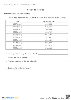
These scatter plot worksheets give 8th-grade teachers a structured path through one of the year's more conceptually layered statistics units — from plotting ordered pairs off a two-column data table all the way to writing slope-intercept equations from a hand-drawn trend line. Each page uses a properly scaled coordinate grid so students spend their time on interpretation, not on wrestling with cramped axes or inconsistent spacing.
What Each Page Asks Students to Do
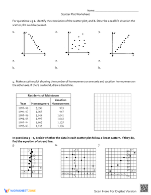
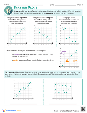
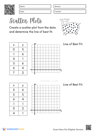
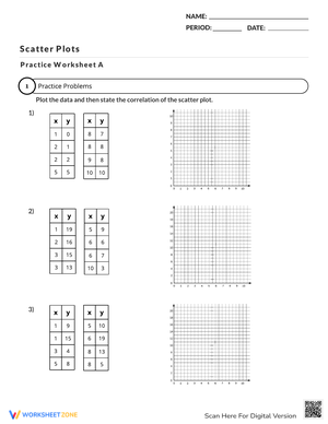
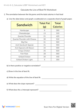
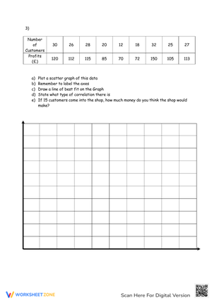
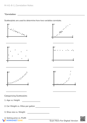
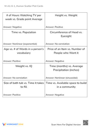
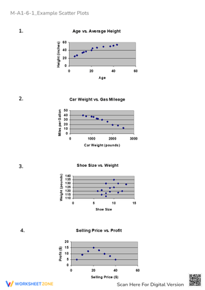
The worksheet set moves through six distinct skills, and the sequencing matters. Students begin by transferring raw bivariate data onto a coordinate plane — straightforward plotting that nevertheless reveals who still reverses the x- and y-coordinates. From there, pages ask students to classify the association: positive, negative, or none, and then to make the harder call between linear and nonlinear patterns. A cluster of a dozen points curving upward looks superficially similar to a linear trend until students try to place a straight ruler through it and notice the residuals stacking on one side.
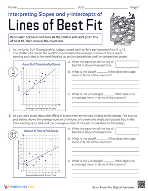
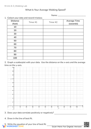
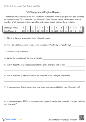
Later pages add outlier identification, informal line-of-best-fit drawing, and finally the algebraic step: selecting two points on the trend line, calculating slope, reading the y-intercept, and writing the equation. That last task is where scatter plot work connects directly to the linear functions thread running through all of 8th-grade math — students aren't learning a separate topic, they're applying slope-intercept form to a new context.
Where These Fit in a Multi-Day Sequence
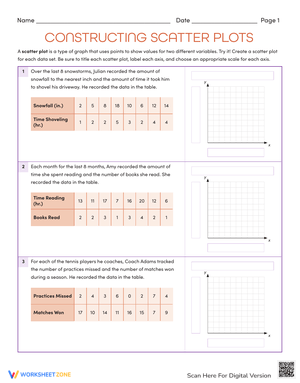
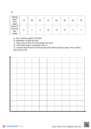
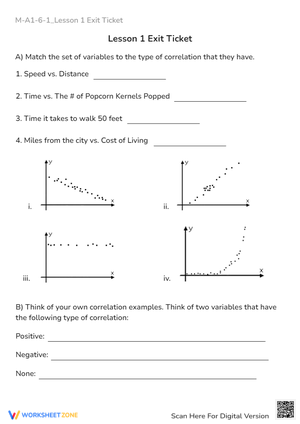
Most teachers spread this unit across four class periods, and these worksheets are built for exactly that structure. Day one pairs a pre-labeled coordinate plane with a small eight- to ten-point data set; the teacher plots the first three points together, then releases students to finish independently. That gradual release surfaces scaling errors early, before students develop bad habits on larger data sets.
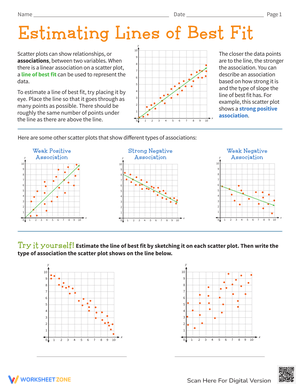
Day two uses completed scatter plots — students classify and describe rather than plot, which shifts cognitive load toward interpretation. Including at least one nonlinear example here is worth the extra discussion time; students who have only seen linear clusters will confidently call any upward trend "positive correlation" without registering the curve. A short partner comparison after independent work generates the kind of productive disagreement that sticks.
Days three and four move into line-of-best-fit drawing and then equation writing. One technique worth building into day three: after students draw their trend line, have them cover the right half of the scatter plot and predict where the next five data points would fall based on the visible portion alone. Revealing the actual data afterward makes extrapolation concrete in a way that defining the term never does.
Why This Skill Develops at 8th Grade Specifically
Scatter plots appear in 8th grade rather than earlier because the conceptual prerequisites converge here. Students need a working understanding of the coordinate plane, slope as a rate of change, and y-intercept as a starting value — all content from the 7th- and 8th-grade functions standards. Asking a 6th grader to write a trend-line equation isn't just premature; it's incoherent without those foundations. The 8.SP standards (specifically 8.SP.A.1 and 8.SP.A.2 from the Common Core State Standards Initiative) place bivariate data analysis at this grade because it is the natural integration point: statistics and linear algebra arriving at the same problem from different directions.
That integration is also what makes the unit harder to teach than it looks. Students who can calculate slope from two points in a functions unit will sometimes freeze when asked to do the same thing from a hand-drawn line on a scatter plot. The physical act of drawing the line introduces ambiguity — their line doesn't start from a labeled table of values, so the connection to the algebra feels broken. Worksheets that explicitly ask students to record the coordinates of the two points they chose before calculating slope help bridge that gap.
Error Patterns Worth Watching For
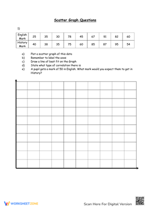
The most common mistake at the plotting stage isn't reversed coordinates — it's scale compression. Students who see a data set ranging from 0 to 80 will sometimes label axis increments as 0, 10, 20... and then, running out of room halfway through, shift to 30, 50, 80. The resulting scatter plot looks plausible until you notice the unequal spacing. Pre-scaled grids with labeled axes eliminate this, which is one reason PDF format matters: the grid prints at exactly the intended size every time.
At the association stage, students reliably confuse "no correlation" with "negative correlation" when the data cloud is wide but slightly tilted downward. Showing three plots side by side — one clearly negative, one truly random, one ambiguous — and asking students to rank them by correlation strength is more effective than having them label a single plot in isolation.
The outlier task produces a different error: students who have learned that outliers are "far from the mean" in earlier statistics units will sometimes flag the lowest or highest x-value as an outlier simply because of its position on the axis, rather than examining its distance from the trend. Worksheets that ask students to draw the line of best fit before identifying outliers correct this — once the trend line is visible, "far from the trend" becomes the natural standard.
Adjusting for the Range of Learners in the Room
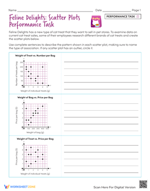
Students who struggle with plotting benefit from worksheets where the data points are already placed on the grid. Removing the plotting task entirely lets them focus on describing what they see — the association, any outliers, the plausible direction of a trend line — without the fine-motor and scaling demands crowding out the statistical reasoning. That's a legitimate differentiation, not a shortcut.
Advanced students move into comparison tasks: two scatter plots using the same variables but different data sets, where the question is which shows the stronger association and why. Alternatively, a data set that follows a curved pattern gives them something a straight trend line genuinely cannot capture, which opens a conversation about the limits of linear models that pays dividends when they reach Algebra 2.
Frequently Asked Questions
1. Can Algebra 1 teachers use these, or are they strictly for 8th-grade math?
Algebra 1 teachers use scatter plot worksheets regularly, either as a bridge from numerical pattern-finding to formal regression or as a review of 8.SP content before introducing least-squares methods. The equation-writing pages align cleanly with slope-intercept work regardless of whether the course is labeled 8th-grade math or Algebra 1.
2. How should I handle the fact that students draw slightly different lines of best fit?
Treat it as a feature rather than a grading problem. Two students who each drew a defensible trend line through the same scatter plot will write slightly different equations — and both can be correct. Building a brief discussion around this ("both lines are reasonable; which one do you think captures the trend better, and why?") reinforces that informal fitting is an estimation process, which is exactly what 8.SP.A.2 describes.
3. Do the worksheets include answer keys?
Yes. Each page includes an answer key with a sample trend line drawn in, coordinates used to derive the slope, and the resulting equation. Because line-of-best-fit drawing allows for reasonable variation, the keys show one acceptable solution rather than the only correct one — which helps when students ask why their equation looks different from the key's.