What Aesthetic Handwriting Worksheets Actually Do in a Classroom
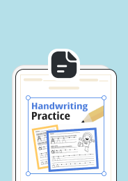
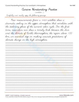
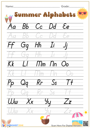
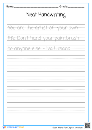
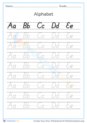
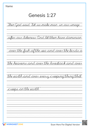
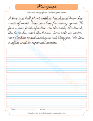
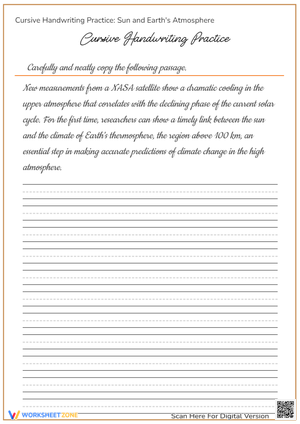
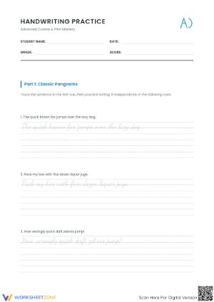
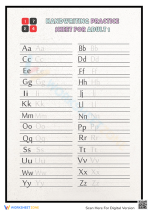
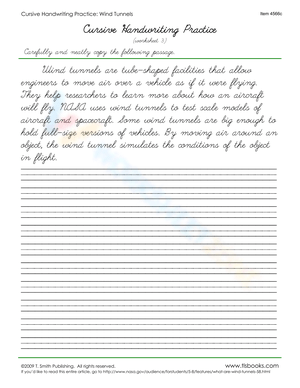
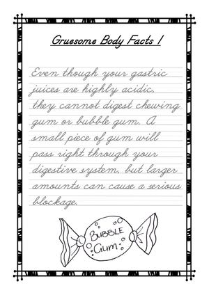
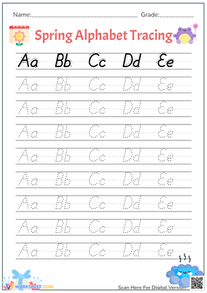
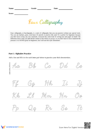
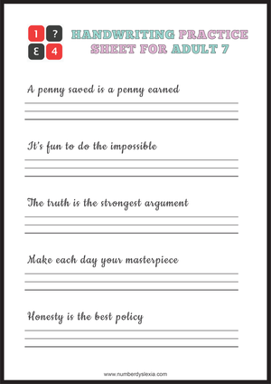
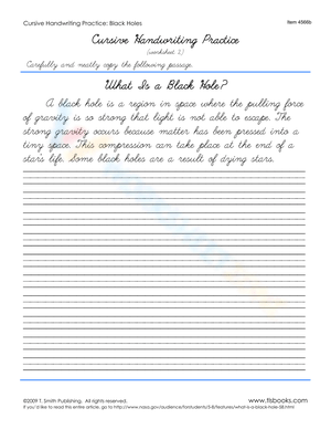
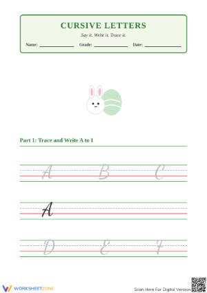
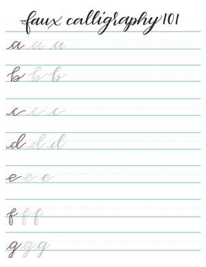
Aesthetic handwriting worksheets ask students to practice letter formation using decorative styles—bubble letters, block lettering, calligraphy-inspired strokes, and stylized cursive—instead of plain repetition rows. For US teachers, the appeal is practical: the same stroke practice that builds legibility happens inside a format students actually want to finish. You still get controlled letter shapes, consistent spacing, and repeated motor patterns, but the visual payoff keeps pencils moving.
This matters more than it might seem. In early elementary classrooms, handwriting tasks such as copying and writing to dictation take up more than half of daily instructional time. When that much of the day runs on penmanship, the format of your practice sheets stops being a small decision. A worksheet that students rush through carelessly wastes minutes you can't get back, while one that holds attention turns routine practice into usable skill-building.
Why Decorative Letterforms Motivate Reluctant Writers
Plenty of students hit a wall with standard drill sheets. They know how to form the letters well enough to get by, so another row of lowercase a feels like busywork. Aesthetic styles reset that dynamic by giving each letter a purpose beyond correctness—students shade bubble letters evenly, keep calligraphy downstrokes thick and upstrokes thin, or balance the loops in a stylized script.
Here's the part that gets overlooked: the decorative constraint quietly forces more repetition, not less. A student who would grumble at writing a letter five times will happily redraw the same curve six or seven times to make a bubble letter look symmetrical. Teachers consistently report that stylized sheets get students to repeat strokes more willingly than plain drills, which means the motor practice you want is happening precisely because the task looks like art rather than handwriting homework.
That willingness compounds over a semester. A student who associates handwriting practice with something they made and liked keeps showing up to it with less pushback, and the letters they form for fun start bleeding into the letters they form on a spelling test or a science lab writeup.
Matching Aesthetic Styles to Grade Bands
Not every decorative style fits every age. Choosing the wrong one either frustrates younger hands or bores older students, so match the format to fine motor readiness.
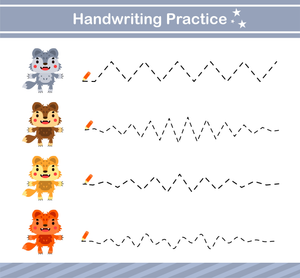
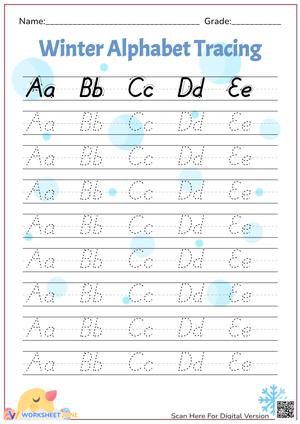
- Early elementary (K-2): Bubble letters and thick block styles. Large, forgiving shapes let developing hands practice closed curves and straight lines without demanding precision they don't have yet.
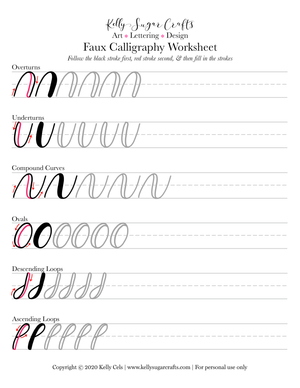
- Upper elementary (3-5): Simple calligraphy strokes and stylized print. Students can manage thick-and-thin contrast and start controlling pressure.
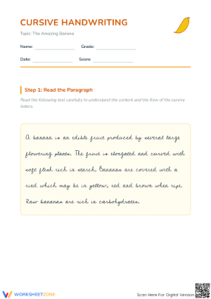
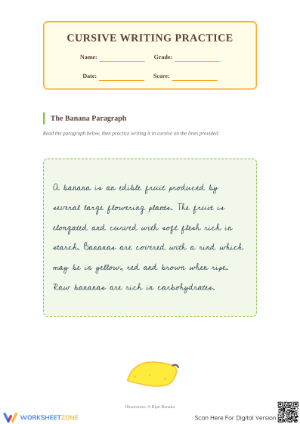
- Middle school (6-8): Calligraphy-inspired cursive and modern script. Older students treat these as a genuine skill and often keep practicing on their own.
The grade-band split also lets you differentiate within a single class. A fifth-grade room with mixed fine motor ability can offer block-letter sheets to students still building control and script sheets to those ready for a challenge, all under the same aesthetic-handwriting umbrella.
How Stylized Practice Builds Fine Motor Control
The engagement angle only matters if the practice does something. It does. Decorative letterforms demand the same underlying skills—grip control, in-hand manipulation, and visual-motor integration—that occupational therapists target when they work on legible writing.
Structured fine motor work reporting a Cohen's d of 1.598 for gains in hand strength, grip control, and coordination shows how much controlled practice can move the needle, according to research summarized in 'Improving Fine Motor and Handwriting Skills' (NWCommons). An effect that large signals that deliberate stroke practice, not just time spent, drives measurable change in young hands.
Foundational handwriting programs for the youngest students show a similar pattern. A study of kindergarten and first-grade intervention found significant gains in visual-motor integration after short structured blocks, with the strongest effects for kindergartners. That points to a simple takeaway: brief, focused, engaging practice beats long, tedious sessions—which is exactly what a well-designed aesthetic worksheet delivers.
What to Look For in a Quality Aesthetic Sheet
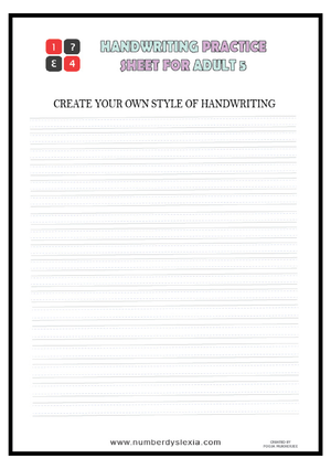
Not all decorative sheets earn their place. The best ones keep the underlying letter shapes correct even when the styling gets fancy, because a bubble letter with the wrong basic form just reinforces a bad habit. Look for sheets that show clear stroke direction, give students a model to trace before they write independently, and leave enough space for the hand to move without cramping.
- Correct base shapes: The decorative version should sit on top of accurate letter formation, not replace it.
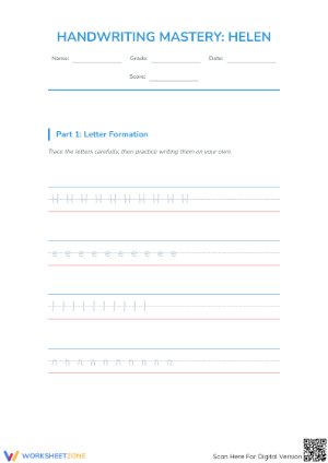
- Visible stroke order: Numbered or arrowed strokes help students build the right motor pattern from the start.
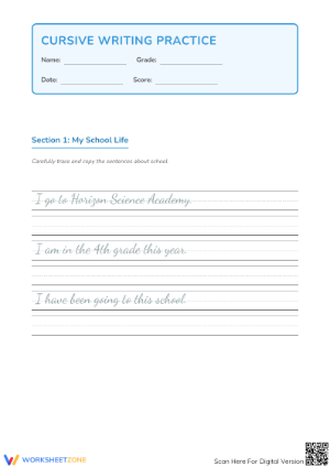
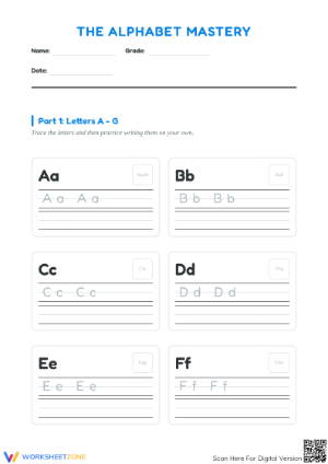
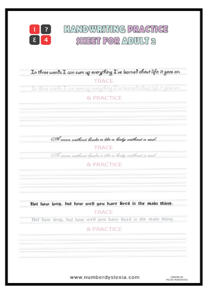
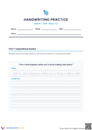
- Trace-then-write flow: A model, guided tracing, and independent space in one sheet scaffolds the skill.
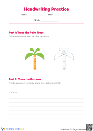
- Age-appropriate sizing: Larger guides for young hands, tighter lines for older students refining control.
A quick way to vet a sheet: try writing one row yourself. If your own hand naturally lands on the correct letter shape while following the style, students will too. If the decoration fights the letter form, skip it.
Classroom Implementation
The fastest way to use these sheets without eating into core instruction is to treat them as framing tasks. A stylized letter sheet works well as a bell-ringer while you take attendance, or as an early-finisher option that keeps fast workers productively occupied instead of restless.
- Bell-ringers: One or two decorative letters at the start of class settle students and warm up their hands before writing tasks.
- Early finishers: Keep a small stack of aesthetic sheets in a labeled bin so students can grab one independently.
- Art-integrated blocks: Pair calligraphy practice with a short lesson on lettering styles to connect penmanship and visual art.
- Small-group rotation: Use decorative sheets as a low-supervision station while you run guided reading or intervention with another group.
Keep sessions short. Five to ten focused minutes beats a full page of rushed letters, and it respects how much of the day is already spoken for by copying and dictation work.
Supporting Intervention and OT Goals
For students receiving handwriting intervention or occupational therapy support, aesthetic sheets double as motivating practice toward specific fine motor goals. Occupational therapy research links explicit fine motor precision and in-hand manipulation to more legible, better-articulated letter formation, so the shading, tracing, and controlled strokes these sheets require line up with what intervention already targets.
Coordinate with your OT or intervention specialist so the style matches the goal. A student working on pencil pressure benefits from thick-and-thin calligraphy strokes; one building closed-curve control gets more from bubble letters. Framing the work as making it look nice rather than fixing your handwriting also lowers the resistance many struggling writers bring to remediation.
Progress monitoring stays simple, too. Keep a dated sample from the start of a unit and compare it to one a few weeks later; cleaner spacing and steadier lines on the aesthetic sheets usually show up in a student's regular writing before any formal assessment catches it.
Frequently Asked Questions
1. What is aesthetic handwriting and how is it different from standard print or cursive?
Aesthetic handwriting focuses on decorative, visually appealing letterforms—bubble letters, block styles, and calligraphy-inspired script—rather than the plain shapes of standard print or cursive. The letter formation goals overlap, but the stylized finish makes practice feel creative instead of repetitive.
2. Which grade levels benefit most from aesthetic handwriting worksheets?
Every grade band can use them with the right style. Younger students (K-2) do best with bubble and block letters, upper elementary students handle simple calligraphy strokes, and middle schoolers often take to script styles as a personal skill.
3. How can teachers fit aesthetic handwriting practice into a busy schedule?
Use them as bell-ringers, early-finisher tasks, or low-supervision stations. Five to ten minutes is enough, so the practice supports rather than displaces core ELA instruction.
4. Can aesthetic handwriting practice help students with fine motor delays?
Yes. The grip control, in-hand manipulation, and visual-motor integration these sheets build are the same skills tied to legible writing, making them a strong fit for students in intervention or OT support when coordinated with a specialist.
5. How often should students practice for visible improvement?
Short, frequent sessions work best—several brief practices a week outperform occasional long ones. Consistency and engaged repetition drive the fine motor gains that show up as cleaner, more legible everyday writing.