These kindergarten neat handwriting worksheets give teachers a structured, repeatable format for the part of early literacy instruction that's hardest to improvise — the ten minutes of focused letter formation practice that has to happen every single day. Each worksheet pairs clear three-line guides with directional stroke arrows so students aren't just tracing shapes; they're building the physical habit of forming each letter correctly from the first try.
What's Inside the Set
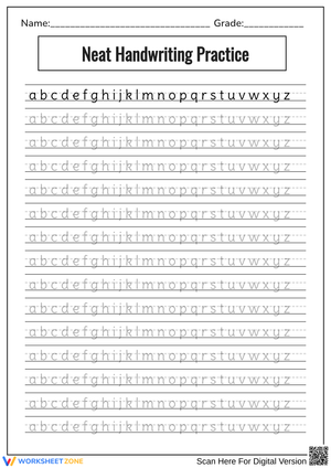
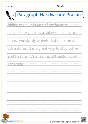
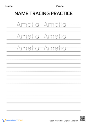
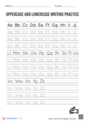
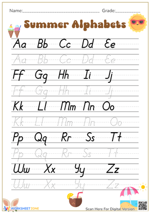
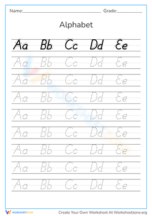
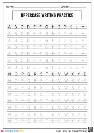
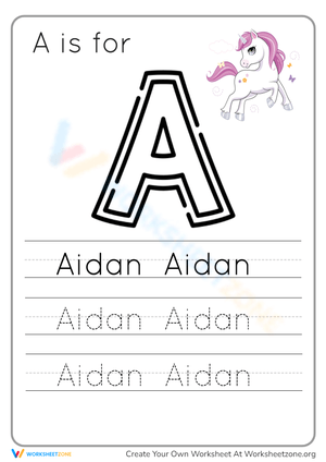
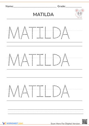
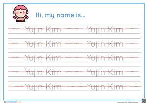
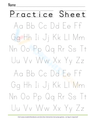
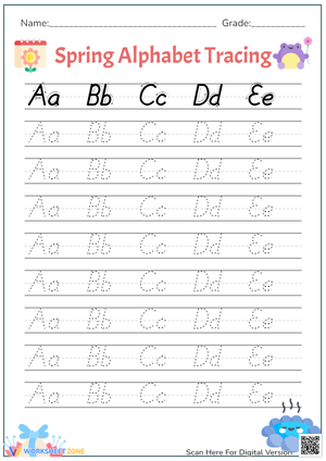
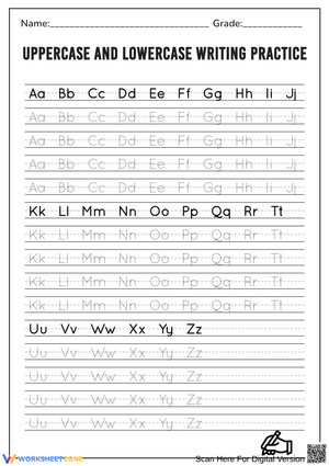
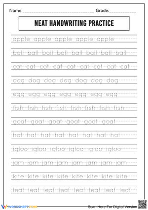
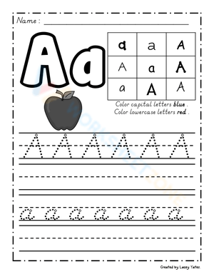
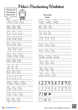
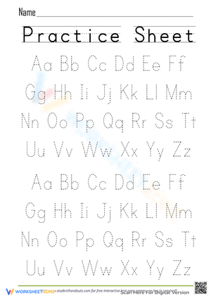
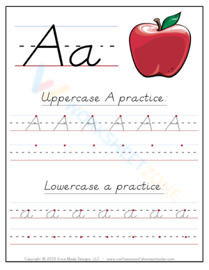
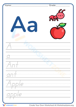
Each worksheet targets a specific letter or small group of related letters, giving students repeated tracing practice before moving to independent writing in the lower portion of the page. The three-line format — baseline, midline, and top line — is present on every worksheet, not just the introductory ones, so spatial expectations stay consistent as students move through the set. Directional arrows show entry points and stroke sequence rather than just the finished shape, which matters because a letter that looks correct can still be formed inefficiently if the child started from the wrong place. Sufficient white space between rows prevents the visual crowding that causes kindergartners to rush and lose precision.
Standard Alignment
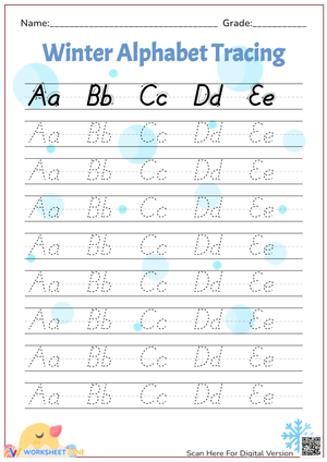
These worksheets align with CCSS.ELA-LITERACY.L.K.1a, which requires kindergartners to print many upper- and lowercase letters. In classroom terms, that standard is typically addressed during the first half of the year — teachers work through the alphabet letter by letter while students are simultaneously learning letter names and sounds in phonics. The worksheet set fits into that sequence naturally, with one worksheet per letter providing the formation practice that reinforces what students are learning in whole-group phonics instruction. Using the worksheets in alphabetical order is one approach, but many teachers sequence by letter formation type — starting with straight-line letters like L, T, and H before introducing curve-heavy letters — which tends to reduce frustration early in the year and build confidence before the harder letters arrive.
The Specific Skills Targeted
The worksheets address letter formation in both upper- and lowercase, consistent sizing relative to the guidelines, baseline adherence, and pencil control through curves and diagonal strokes. Those last two categories — curves and diagonals — are where most kindergarten breakdowns happen. Students who handle L, T, and I confidently will often struggle with S, G, and K because those letters require stroke transitions that feel less natural at this stage. The worksheets give heavier tracing scaffolding to those transitional letters before asking students to write them independently.
Beyond letter formation, the set also builds left-to-right directionality and the habit of returning to the left margin before starting the next letter — a spatial routine that pays dividends when students begin writing words rather than isolated characters.
Pedagogical Reasoning Behind the Format
Cognitive load theory explains why this matters for five-year-olds more than it does for older students. When a child has to consciously think through how to form a letter — where does the pencil start? which direction does the curve go? — that working memory load competes directly with the phonics thinking they're supposed to be doing simultaneously. Explicit, repeated handwriting practice doesn't just produce neat papers; it automates the physical act of writing so that cognitive resources are freed for spelling, word retrieval, and sentence construction. The worksheets are structured around this principle: the tracing phase handles the modeling, the guided practice row builds the motion pattern, and the independent row asks students to produce the letter from memory. That three-stage gradual release is deliberate, not decorative.
Frequent Student Errors Worth Watching For
The most persistent error at this level isn't the reversal that everyone anticipates — it's letter height inconsistency. A student will write a lowercase a that respects the midline on Monday and then produce one that floats halfway to the top line on Tuesday, and they genuinely don't notice the difference. What they're missing is a stable internal reference for where the "body" of the letter lives. One adjustment that helps: before handing out a worksheet, take a yellow highlighter and shade the space between the baseline and midline. That band of color gives students a concrete target zone and dramatically reduces the floating-letter problem without requiring constant verbal reminders from the teacher.
Stroke reversals on b, d, p, and q are the other predictable trouble cluster. Students who've been forming these letters incorrectly for even a few weeks have already begun automating the wrong motion, which makes correction harder than initial instruction. The directional arrows on these worksheets are especially important — use them as a talking point during whole-group modeling before students ever touch the page independently.
How to Build These Worksheets Into Your Lesson Plans
These worksheets function well in three different scheduling slots, and the right choice depends on what else is happening in your literacy block. As morning work, they provide a calm, predictable opening routine that doesn't require teacher setup once students know the format. During literacy centers, slide the worksheets into dry-erase pockets so students can practice the tracing portion repeatedly with whiteboard markers before committing to pencil — this preserves the paper copy for the independent writing rows and adds repetition without adding prep. As a whole-group warm-up tied to phonics instruction, hand out the worksheet for the letter being introduced that day, model the stroke sequence on the board before students begin, and have them say the letter's sound aloud each time they write it. That multisensory loop — hearing, seeing, and writing simultaneously — is one of the more reliable ways to accelerate letter-sound correspondence in kindergartners.
Whatever the scheduling context, ten to fifteen minutes is the right session length. Longer than that, and hand fatigue produces sloppy output that reinforces bad habits rather than good ones. Five perfectly formed letters in a focused session build more lasting skill than a full page written carelessly.
Adapting These Worksheets for a Range of Learners
For students whose fine motor development is significantly behind their peers — students who fatigue quickly, grip the pencil with a full fist, or can't yet control a curve — enlarge the worksheet on the copier before printing. The wider lines give more margin for error while the student builds the underlying muscle strength. Pair the enlarged worksheet with a few minutes of pre-writing tactile work: tracing the letter in a sand tray or forming it with clay gives proprioceptive input that transfers surprisingly well to pencil control. A physical pencil grip aid is worth keeping in a classroom supply bin for students who are still locking into the tripod grasp.
For students who've moved through the basics and find standard letter formation worksheets under-challenging, the right move isn't to skip ahead to cursive — it's to shift the demand from formation to fluency. Have them write short CVC words using the letters practiced, focusing on even spacing between letters and consistent sizing across an entire word rather than a single character. That's a meaningfully harder task at this level than it looks.
Frequently Asked Questions
Do these worksheets work for both Zaner-Bloser and Handwriting Without Tears classrooms?
The three-line format is standard Zaner-Bloser style. Handwriting Without Tears classrooms use a two-line system, so the spatial expectations on these worksheets won't match what HWT students are learning. If your school uses HWT, check the worksheet format carefully before distributing — teaching students to write between three lines when their core program uses two creates unnecessary confusion at a stage where spatial habits are still forming.
How should left-handed students be set up before starting a worksheet?
Left-handed students need the paper angled slightly to the right, which is the opposite of what feels instinctive to most teachers. Their pencil grip should sit about an inch farther back from the tip than a right-handed student's to avoid smudging fresh strokes and to maintain a clear sightline to the letters being traced. Watch that left-handed students aren't hooking their wrist over the top of the paper — that posture is a compensation for poor paper positioning and leads to fatigue quickly.
What's the best way to track progress on letter formation over time?
Keep one completed worksheet per letter in a simple portfolio folder — one folder per student, labeled with their name. Comparing the worksheet completed in October to the same letter practiced again in January gives concrete visual evidence of growth that's meaningful to both parents and students. A simple three-point rubric — stroke sequence, baseline adherence, and consistent sizing — is enough to make that comparison systematic without turning assessment into a separate administrative task.