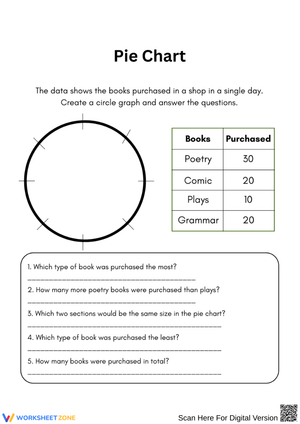
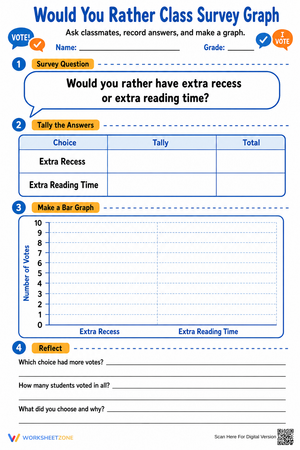
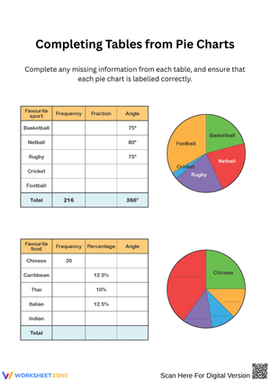
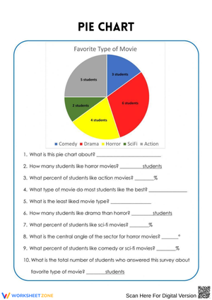
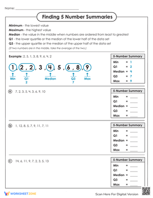
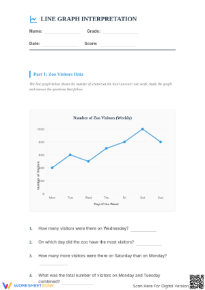
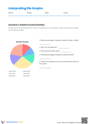
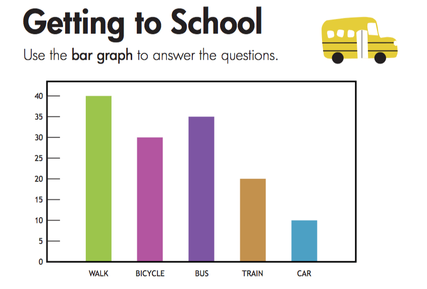
These graphing data printable worksheets for 6th grade move students through both sides of data literacy — constructing graphs from raw data tables and pulling meaning from finished displays. Each worksheet targets one or more of the graph types expected at this level: bar graphs, line graphs, histograms, dot plots, and coordinate-plane plotting. The tasks go past locating a single value and require students to compare categories, describe trends, and justify conclusions in writing.
The Specific Skills Each Worksheet Targets
Grade 6 is the year graphing shifts from a drawing task to an analytical one. State frameworks and the Common Core both require students to create data displays, interpret them, and connect them to statistical reasoning — which means working across multiple graph types is not optional. Each worksheet in the set focuses on a concrete skill within one of these areas:
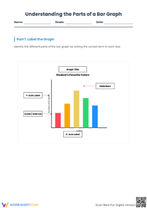
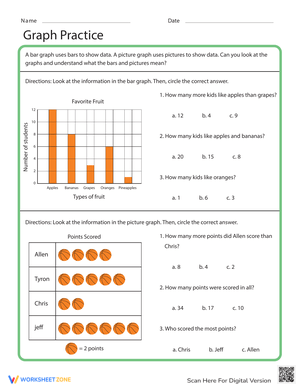
- Bar graphs: reading category values, comparing groups, and explaining differences between the highest and lowest bars in the context of the data
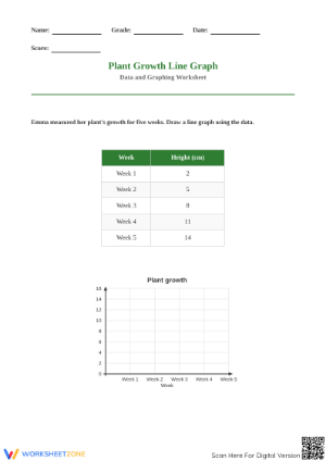
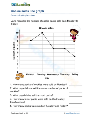
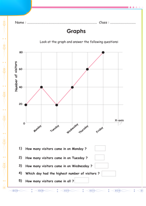
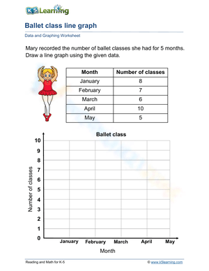
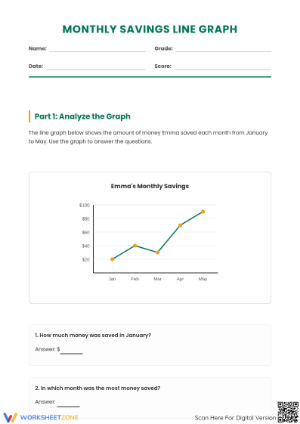
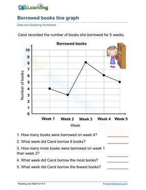
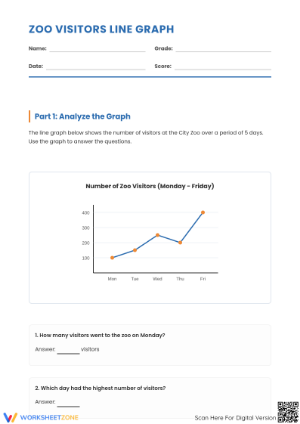
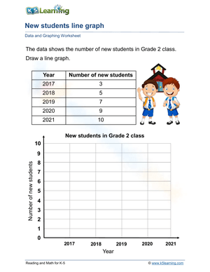
- Line graphs: tracking change over time, identifying periods of increase or decrease, and describing an overall trend in a sentence
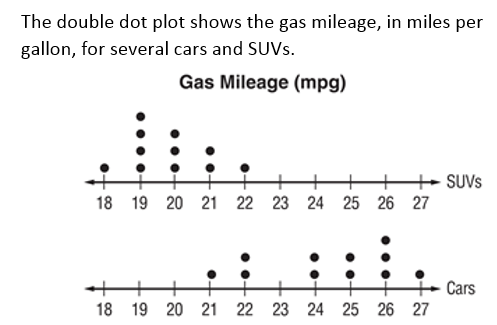
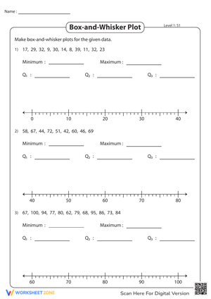
- Dot plots and line plots: recording frequency data, marking clusters and gaps, and drawing a basic conclusion about what the spread reveals
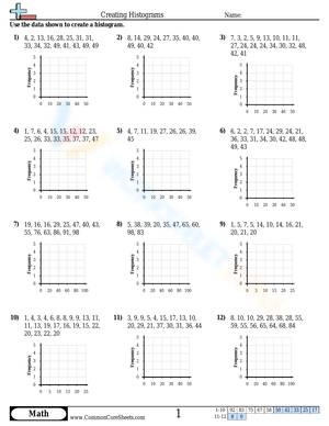
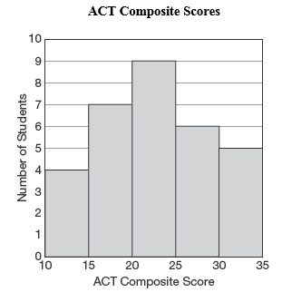
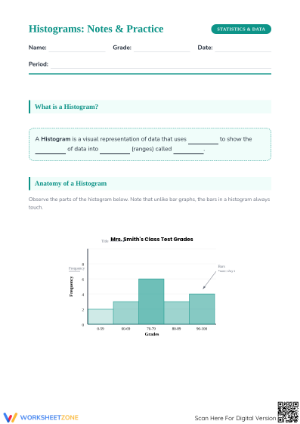
- Histograms: sorting numerical data into intervals, reading interval counts, and comparing groups of values rather than individual data points
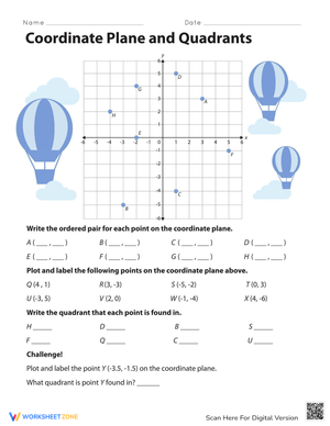
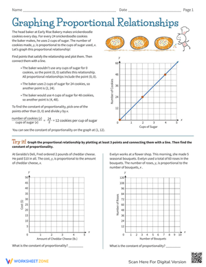
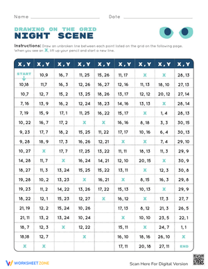
- Coordinate-plane graphing: placing ordered pairs on a full four-quadrant plane, reading axis values, and describing what the location of a point means within the problem's context
Several worksheets build in a three-part task structure: students set up the graph first — title, axis labels, scale — then create the display from a data table, then answer 3 to 5 questions requiring written interpretation. That sequence mirrors how data tasks appear on grade-level assessments and slows students down enough at each stage that they stop treating the graph as a drawing to finish quickly and start treating it as a tool for reasoning.
Student Errors Worth Anticipating Before You Assign These
Scale misreading is the most stubborn graphing error at this grade. A student who has spent years counting discrete objects will look at an axis marked in increments of 5 — 0, 5, 10, 15 — and count tick marks instead of reading interval values. Ask that student how tall a bar is when it lands on the 15-mark, and you may hear "3" because they counted three ticks up from zero. The worksheets in this set use varied scales — increments of 2, 5, 10, and sometimes 25 — which surfaces that error quickly instead of letting it stay hidden behind uniform counting.
Graph-type selection is a second consistent trouble spot. Students default to bar graphs even when data involves change over time (which calls for a line graph) or when values are grouped into numerical ranges (which fits a histogram). A few worksheets include a justification prompt before the graph task: "Explain which graph type fits this data and why." That small addition turns graph-type choice into a visible, teachable moment rather than a silent guess.
A third pattern that shows up reliably in actual student work: the student who plots every point correctly but titles the graph "Graph" and leaves both axes blank. The display is technically there, but it communicates nothing. Worksheets that include a step-by-step checklist for title, axis labels, and scale treat labeling as part of the math — because at this grade, it is.
How to Build These Worksheets Into Your Instructional Week
The most effective approach is a short, consistent graphing routine rather than assigning the full set during one data unit and not returning to it. Two or three focused sessions per week during a statistics block — each built around one worksheet or a small cluster of items — builds more durable recall than a concentrated push followed by weeks away from graphs.
- Warm-up annotation: Project one graph item from a worksheet at the start of class and have students circle the scale, underline the trend, and mark the category with the greatest value before the lesson opens.
- Immediate practice after a mini-lesson: After 10 to 15 minutes of direct instruction on a new graph type, assign a focused worksheet for independent practice while the teaching is still fresh in working memory.
- Station rotation: Place one or two worksheets at a math station where students create the display, then pass the paper to a partner to check the title, labels, and scale accuracy.
- Exit ticket source: Pull the final interpretation question from any worksheet and use it as a 3-minute exit check. Students who answer it clearly are ready to move forward; those who can't give you a concrete reteach group for the next day.
- Spaced review: Return to a histogram or dot plot worksheet three to four weeks after initial instruction. Spacing retrieval practice over time builds recall more reliably than massed practice does, and graphing is a skill that fades fast without it.
A structural routine that reduces careless mistakes: ask students to work through a set-up, plot, interpret sequence on every worksheet before touching the graph area. Students who skip the set-up step — title, axis labels, confirmed scale — tend to plot on unlabeled axes and then can't use their own graph to answer the interpretation questions. The habit takes about a week to establish, and the difference in the work that comes back is noticeable.
The flexibility of these graphing data printable worksheets for 6th grade also extends their instructional life past a single unit. Teachers return to them during spiral review weeks, standardized test prep, and days when independent seatwork needs to run without direct teacher guidance.
Adjusting the Set for a Range of Learners
Graphing data printable worksheets for 6th grade work well in mixed-ability classes because the same real-world data context can carry different task demands without requiring entirely separate materials for each group. A worksheet built around monthly temperature data serves three levels at once: students who need more support work from a partially drawn graph with pre-labeled axes and pre-marked scales; on-level students create the display from a raw data table and answer four interpretation questions; students ready for a deeper challenge compare two temperature graphs — one from an inland city, one from a coastal city — identify which shows greater variability, and write a two-sentence justification of their answer.
For intervention groups, limit each worksheet to one graph type and keep data sets to five or six values. The constraint removes the extra cognitive load of managing a large table while also trying to build a display, so students can focus on fluency with the graph structure itself. For students who finish early, the most demanding extension is not more graphs — it's asking them to find and explain a deliberate error embedded in a completed graph that has an incorrect scale or a mislabeled axis. That task requires a level of graph literacy that goes well beyond constructing a correct display from scratch.
Standard Alignment
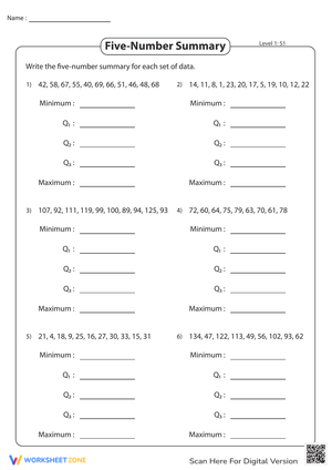
These worksheets align most directly to CCSS 6.SP.B.4, which requires students to display numerical data in plots on a number line — including dot plots, histograms, and box plots — and to 6.SP.B.5, which asks students to summarize numerical data sets in relation to the context. Coordinate-plane worksheets connect to 6.NS.C.6, covering placement of rational numbers on a full coordinate plane.
In most 6th grade pacing calendars, the data and statistics domain arrives in the second half of the year, after ratio reasoning and early algebraic thinking. By that point, students have enough number sense to handle uneven scales and negative coordinates — but they still need direct instruction on what each graph type communicates and when to choose one over another. These worksheets fit that instructional window as structured practice following direct teaching, not as a first introduction to the concepts.
Frequently Asked Questions
Which graph types do these worksheets cover?
Each worksheet addresses one or more of the following: bar graphs, line graphs, dot plots, histograms, and coordinate-plane graphing with ordered pairs. The set includes both creation tasks, where students build a graph from a data table, and interpretation tasks, where students read a finished display and answer questions about what it shows.
Can these worksheets be used for homework as well as class practice?
Worksheets with clear scales, pre-printed axis structures, and step-by-step task prompts work well as homework because students can follow the format without a teacher present. Worksheets that require graph-type justification or multi-sentence written explanations are better assigned during class time, where you can observe student thinking and address confusion before it hardens into a fixed misconception.
How do these work for students who are behind grade level in graphing?
Choose worksheets with smaller data sets — five or six values — and pre-labeled axes for students who are behind. Pair the worksheet with a simple four-step checklist: title, label axes, mark the scale, plot the data. Working through each step in order gives students a repeatable process rather than a blank page with too many decisions at once. Graphing data printable worksheets for 6th grade that include detailed answer keys also support small-group reteaching without requiring the teacher to reconstruct examples on the spot.
Do the worksheets include answer keys?
Answer keys are included with each worksheet. They show the correct graph setup, accurate plotted values, and model responses for interpretation questions. For open-ended written questions, the key provides a sample explanation rather than a single accepted phrasing — which gives teachers a realistic benchmark for evaluating student responses without holding work to an artificially narrow standard.









 Interactive Worksheet Maker
 Quiz Maker
 Word Search Maker
 Crossword Puzzle Maker
 Word Scramble Generator
 Sentence Scramble Generator
 Handwriting Worksheet Generator
 Name Tracing Generator
 Fill In The Blank Generator