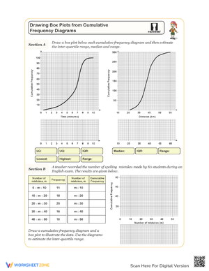
These box plots worksheets printable for 6th grade give teachers a ready set of practice resources covering the full process—ordering data, building a five-number summary, drawing box and whiskers on a number line, and reading distributions for center and spread. Each worksheet targets a specific phase of that sequence so students can direct their full attention to one layer of the skill before carrying it into the next.
The Specific Skills Targeted
Box plots ask students to move through a chain of dependent decisions, and a missed step early in the process derails everything that follows. The worksheets break that chain into addressable parts:
- Ordering data sets: Students rewrite values from least to greatest—a step many rush and get wrong when the list mixes two-digit and three-digit numbers or includes decimals.
- Finding the median: Practice covers both odd- and even-length data sets, since the even-count case (averaging the two middle values) trips up students who only practiced with five or seven numbers.
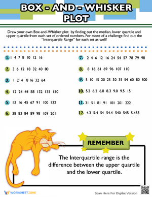
- Identifying Q1 and Q3: Students locate the medians of the lower and upper halves of the ordered list, working through multiple problems until the procedure is reliable.
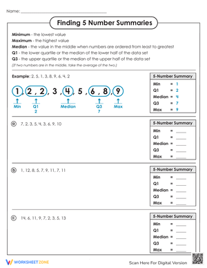
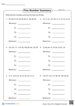
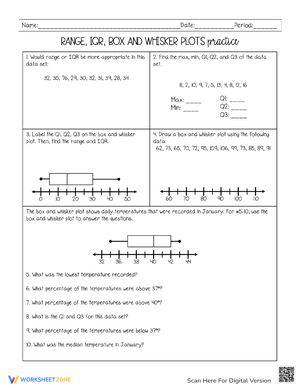
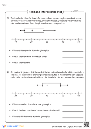
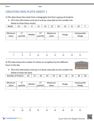
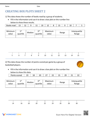
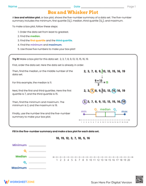
- Recording the five-number summary: Each worksheet asks students to state the minimum, Q1, median, Q3, and maximum before touching a number line—making the summary a deliberate stop rather than a byproduct of the drawing.
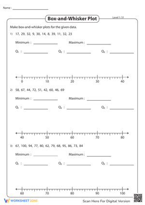
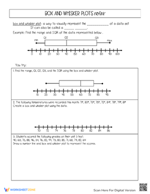
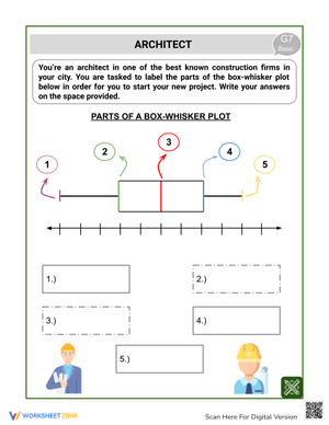
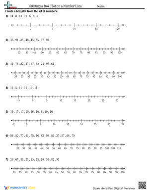
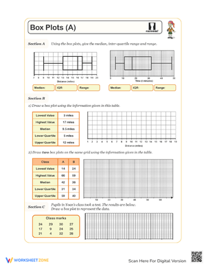
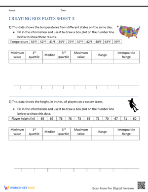
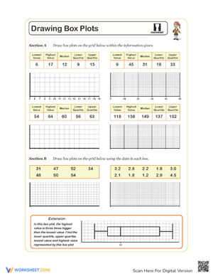
- Drawing the box and whiskers: Students plot all five values on a consistent scale and construct the box from Q1 to Q3, mark the median inside, and extend each whisker to the extreme values.
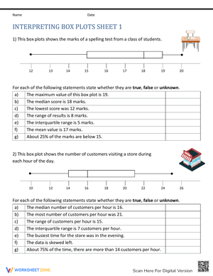
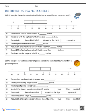
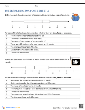
- Comparing distributions: Later worksheets present completed box plots side by side and ask students to compare medians, ranges, and the width of individual sections—connecting what they see visually to what it reveals about the data.
Frequent Student Errors Worth Watching For
The most persistent error in student work is quartile confusion. Students split the full data set into four equal-width segments on the number line rather than finding the medians of the lower and upper halves of the ordered list. A student who correctly identifies 14 as the median of {8, 10, 14, 17, 19, 22, 25} will still write Q1 = 11 by averaging 8 and 14 instead of using the lower half {8, 10, 14}, whose median is 10. Because this error appears in the five-number summary step—before the graph is even started—worksheets that require students to record Q1 and Q3 explicitly catch the mistake before it contaminates the drawing.
A second issue is number-line placement. Students who find the correct five values often crowd Q1 and the median together because those values sit adjacent in their written summary, then spread Q3 and the maximum far apart for the same reason. A reliable classroom fix: ask students to circle each five-number summary value in the ordered list using a colored pencil before touching the number line, then transfer one value at a time rather than plotting all five in a single pass.
A third misconception is the assumption that the four sections of a box plot cover equal distances on the number line. Students who expect symmetry are thrown off when one whisker is much longer than the other. That visual asymmetry is precisely what box plots are built to reveal—a long right whisker signals right skew—but students need explicit practice reading those shapes before that point lands.
How to Build These Worksheets Into Your Lesson Plans
The box plots worksheets printable for 6th grade fit most naturally into a 30- to 35-minute instructional block. A reliable structure: spend the first 8 to 10 minutes modeling one complete problem with a think-aloud that names every decision aloud ("I have seven values, so the median is the fourth one; now I set that median aside and find the median of the lower three"), then release students to work through the first worksheet with a partner while you circulate. Independent practice on a second worksheet follows, and a brief whole-class comparison discussion closes the block.
The set also works well in stations. One station targets five-number summaries from raw data, a second has students draw the box plot on a pre-labeled number line, and a third asks them to compare two completed box plots using two written sentences. That three-station rotation distributes cognitive load across the period—students return to the most demanding task (constructing from scratch) after working through the less demanding one (reading a finished graph), which tends to sharpen accuracy on construction problems the second time through.
For a Monday warm-up after a weekend, a single comparison prompt—two box plots side by side, three short-answer questions about median and spread—takes about six minutes and surfaces any drift from the previous week's instruction before new content is introduced.
Differentiating the Set Across Ability Levels
Students who are still building confidence do better when the data set is smaller—five or seven values rather than twelve—and when the number line arrives pre-labeled with tick marks at consistent intervals. A partially completed five-number summary table gives them a natural check-in point after each step so errors don't compound silently. These adjustments don't change the mathematical goal; they reduce working-memory strain on students who are still automating the ordering step.
Grade-level students handle eight- to twelve-value data sets without a pre-labeled number line, selecting their own scale and increments. That decision alone—picking a scale that fits the range without wasting space—is a meaningful mathematical judgment worth building into independent practice.
For students ready for more, box plots worksheets printable for 6th grade become genuinely demanding when the task asks them to compare two distributions in writing, identify which set shows greater variability, and reason through whether a high outlier value would meaningfully shift the median or barely move it. Those prompts require synthesis, not just calculation, and they point toward the statistical reasoning students will need in 7th grade when they begin working formally with the interquartile range and mean absolute deviation.
Standard Alignment
These worksheets address CCSS.MATH.CONTENT.6.SP.B.4, which requires students to display numerical data on a number line using box plots, and CCSS.MATH.CONTENT.6.SP.B.5c, which asks students to give quantitative measures of center and variability—median, range, and interquartile range—when summarizing a data set. In classroom terms, 6.SP.B.4 is the construction standard: students build the graph from raw data. 6.SP.B.5c is the interpretation standard: students explain what the five-number summary reveals. Both standards land in the same unit in most 6th-grade curricula, and the worksheets address both so teachers don't need separate materials for each half of the skill.
Frequently Asked Questions
What do students need to know before these worksheets make sense?
Students should be able to order a list of positive numbers, locate the median of an odd-count data set, and read intervals on a number line. Understanding range—the difference between the maximum and minimum—helps when the discussion turns to spread, but it can be reviewed briefly during the same lesson if students need the refresher.
How do students handle even-count data sets when finding quartiles?
For an even-count data set, students average the two middle values to find the median, then set that result aside. To find Q1 and Q3, they work only with the lower and upper halves of the original ordered list and find each half's median independently. This is where many students stall, and working through two or three explicit examples with the lower and upper halves circled separately makes the procedure reliable faster than repeated explanation alone.
Can a single worksheet work as a formative assessment?
A single well-constructed box plots worksheets printable for 6th grade problem—raw data list, five-number summary table, blank number line, and one written comparison question—gives enough diagnostic information to identify exactly where a student's process breaks down. A wrong Q1 value in the table tells you the problem is in the quartile step; a correct summary with a misplaced point on the graph tells you the problem is in scale interpretation. That specificity is more actionable than a total score.
Do these worksheets use real-world contexts or abstract numbers?
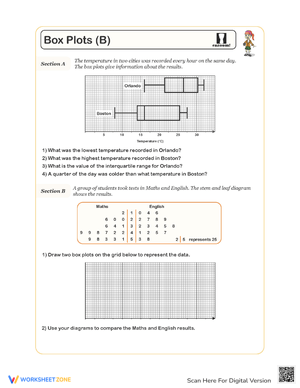
The set includes both. Some worksheets use context-free numerical lists to keep attention on the procedure. Others use realistic data—quiz scores, recorded temperatures across a week, or step-count data from a health scenario—so students practice interpreting a distribution that means something and answering questions that require them to connect the graph back to the situation it represents.