These data and graphing worksheets printable for 6th grade target the moment in middle school math when students are expected to do more than locate a value on an axis — they are supposed to interpret what a distribution shows, compare two data sets, and justify a conclusion with specific evidence from a graph. The set covers bar graphs, line graphs, histograms, dot plots, box plots, and coordinate graphs, and pairs graph reading and graph construction tasks with statistical summary work: mean, median, mode, range, and the effect of outliers on each. Teachers get print-ready materials that fit bell ringers, independent practice, and test prep without time-consuming setup.
Where 6th Graders Consistently Get Stuck
The histogram is where the most persistent confusion appears. Students with solid bar graph experience treat histogram bars as categories — they read the frequency axis correctly but miss that each bar spans an interval of values. When asked "how many students scored between 70 and 80?" they answer accurately. But when asked whether the data is clustered or spread out, they apply bar graph logic and point to the tallest bar rather than describe the overall shape. A worksheet that asks students to circle whether a distribution is symmetric, skewed left, or skewed right — before any computation questions appear — catches this habit before it becomes a testing-day error.
Box plots produce a different, equally stubborn mistake. Students who can find the median from an ordered list will look at a completed box plot and identify the median as the widest section of the diagram. They associate visual size with mathematical meaning — a reasonable but wrong inference. Worksheets that have students calculate quartile values from a raw data set and construct the box plot themselves, before answering interpretation questions, interrupt that visual confusion more effectively than purely reading-based tasks.
The mean-versus-median question is a third sticking point. Most 6th graders can calculate both correctly from a clean data set, but when an outlier is present, they default to the mean as "the average" without considering whether it actually describes the group well. Presenting two parallel data sets — one with a near-outlier, one without — and asking students to argue which measure of center they would report and why produces the kind of reasoning that single-computation tasks do not.
Skills Covered Across the Set
Each worksheet moves between computation and interpretation rather than treating them as separate activities. Students build graphs from raw data, read displays they did not create, calculate statistical measures, and explain what those measures reveal about a real situation.
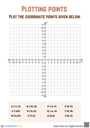
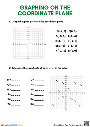
- Axis and scale reading: Students read values from graphs with non-zero starting points and varied interval sizes — the axis setups most likely to produce misreads on state assessments.
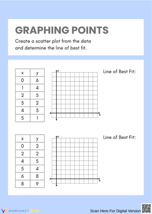
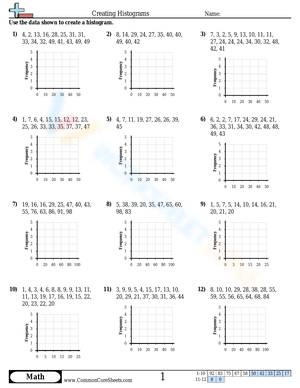
- Graph construction: Students organize unordered data lists and create dot plots, histograms, and bar graphs with correct titles, labels, and scales of their own choosing.
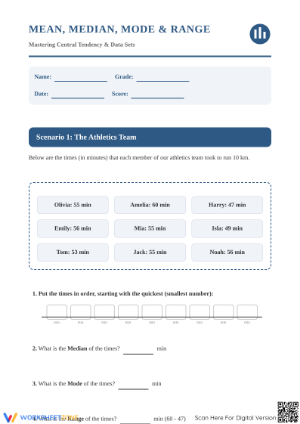
- Measures of center and spread: Students calculate mean, median, mode, and range, then identify which measure best describes a given distribution and explain why.
- Outlier analysis: Students determine whether a value qualifies as an outlier and calculate how removing it changes the mean compared to the median — a comparison that reveals whether students understand what each measure actually represents.
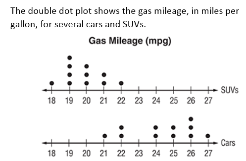
- Comparative analysis: Students examine two graphs side by side and describe differences in center, shape, and spread using vocabulary such as symmetric, skewed, gap, and cluster.
- Written justification: Students support a conclusion with a specific value or feature from the graph — not a restatement of the question — which mirrors the response format required on standardized assessment items.
Fitting These Worksheets Into Actual Instruction
The bell-ringer slot is the most reliable entry point. Three to five questions on reading a histogram or calculating median from a dot plot costs about five minutes and activates prior learning before new instruction begins. Monday mornings — when data vocabulary has faded over the weekend — are especially well served by a short review worksheet rather than relying on verbal recall alone.
A pairing that consistently works: assign a construction task first, where students organize raw data and build their own graph, then follow it with an interpretation task on a different, already-completed graph. Students who have just made decisions about scale and title read a finished display more critically than students who have not. That sequence surfaces misunderstandings about interval choices and distributional shape in ways that computation-only practice does not.
For sub plans, data and graphing worksheets printable for 6th grade that review graph reading and statistical measures are among the safest choices. They cover familiar content, require no teacher explanation to launch, and produce written work that shows exactly what students retained — and where the gaps remain — when you return.
Standard Alignment
The set aligns to the Common Core State Standards for Mathematics, Statistics and Probability domain, Grade 6. 6.SP.B.4 requires students to display numerical data in plots on a number line — specifically dot plots, histograms, and box plots — and the construction tasks in these worksheets address this directly. 6.SP.B.5 extends that work to summarizing and describing distributions: reporting the number of observations, describing how data was measured, calculating measures of center and variability, and relating those measures to the distribution's shape and context.
In classroom terms, these standards typically arrive in the third or fourth quarter of 6th grade, after students have worked through ratios, expressions, and equations. By that point students have the arithmetic to compute mean and median, but they have not yet been asked to use those measures to make a claim about a real situation. The statistics unit bridges from calculation to interpretation — a genuinely different cognitive task, and one students often find disorienting at first. These worksheets address that transition directly, pairing computation questions with interpretation tasks throughout the set.
Adjusting the Worksheets for Different Learners
Data and graphing worksheets printable for 6th grade support tiered use because the same graph can anchor questions at multiple levels of complexity. A box plot display can generate a basic "name the median" prompt for students still building familiarity, an on-level comparison task asking which class showed more spread — with a requirement to cite two values from the graphs — and a challenge task asking students to evaluate which measure of center better represents the data and what removing an outlier would change about that argument.
- Students needing additional support: Choose worksheets with clearly labeled axes, small data sets (fewer than 10 values), and direct-answer questions that reference visible graph features. Pairing the worksheet with a vocabulary reference card reduces the word-level barrier without lowering the math expectation.
- On-level practice: Assign worksheets that include both graph construction and written interpretation, with data sets in the 10–20 value range and at least one question requiring a comparison or a supported claim drawn from the data.
- Challenge tasks: Use worksheets with two data sets, outlier analysis questions, and open-ended prompts where students select the most appropriate graph type for a given situation and defend that choice — a task that requires understanding the purpose of each display, not just how to read one.
Context also functions as a differentiation tool. Students who disengage from abstract data sets often re-engage when the numbers come from sports statistics, school survey results, or local weather records. Pairing a familiar context with an unfamiliar graph type keeps the cognitive demand on the math skill rather than on parsing the scenario.
Frequently Asked Questions
Which graph types should I prioritize if my unit time is limited?
Dot plots, histograms, and box plots carry the most instructional weight because they appear directly in 6.SP.B.4 and push students toward distributional thinking rather than single-value reading. Bar graphs and line graphs are typically familiar enough by 6th grade to function as review rather than new instruction, and they work well as entry points before students encounter box plots.
How do I decide which worksheet to assign on a given day?
Match the worksheet type to your instructional goal. Early in a unit, use graph-reading worksheets that focus on one display type at a time. Mid-unit, assign construction-plus-interpretation worksheets where students work with data from both ends of the skill. Near the end of a unit, worksheets that require students to move across multiple graph types in a single sitting show whether students apply the right strategy or rely on format recognition alone.
Are these resources useful for small-group intervention?
Data and graphing worksheets printable for 6th grade work well in intervention settings when you select worksheets that isolate one skill at a time — reading histogram intervals, identifying median on a dot plot, or calculating range before connecting it to a box plot. Building one step at a time before adding comparison or justification tasks gives students a clear success point and makes it easier to pinpoint exactly where the gap lives.
Do the worksheets include answer keys?
Yes. Answer keys accompany every worksheet in the set. For graph construction tasks, the keys show the completed graph rather than just a final numerical answer, which allows students to verify their scale choices, labels, and plotted values — not only their last calculation. That level of detail matters for box plot and histogram work, where a misread interval at the start of a task produces cascading errors across every answer that follows.