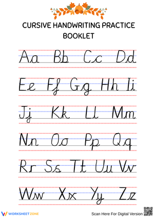
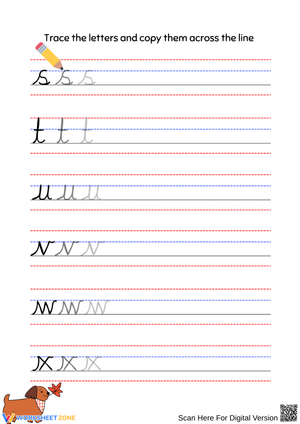
These cursive alphabet handwriting worksheets printable for 3rd grade give teachers a structured path through the full alphabet — organized by stroke family rather than alphabetical sequence, with directional arrows, appropriately sized writing lines, and enough repetition per letter to build genuine muscle memory without burning students out. Lowercase letters come first, because that's where students need fluency fastest; uppercase follows once the foundational strokes are secure.
What Each Worksheet Covers
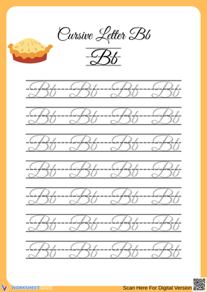
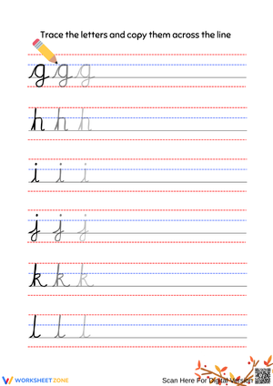
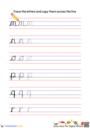
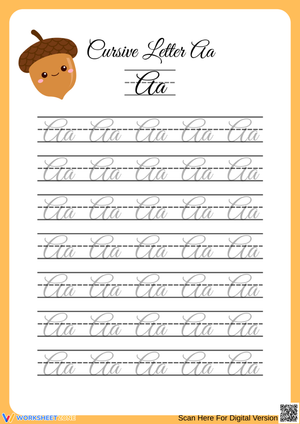
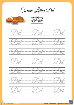
The set moves through three stroke families. Undercurve letters — i, u, w, t, and several others — begin with an upward swing from the baseline. Downcurve letters (a, d, g, q, c) start with a leftward curve that circles back, making them the most technically demanding group for most students. Overcurve letters (m, n, v, x) use a rolling wrist motion with rounded tops. Each worksheet targets one letter or a tightly related cluster, with the formation model visible throughout the practice rows — not just in the first row, where students might trace it once and lose reference as they continue down.
Letter height proportion gets specific attention across the set. Tall letters (l, h, k) extend to the top line; midline letters (i, u, a) stay in the lower zone; descenders (g, j, y) drop below the baseline. Students identify these height categories before writing, which slows the impulse to rush and keeps proportion from collapsing into a flat row of equal-height letters.
Formation Errors That Appear Consistently Across the Grade
The downcurve group produces the most predictable error. Students learning cursive a understand that the stroke begins like a circle, but they end the curve too early and skip the connecting exit stroke entirely. In isolation the letter looks passable; in a word like and, it sits unconnected to the next letter and the cursive effect is lost. Catching this in the first week of downcurve practice — before the habit is established — makes the correction much faster.
In the overcurve group, m is where almost every class has the same trouble. Students write two humps rather than three, not from carelessness but because the letter looks symmetrical and the brain rounds down. A quick fix: ask students to tap the paper once for each hump as they trace the model, count aloud, then write. The physical counting interrupts the auto-pilot and gets the right form on paper. Left unaddressed, the two-hump m persists through the year.
Slant consistency cuts across all letter groups. Students maintain a good forward slant for the first few letters, then drift upright as attention shifts to spelling. Paper tilt is the main corrective — right-handed writers angle the top of the paper to the left, left-handed writers angle it to the right — but it has to be reset at the start of each practice session. Students who set their paper once at the unit's beginning and never adjust again tend to show the worst slant drift by week three.
Finding the Right Spot for These Worksheets in the Daily Schedule
Ten to twelve minutes at the start of the morning, after attendance and morning meeting, is where these cursive alphabet handwriting worksheets printable for 3rd grade fit most naturally. Motor learning research is consistent on this: short daily sessions build procedural skills more reliably than longer, less frequent blocks. The morning transition gives students a quiet seat-work anchor while the teacher handles arrival logistics, and the daily regularity matters — students who practice every day form letter habits faster than those who work in two or three longer sessions per week.
Before pencil touches paper, have students air-write the target letter using the full arm, not just the wrist. The large-muscle movement encodes the stroke sequence, so when students move to the worksheet, they know where to start. This takes about ninety seconds and significantly reduces the hesitating and erasing that happens when a child stares at a blank writing line trying to reconstruct the letter from memory.
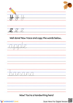
The jump from isolated letter practice to connected writing should happen earlier than most pacing guides suggest. Once students form an undercurve letter consistently, introduce two-letter connections, then short words. For undercurve letters, it, in, and win give students an immediate feel for the actual flow of cursive. Keeping them in single-letter drill too long delays the payoff and makes the purpose of the work less obvious to eight-year-olds.
Pacing and Support Adjustments for Mixed-Ability Classes
Students who haven't yet internalized letter height categories in manuscript need a brief review before starting these cursive alphabet handwriting worksheets printable for 3rd grade. Without that foundation, students write all letters at the same height — tall letters, short letters, descenders together — producing cursive that is technically formed but illegible. One worksheet session spent identifying tall, midline, and descending letters in print, before any cursive begins, clears this up and prevents the height problem from following students through the unit.
For students moving quickly, connecting letters into words earlier than the unit pacing suggests works well. Give them a short word list tied to the current stroke family and have them write each word three times in a row. For students with fine motor difficulty, allow tracing-only passes through each worksheet on the first encounter, then return to independent writing on a second pass later that week. This gives you two distinct assessment points — one for traced form, one for independent production — rather than a single rushed sample that is hard to interpret.
Standard Alignment
The Common Core State Standards do not mandate cursive instruction, but more than twenty states have passed legislation or adopted state handwriting frameworks requiring cursive by the end of third grade. These cursive alphabet handwriting worksheets printable for 3rd grade align with those state-level handwriting strands, which typically address legible letter formation, consistent size and spacing, and the production of connected cursive text. In states without a separate handwriting standard, teachers most often anchor these worksheets to CCSS Language strand L.3.1, which covers writing conventions including the production of legible text, even though the standard does not specify letterform style.
Frequently Asked Questions
Should uppercase or lowercase cursive letters be introduced first?
Lowercase first. Lowercase letters make up the vast majority of running text, so fluency with them lets students write real words almost immediately. Uppercase cursive letters also tend to be more ornate — particularly G, I, and Z — and introducing them before the lowercase foundation is secure adds difficulty at exactly the wrong moment in the unit.
How do left-handed students use these worksheets without smearing?
Paper tilt is the primary adjustment. Left-handed writers angle the paper so the top right corner points away from them, which allows the wrist to stay below the writing line rather than hooked above it. Teachers should also check that left-handed students can see the letter model without their writing hand covering it as they move across the page — this comes up most in the downcurve group, where the oval entry stroke gets covered quickly by the writing hand.
Is there evidence that cursive supports students with dyslexia?
Many reading specialists and occupational therapists recommend cursive for students with dyslexia because connected letterforms reduce reversals. Cursive b and d use different entry strokes — b swings up from the baseline, d starts from an oval — making the two letters kinesthetically distinct in a way that their printed counterparts are not. The continuous stroke also helps students perceive a word as a unit rather than a string of disconnected characters, which supports word memory and spelling recall.
What is the difference between Zaner-Bloser and D'Nealian cursive, and which style do these worksheets follow?
Zaner-Bloser uses deliberately connected strokes and tends toward upright ovals and clear looped ascenders. D'Nealian is built as a bridge from the manuscript style taught in earlier grades, where many lowercase letters already end with a connecting tail that reduces the adjustment required for cursive. Both are widely used in US third-grade classrooms. These worksheets follow one specific style — check the preview images to confirm it matches your school's chosen program before purchasing.