These cursive z handwriting worksheets pdf for 3rd grade give teachers a focused set of resources for one of the handwriting sequence's most skipped letters — a character that appears in everyday words like "blizzard," "puzzle," and "fizz," yet often receives the least direct instruction because it falls last in the alphabet sequence and last in students' willingness to keep drilling letter forms.
What Each Worksheet Targets
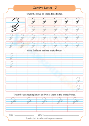
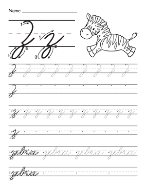
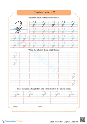
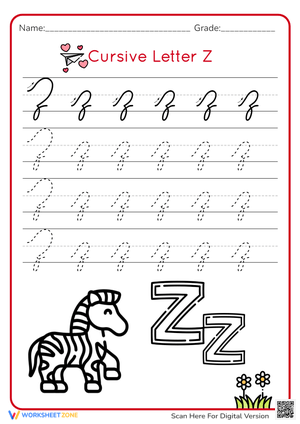
The set treats the lowercase and uppercase cursive z as distinct technical challenges. The lowercase z opens with an over-curve and a notched shoulder — that shoulder is the detail students most reliably drop when they rush — then transitions into a descender loop that passes below the baseline before an exit stroke crosses back up and positions the pen to connect to the next letter. The uppercase Z, particularly in Zaner-Bloser style, begins with a lead stroke above the midline, slants through the letter body, and finishes with a wider descender loop than the lowercase version requires.
Practice in each worksheet moves from guided tracing with directional arrows, through isolated letter copying, into word-level writing, and finally to a row without any tracing guide. That progression builds independent motor control rather than relying on guided repetition at every stage.
Student Errors Worth Watching For Before They Become Habits
The most persistent confusion is between lowercase cursive z and cursive g. Both use descender loops, but the entry strokes differ entirely: cursive g opens with a closed oval, similar to a lowercase a, while cursive z begins with an open over-curve and a notched shoulder. Students who rush through the top of the z produce something indistinguishable from a g with a loose tail. One fix that works well in practice: have students write ga and za side by side, then use a colored pencil to highlight the top stroke of each. Seeing the contrast in a paired comparison resolves the confusion faster than verbal correction alone.
Descender loop size creates a second category of trouble. The loop should extend roughly halfway into the descender space — large enough to read clearly as a z, small enough that it does not cross into the line of writing below it. Students tend to err in one of two directions: they flatten the loop into a stub that looks ambiguous, or they swing it so wide that it collides with adjacent letters. Worksheets with a clearly marked descender space make that boundary visible without requiring a teacher to remind students every time.
Slant inconsistency is a third error to monitor. Because the z has both an above-baseline body and a below-baseline loop, students sometimes write the two portions at different angles, producing a letter that looks crooked inside an otherwise even word. A cramped pencil grip often drives this — tight finger pressure forces rigid strokes, while a relaxed tripod hold allows the fluid wrist movement the descender loop needs.
Fitting These Worksheets Into Your Lesson Plans
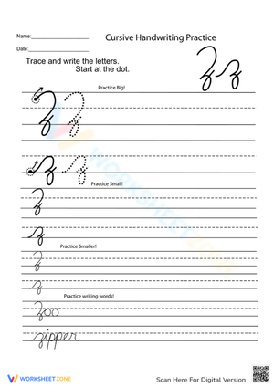
Short, frequent sessions outperform long ones for letter formation at this age. Five to eight minutes at the start of language arts — or in the transition between morning meeting and the first content block — builds steadier motor memory than a 30-minute handwriting period once a week. When using cursive z handwriting worksheets pdf for 3rd grade, an efficient routine starts with one or two tracing rows, moves to isolated letter practice, then ends with word-level writing. Words like "blizzard," "dizzy," "pizza," and "wizard" give students practice with the double-z connection, which has a slightly different rhythm than writing z in isolation, and keep the work grounded in vocabulary students actually recognize rather than random letter strings.
The completed word rows also serve as quick formative data. A 90-second scan of a class set shows which students have internalized the shoulder-notch and which are still producing shapes that read as g. That kind of immediate feedback lets you pull two or three students for a focused corrective demonstration the next morning before group practice begins.
Adjusting the Worksheets for Different Points in the Learning Curve
Students still building basic letter formation benefit most from staying at the isolated letter level — repeated tracing rows before any word-level work — and from using paper with a clearly labeled descender space. Some students at this stage find it helpful to trace the z on a whiteboard with one finger before moving to paper; the larger arm movement transfers to the pencil task more cleanly than going straight to writing.
Students who can form the z correctly but write it inconsistently are ready for word-level practice. Ask them to circle their three best z letters in each row after finishing. Self-evaluation at that level of specificity tends to sharpen accuracy more reliably than general praise. Students who already have strong z formation and clean letter connections can use the cursive z handwriting worksheets pdf for 3rd grade as a fluency check — can they maintain legible z letters at a natural writing pace, without the flattened loop that tends to reappear under speed?
For students with fine motor delays, the most effective adaptation is increasing the writing space rather than simplifying the letter. Writing the z larger, on unlined or wider-ruled paper, lets students see and feel the stroke sequence without the constraint of a narrow line. Once the movement is reliable at the larger size, the shift to standard lines happens quickly.
Standard Alignment
Cursive instruction in Grade 3 connects to CCSS Language Strand Production and Distribution standards, though the explicit cursive requirement lives at the state level rather than in the federal document. California's ELA Standard 2.4a names cursive letter formation by the end of third grade; North Carolina's 3.HW.1.1 calls for legible cursive writing at the same grade. In both frameworks, the cursive z arrives late in the instructional sequence — after students have established descender control through g, j, and y — placing it in the second semester of Grade 3 in most published scope-and-sequence guides. The worksheets fit that placement, treating the z as a culminating letter rather than an introductory one.
Frequently Asked Questions
Why does the cursive z look so different from the printed version?
The cursive z developed from writing traditions that prioritized keeping the pen on the paper to move quickly between letters. The three straight lines of print z were replaced by a continuous stroke — over-curve, shoulder, descender loop, exit — that flows directly into the next character without lifting. Telling students the shape exists for efficiency, not for difficulty, often takes the edge off the frustration that surfaces when they first see the letter in a model.
What is the difference between Zaner-Bloser and D'Nealian cursive z?
Zaner-Bloser style uses a more prominent opening flourish on the uppercase Z and tends toward a slightly more vertical slant overall. D'Nealian cursive grew out of the slanted manuscript style many students learn first, so the z in D'Nealian uses simpler entry strokes and leans more consistently forward. Both styles share the same basic descender loop structure for the lowercase z, so the core stroke instruction in these worksheets applies to either curriculum without modification.
How can I help a student who keeps confusing cursive z with cursive g?
Focus on the entry stroke. A cursive g starts with a closed oval; a cursive z starts with an open over-curve. Have the student write both letters enlarged on a whiteboard and circle just the top portion of each, then return to lined paper. On the cursive z handwriting worksheets pdf for 3rd grade, have them write alternating z and g across a single row, then mark the top stroke of each letter with a colored pencil. Seeing the contrast repeated across a full row — rather than corrected one letter at a time — produces faster retention.
How large should the descender loop be?
On standard ruled paper, the loop should reach roughly halfway into the descender space below the baseline — not so deep that it crosses into the line below, not so shallow that the letter looks unfinished. A practical classroom tool: have the student draw a light pencil mark at mid-descender before writing, use it as a target for the loop bottom, then erase it once the size feels natural. That gives students a concrete reference point and works better than the standard verbal reminder to "watch the loop."