8th Grade Correlation vs Causation PDF Worksheets
These 8th grade correlation vs causation worksheets give students a structured process for doing what many of them resist: slowing down before deciding a pattern proves a cause. Each worksheet in the set moves beyond vocabulary recall and asks students to read scatter plots, evaluate real-world claims, and write out their reasoning in complete sentences — the combination that actually shifts how students interpret data.
What's Inside the Set
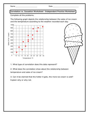
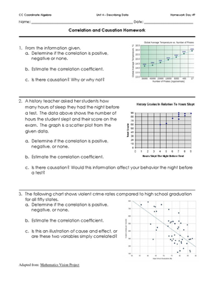
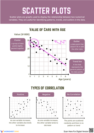
The worksheets cover the cluster of skills that makes this concept genuinely hard for 8th graders. Students begin by identifying whether two variables show any relationship at all, then describe the direction and strength of that relationship from a scatter plot, then make the harder judgment: does the evidence support only an association, or does someone need more proof before claiming cause and effect? That sequence — notice, describe, evaluate — keeps the thinking visible rather than buried in a multiple-choice guess.
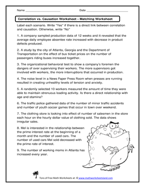
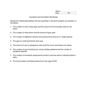
The specific skills targeted across the set include scatter plot interpretation with positive, negative, and weak relationships; vocabulary in context (correlation, causation, association, variable, confounding factor); scenario sorting where students decide whether a claim shows coincidence, association, or a defensible causal link; identifying third-variable explanations; and written justification where students complete sentence-level reasoning, not just label an answer.
Real-world examples draw from sleep and test performance, screen time and attention, ice cream sales and drowning rates, school attendance and grades, and advertising claims that imply causation without stating it. Those domains are accessible enough that students can engage with the content without needing background knowledge that would crowd out the statistical thinking.
Standard Alignment
These worksheets align to CCSS 8.SP.A.1, which asks students to construct and interpret scatter plots for bivariate measurement data and describe patterns such as clustering, outliers, positive or negative association, and linear association. The correlation vs. causation distinction sits just beyond the graph-reading skill that 8.SP.A.1 introduces — students learn to see a relationship in the data, and these worksheets build the next layer: interrogating what that relationship actually means. CCSS 8.SP.A.2 and 8.SP.A.3, which address lines of best fit and the relationship between slope and rate of change in context, also create natural moments to revisit this concept, since a line of best fit can make a causal story look more plausible than the data warrant.
Mistakes Students Make That These Worksheets Help You Catch
The most common error isn't a vocabulary mistake — it's a confidence mistake. Students see a tight positive trend on a scatter plot and decide the case is closed. They treat visual strength as logical proof. A student who correctly labels a graph "positive correlation" will often, in the very next question, write that the x-variable "causes" the y-variable to increase, without noticing the contradiction. One worksheet addresses this directly with a scatter plot showing a near-perfect positive relationship between two obviously unrelated variables, forcing students to confront the fact that a tight pattern doesn't settle the causation question.
A second error pattern: when asked to name a possible third variable, students generate explanations that are really just restatements of the original claim. If the scenario involves shoe size and reading level in children, a student might write "because older kids read better" — which is the third variable — but then add "and bigger feet cause better reading" right after it, collapsing the explanation back into a causal claim. The worksheets include follow-up prompts that push students to keep the third variable separate: "Name a variable that could influence both, without connecting them directly."
Students who freeze on written justification questions often do so because they've never been given language for statistical uncertainty. Answer keys in this set model that language explicitly, showing responses like "the graph alone does not give us enough information to claim one caused the other" rather than just marking an item correct or incorrect.
How to Build These Worksheets Into Your Lesson Plans
The most effective entry point is to lead with a clean scatter plot worksheet before introducing any written scenarios. Graphs make the pattern visible without adding the verbal complexity of a claim, which reduces cognitive load during the first exposure. Once students can describe a relationship from a graph with some confidence, the scenario-based worksheets land harder — students have a visual reference point and can ask themselves whether the claim goes beyond what a graph like that would actually show.
For bell work in the first five minutes before the lesson moves into new content, one or two sorting scenarios work well — students classify a claim as "association only," "possible causation with more evidence," or "coincidence" and hold their answers until a quick pair-check. The disagreements in that pair-check are more instructionally valuable than the correct answers; they show you exactly which students are still treating a pattern as proof.
In intervention settings, start with the vocabulary-in-context worksheet and keep the scenario count low — two or three examples with sentence frames already printed on the page. The sentence frame "The data show ___, but that does not prove ___" removes enough of the writing barrier that students can focus entirely on the statistical reasoning. Once that pattern is fluent, pull the frames and let students construct their own justifications.
As an exit ticket in the last few minutes of a data lesson, one well-chosen scenario with a space for a single written sentence tells you more than a five-question multiple-choice check. Ask students to rewrite a causal claim into a statistically careful one — that revision task separates students who have absorbed the distinction from students who can identify vocabulary terms but haven't internalized the reasoning.
Adjusting the Worksheets for a Range of Learners
Students who need additional support benefit most from worksheets where the scatter plot axes are clearly labeled, the example domains are familiar (sleep, sports, school), and sentence frames are available for the written responses. Reducing the number of scenarios per worksheet and keeping each one to a single, clean example also helps — these students often shut down when a scenario introduces two or three variables at once before they've built confidence with one.
For students who move through the basic tasks quickly, the higher-demand questions ask them to construct their own scenario: describe two variables that would show a strong positive correlation but clearly no causal relationship, and explain why. That generative task reveals whether a student has genuinely abstracted the concept or just learned to recognize the standard examples. Students ready for extension work can also evaluate real claims from news headlines or nutrition labels, annotating what additional evidence would be needed before a causal statement could be supported.
Frequently Asked Questions
What's the difference between correlation and causation, in terms students can actually use?
Correlation means two variables tend to move together — when one goes up, the other tends to go up (or down). Causation means one variable is directly responsible for changing the other. In classroom terms: a scatter plot can show correlation, but showing causation requires ruling out other explanations, establishing a logical mechanism, and usually running a controlled experiment. 8th grade students are expected to understand that a graph showing correlation does not, by itself, establish causation.
How many worksheets are in the set, and how long does each one take?
The set includes multiple standalone worksheets targeting different aspects of the skill — vocabulary in context, scatter plot interpretation, scenario sorting, and written justification. Each worksheet runs approximately 10 to 20 minutes depending on whether you're using it as a timed bell task or a fuller practice activity with class discussion built in.
Can these be used for test prep?
Yes. State assessments at the 8th grade level regularly present students with a scatter plot and ask them to describe or interpret the relationship shown — and the most common distractor answers involve implying causation from correlation. Students who have practiced articulating why a pattern isn't sufficient proof are less likely to select those distractors under timed conditions.
Clear All