


0
Views
0
Downloads
0.0
0
Save
0 Likes
Understanding Scatter Plots and Correlation Types
0 Views
0 Downloads
Paste this activity's link or code into your existing LMS (Google Classroom, Canvas, Teams, Schoology, Moodle, etc.).
Students can open and work on the activity right away, with no student login required.
You'll still be able to track student progress and results from your teacher account.
Information
Description
What It Is:
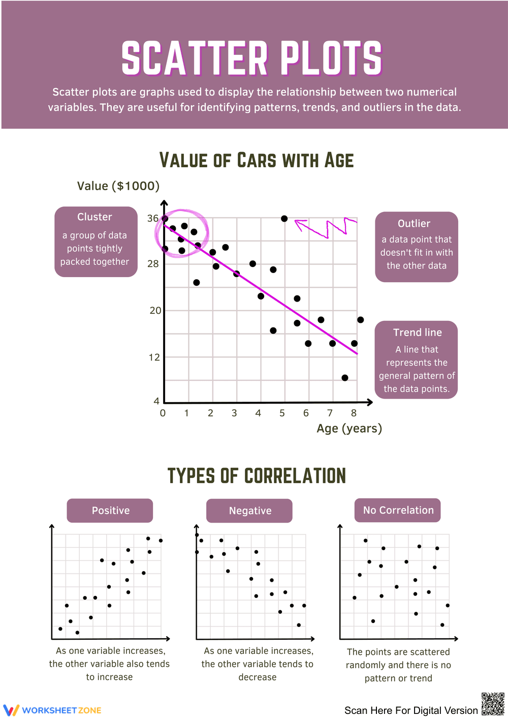
This worksheet introduces scatter plots, illustrating how to display the relationship between numerical variables through graphs. It features visuals showing values of cars with age, including clusters, outliers, and trend lines, along with explanations of positive, negative, and no correlation types.
Why Use It:
This resource supports students in visualizing data relationships, enhancing their understanding of statistics and data analysis techniques.
How to Use It:
• Review the scatter plot examples provided.
• Discuss the definitions of key terms like cluster and outlier.
• Practice identifying correlations in different datasets.
Grade Suitability:
Best for Grade 6 and Grade 7.
• Younger kids focus on basic graph interpretation.
• Older students delve into detailed data analysis.
Target Users:
This worksheet is designed for teachers, students, and parents.