These 8th grade data and graphing printable worksheets address the most analytically demanding statistics unit in middle school math. At this grade level, students stop simply reading a graph and start reasoning about relationships — describing the direction and strength of an association between two variables, deciding whether a line of best fit is placed reasonably, and making predictions they can support with evidence from the data. The worksheets build that full range of skills, from initial graph reading through written justification of a statistical claim.
Errors Students Make That These Worksheets Help You Catch
The most persistent mistake in scatter plot work is describing association without naming the variables. A student who sees hours practiced on the x-axis and points scored on the y-axis will write "it goes up" — technically not wrong, but missing the statistical point entirely. The goal is a response like "as practice time increases, points scored tend to increase" — naming both quantities and the direction of change. Short-response questions on each worksheet push students toward that precision by explicitly requiring both variable names in the answer.
Line of best fit produces a specific drawing error worth addressing before students practice independently: most 8th graders draw a line that connects the leftmost and rightmost data points, applying the same logic they use when connecting points in a line graph. That one misconception is worth a two-minute demonstration under a document camera — show both lines, ask which one makes better predictions for points in the middle of the data, and the contrast usually resolves it. Worksheet practice after that moment reinforces the correct approach rather than cementing the wrong one.
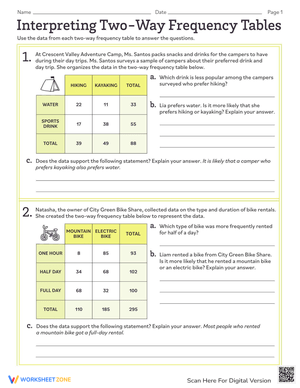
Two-way tables produce a different pattern altogether. When calculating relative frequencies, students almost always choose the wrong denominator — picking the total physically closest to the cell they're working with rather than the one that actually answers the question being asked. Row frequency versus column frequency feels like a small distinction until an entire class makes the same error on a quiz.
What the Set Covers
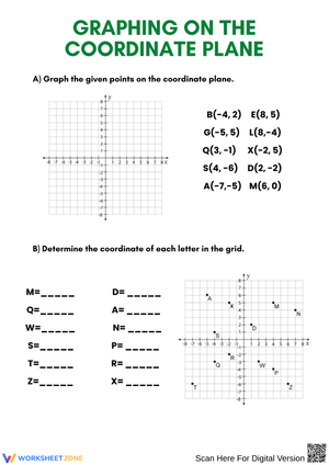
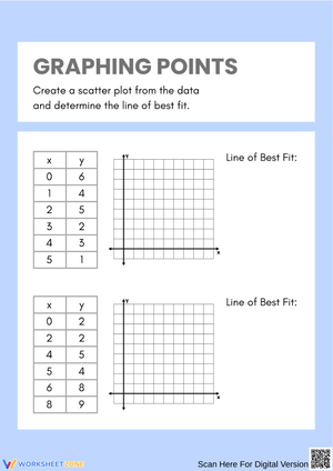
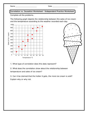
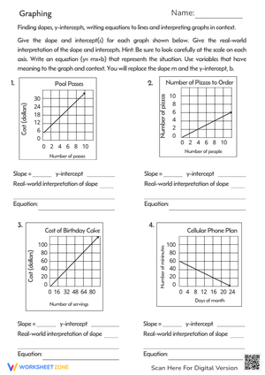
- Scatter plots: plotting bivariate data, describing the direction and form of association, and identifying clusters
- Outlier analysis: recognizing data points that break from the overall pattern and explaining how they affect interpretation
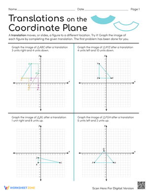
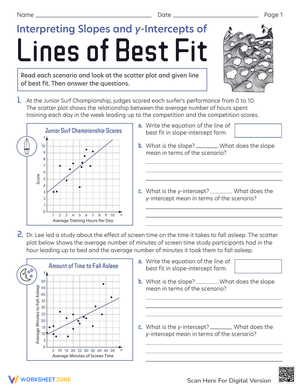
- Line of best fit: drawing trend lines, evaluating their placement, and using them to make interpolated and extrapolated predictions
- Two-way tables: constructing and reading relative frequency tables for bivariate categorical data
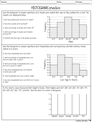
- Box plots and histograms: comparing distributions, describing spread, and interpreting the shape of a data set
- Mixed graph analysis: evaluating which display type best represents a given situation and defending that choice in writing
Several 8th grade data and graphing printable worksheets in the set draw on real-world contexts — athletic statistics, weather records, survey results — because students write more specific and accurate responses when the scenario carries some meaning. A scatter plot comparing study time and quiz scores produces sharper written justifications than one presenting abstract Variable A versus Variable B.
Building These Worksheets Into Your Instructional Sequence
The first two or three days of a scatter plot unit tend to be heavily teacher-led — projecting data sets, modeling the language of association, and demonstrating line-of-best-fit placement as a class. Printable practice earns its place around day three, when students are ready to try interpretation independently but still benefit from structured questions guiding the analysis. Assigning one worksheet after each direct-instruction segment lets you check comprehension before moving on.
The Friday before a unit quiz is a reliable spot for a mixed-review worksheet that puts a scatter plot, a two-way table, and a box plot on the same assignment. Students who have practiced each display type in isolation often struggle when assessment items require them to shift between representations — that transition is something students need to rehearse before the test, not discover during it. These 8th grade data and graphing printable worksheets are organized to support that kind of progression, moving from single-concept practice toward multi-display comparison.
Annotation sharpens written responses more than most teachers expect. Ask students to mark the graph before answering the written questions — circle the outlier, sketch the trend line in pencil, label the variable on each axis. Written explanations become noticeably more specific after that physical engagement with the graph, and the annotations make it easier to distinguish between a reading error and a reasoning error when reviewing student work.
Standard Alignment
The resources in this set address all four standards in the 8.SP domain of the Common Core State Standards. 8.SP.A.1 requires students to construct and interpret scatter plots for bivariate measurement data — each scatter plot worksheet targets this standard through both reading tasks and written description prompts. 8.SP.A.2 and 8.SP.A.3 cover lines of best fit: recognizing that straight lines model linear relationships and using the equation of a linear model to make predictions. Worksheets covering trend lines ask students to draw, evaluate, and apply them to estimate values not shown in the original data. 8.SP.A.4 addresses two-way tables for bivariate categorical data; the corresponding worksheets ask students to calculate relative frequencies and describe any patterns of association the table reveals. Teachers in non-CCSS states will find the skill progression matches most grade 8 statistics standards, though specific code alignment should be confirmed against state documents.
Adjusting the Worksheets for Different Points in the Skill Progression
Students entering this unit vary more than the standards suggest. Some arrive confident reading bar graphs but have never analyzed a relationship between two quantitative variables. Others may have encountered scatter plots in an enrichment context and are ready for more demanding work. Keeping a few versions of key concepts available makes small-group instruction manageable without requiring entirely separate lesson plans for each group.
- Foundational practice: use worksheets with whole-number scales, fewer than fifteen data points, and direct reading questions before asking for any interpretation
- On-level work: include questions that require naming both variables when describing association and using a trend line to make a specific numerical prediction
- Extension tasks: ask students to compare two scatter plots side by side — which shows a stronger association, and what features of each graph support that conclusion
- Language support: sentence frames such as "As ___ increases, ___ tends to ___" and "The outlier may affect the trend line because..." give students the structural pattern before that language becomes automatic
The side-by-side comparison task appears regularly on grade 8 assessments and is consistently harder for students who have only practiced describing a single display. Building it into the more demanding tier prepares those students for the exact analytical moves that test items require.
Frequently Asked Questions
What graph types are included across the worksheets?
The set covers scatter plots, two-way tables, box plots, histograms, and multi-display comparisons. Most of the emphasis falls on scatter plots and bivariate data because those concepts receive the most instructional time at grade 8 and carry the most weight in the 8.SP standards.
Can students complete these without graphing technology?
Yes. Every graph appears directly on each worksheet — students read and analyze the display rather than generating one digitally. Line-of-best-fit questions ask students to draw the trend line by hand, which is exactly the skill 8.SP.A.2 targets. No software or device access is needed.
How do I support students who can read the graphs but struggle to explain their reasoning in writing?
Require annotation before writing. Students who circle the outlier, draw the approximate trend line, and label the axes with variable names consistently produce more specific written responses. Sentence frames help too — "The graph shows a positive association because..." gives students a structural entry point before academic vocabulary becomes automatic. The 8th grade data and graphing printable worksheets in this set include model sentence starters on several interpretation tasks to support that transition.
Do the worksheets include answer keys?
Answer keys are included with the set. For short written-response questions, each key provides a model answer with the expected components — both variable names, the direction of association, and supporting evidence from the data — so teachers can evaluate student reasoning quickly without reading every response word for word.