


0
Views
0
Downloads
0.0
0
Save
0 Likes
Explore Correlation and Causation in Depth
0 Views
0 Downloads
Paste this activity's link or code into your existing LMS (Google Classroom, Canvas, Teams, Schoology, Moodle, etc.).
Students can open and work on the activity right away, with no student login required.
You'll still be able to track student progress and results from your teacher account.
Information
Description
What It Is:
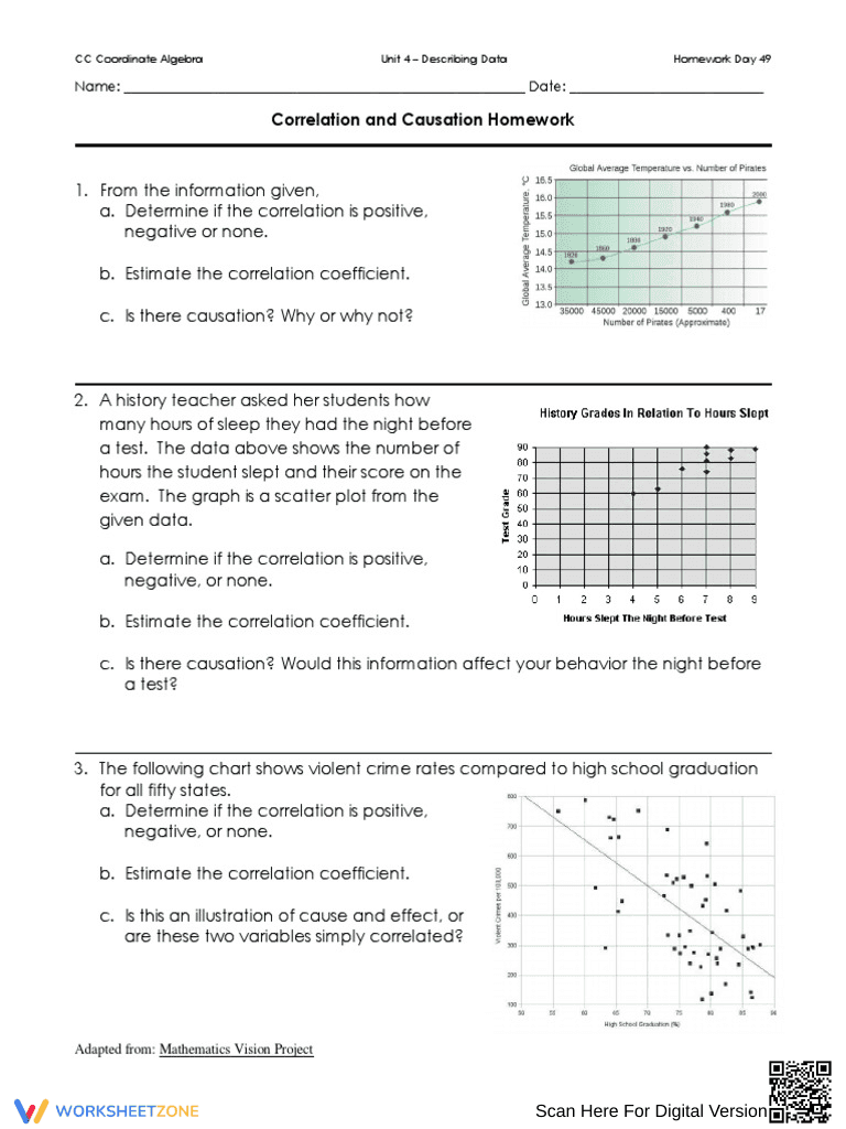
This is a homework worksheet on correlation and causation. It presents three different scenarios with accompanying graphs (scatter plots and line graphs). For each scenario, students are asked to determine if the correlation is positive, negative, or none, estimate the correlation coefficient, and discuss whether there is causation and explain why or why not. The scenarios involve global average temperature vs. number of pirates, hours of sleep vs. history grades, and violent crime rates vs. high school graduation rates.
Grade Level Suitability:
This worksheet is suitable for high school students, particularly those in Algebra 1, Geometry, or Statistics courses (Grades 9-12). It requires an understanding of scatter plots, correlation coefficients, and the difference between correlation and causation, which are typically covered in high school math curricula.
Why Use It:
This worksheet helps students develop critical thinking skills by analyzing real-world scenarios and determining the relationship between variables. It reinforces the concepts of correlation and causation, and allows students to practice estimating correlation coefficients from graphs. It also encourages students to think about the limitations of statistical data and the potential for misleading conclusions.
How to Use It:
Students should read each scenario carefully and examine the provided graph. They should then answer the three questions for each scenario: determining the type of correlation, estimating the correlation coefficient, and explaining whether causation exists. Students may need to use rulers or other tools to help estimate the correlation coefficient.
Target Users:
The target users are high school students learning about correlation and causation in math or statistics classes. It can also be used by teachers as a practice assignment, homework, or assessment tool.