



















8th Grade Scatter Plots and Correlation Worksheets (PDF)
These 8th grade scatter plots correlation worksheets hand you ready-to-print practice in plotting bivariate data, naming the type of association, drawing an informal trend line, and reasoning about whether a relationship actually means cause and effect. The set moves from carefully gridded starter graphs to open tasks where students set their own scales and defend their conclusions in writing.
What Students Practice Across the Set
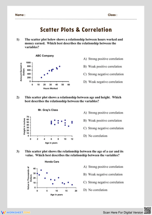
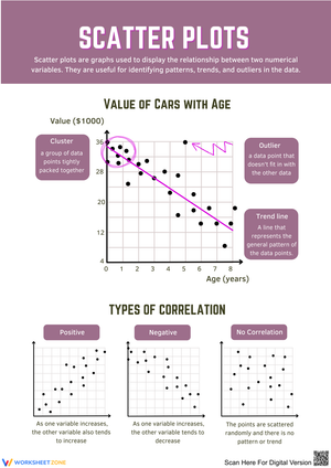
Eighth graders meet scatter plots right as they're getting comfortable with the coordinate plane from earlier in the year, so the early worksheets keep the mechanics clean: plot the ordered pairs, label both axes, and read what the cloud of points is telling you. From there the work shifts toward interpretation. Students sort graphs by direction (positive, negative, none), judge whether the pattern is linear or curved, and circle outliers and clusters that pull against the overall shape.
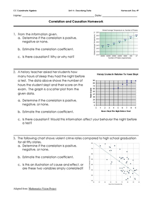
The trend-line worksheets ask students to draw a line of best fit by eye and then use it to estimate a value the data table never gave them — predicting a test score for someone who studied 4.5 hours, for instance. This is where the connection to linear equations starts to pay off, because the same students who graphed lines in the fall now see why slope and intercept describe something real. A separate strand of tasks pushes the correlation-versus-causation distinction with scenarios built to trip up quick thinkers: ice cream sales rising alongside sunburn counts, both driven by the heat rather than each other.
- Plotting coordinate pairs and labeling axes from a data table
- Classifying association by direction, strength, and linearity
- Spotting outliers and clusters and explaining their effect
- Drawing and using an informal line of best fit to make predictions
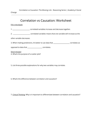
- Writing short explanations for why correlation does not prove causation
Working These Worksheets Into Your Week
A gradual release sequence fits this topic well. Model one full plot on the board — scale, label, plot, describe — then put students in pairs on a worksheet where the axes are already drawn and the scale is set, so their attention stays on the pattern instead of the arithmetic. Save the blank-grid tasks, where they choose their own intervals, for independent work once the routine is solid.
The line-of-best-fit lesson runs better with a piece of dry spaghetti. Students lay the strand across the printed points and slide it around until roughly half the dots sit above and half below, then trace it. They adjust a spaghetti strand far more willingly than they erase a pencil line, and the physical fiddling builds a real sense of what "best fit" means before any equation shows up. I keep the causation worksheets for partner discussion — the ice cream argument or a "shoe size versus reading level" prompt sparks debate, and the misconceptions that surface there are exactly the ones worth correcting with the whole room. These 8th grade scatter plots correlation worksheets also drop neatly into a Friday review block when you want students applying several skills at once rather than drilling one.
Frequent Errors Worth Watching For
The most common slip is mechanical: students reverse the variables, plotting the y-value along the x-axis, which flips a clear positive trend into something that looks like nothing. Watch the first few points each student plots and you'll catch it early. A second pattern shows up with the trend line — students anchor it to the first and last points like a connect-the-dots exercise instead of balancing the whole cluster, so a single outlier drags the line off true.
The conceptual error that matters most is treating correlation as causation. A student will see a tight positive pattern and write "more hours of TV causes lower grades" without considering a lurking third factor. The worksheets force the issue by asking for a written reason, not just a yes/no, and that's where you see whether the idea has landed. Many also confuse "no correlation" with "negative correlation," labeling a random scatter as negative simply because it isn't going up. Push them to describe what a negative pattern would actually look like — points sloping down left to right — and the distinction sticks.
Standard Alignment
The tasks target CCSS.Math.Content.8.SP.A.1, which asks students to construct and interpret scatter plots for bivariate measurement data and to investigate patterns of association — clustering, outliers, positive or negative association, and linear or nonlinear shape. This standard sits in the statistics and probability strand at the end of the eighth-grade sequence, after students have spent the year on linear relationships, which is deliberate: the line of best fit gives them a reason to apply slope and intercept to messy, real data instead of clean equations. The progression here mirrors the depth you'd find in Illustrative Mathematics and Khan Academy's scatter plot units, so the practice lines up with how the topic is taught in those frameworks.
Adjusting the Set for a Range of Learners
For students who still struggle with the coordinate plane, stay on the pre-scaled, pre-labeled worksheets and shorten the data tables to eight or ten points so the pattern is unmistakable. Color-coding the two columns of the data table before plotting helps students who keep reversing the axes. For students ready to push further, hand them the blank-grid versions and have them justify their scale choice, then add a follow-up question that asks them to predict a value well outside the data range and explain why that prediction is less trustworthy than one inside the range. The 8th grade scatter plots correlation worksheets in this set share the same data themes across difficulty levels, so a mixed-ability class can work the same context — study hours and test scores, say — at three different depths without anyone feeling singled out.
Frequently Asked Questions
What's the difference between linear and non-linear association?
A linear association means the points roughly trace a straight line, signaling a steady rate of change between the two variables. A non-linear association still shows a pattern, but it bends — a curve, a U-shape, or another shape that no straight line would capture well. Eighth graders only need to recognize and describe the difference, not model the curve.
How do students decide if a point is an outlier?
An outlier sits noticeably apart from the main body of the data, far from where the trend line runs. There's no formula at this level — students judge it visually. It's worth teaching because a single outlier can tilt a hand-drawn line of best fit and distort any prediction made from it.
Why spend so much time on correlation not meaning causation?
Because students carry the habit of assuming cause and effect into every subject, and a strong-looking pattern feels like proof to them. Two variables can move together by coincidence or because a hidden third factor drives both. Naming that distinction now is foundational statistical literacy, and these 8th grade scatter plots correlation worksheets build it through concrete examples rather than a definition to memorize.
Clear All