These 7th grade statistics worksheets pdf resources give teachers a ready-to-print collection spanning the full arc of Grade 7 data reasoning — from identifying statistical questions to comparing two distributions using box plots and histograms. Each worksheet carries one clear instructional purpose, which makes them easier to slot into a lesson without restructuring the activity on the fly.
The Specific Skills Targeted
Grade 7 marks the point where statistics shifts from describing a single data set to making inferences about a population students cannot fully observe. A student who spent sixth grade computing mean and median now has to ask: What does this sample tell me about the whole group, and how confident should I be in that conclusion? That shift demands reasoning practice alongside procedural fluency, and the worksheets reflect it.
Each worksheet addresses one of the following skills, or a closely connected pairing:
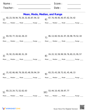
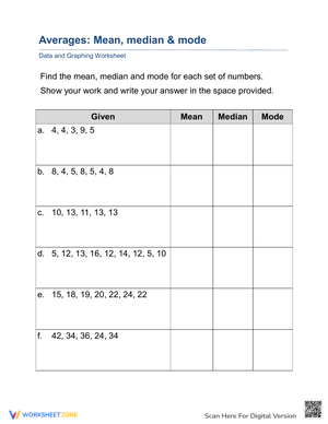
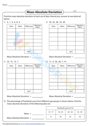
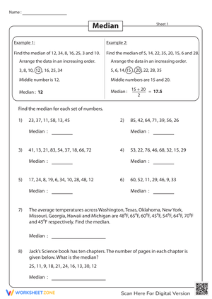
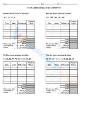
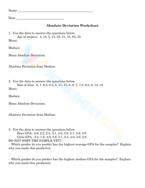
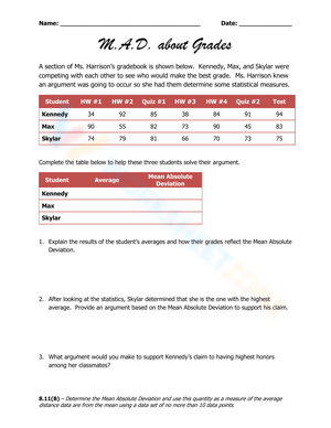
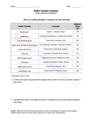
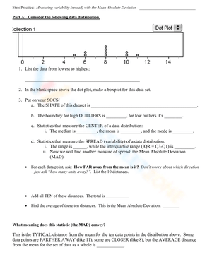
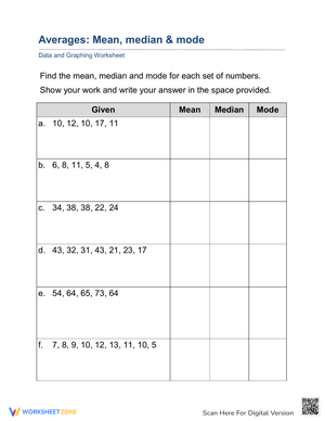
- Measures of center and variability: mean, median, mode, range, and interquartile range — including follow-up questions about which measure is most informative given the shape of the data
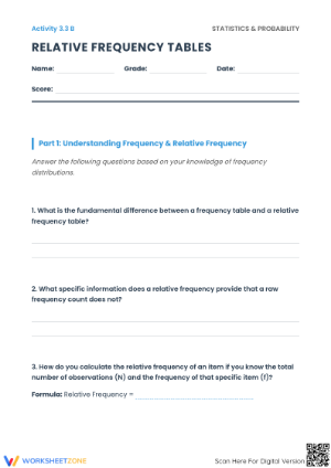
- Statistical questions: distinguishing questions that anticipate variability from those with a single fixed answer
- Populations and samples: identifying the population of interest, the sample drawn from it, and whether that sample is likely to represent the whole group
- Random sampling and bias: evaluating whether a method is random and spotting conditions where convenience sampling would distort results
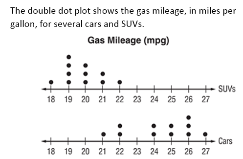
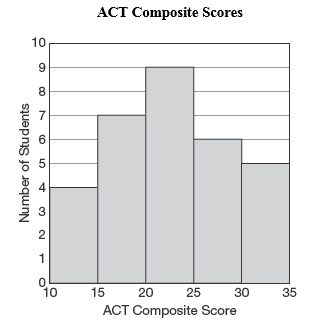
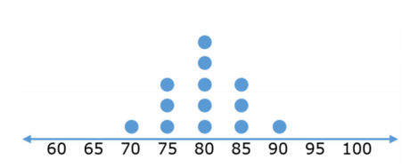
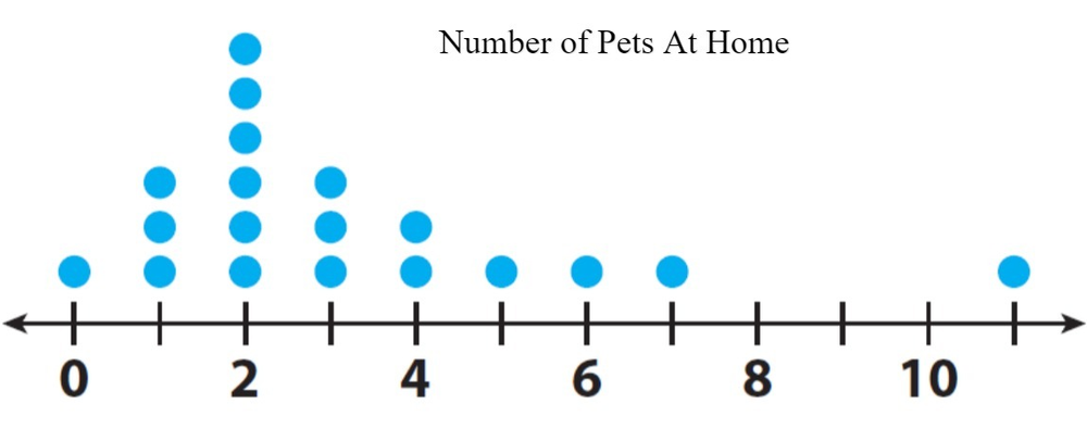
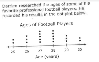
- Data displays: reading and constructing dot plots, histograms, and box plots, including locating medians, quartiles, and the IQR directly from a box plot
- Comparing distributions: describing differences in center, spread, and overlap between two groups using appropriate statistical language
Frequent Student Errors Worth Anticipating Before You Teach
The most persistent mistake in seventh-grade statistics is not a calculation error — it's a reasoning one. Students conflate sample size with sample quality. A student who has correctly memorized that larger samples are better will look at a convenience sample of 400 classmates and call it reliable, while rejecting a random sample of 30 drawn from the full school population. That confusion surfaces clearly on scenario-based worksheets that ask students to evaluate a sampling method, not just name it.
Two other errors come up consistently in the work we see. First, when comparing box plots, students focus on median values and ignore spread — a student might write "Group A is better because its median is higher" without noticing that the two distributions overlap almost entirely, which makes the difference practically meaningless. Second, students misread the box itself as showing the full range of the data rather than the interquartile range. They see a long box and report it as containing "more data," when it actually shows greater spread in the middle 50%. Worksheets that ask students to annotate a box plot directly — marking the IQR, labeling each quartile, shading the overlap region — tend to correct that misreading faster than a verbal explanation alone.
Smart Ways to Build These Worksheets Into Your Weekly Plans
Before the unit begins, sort your 7th grade statistics worksheets pdf collection into three categories: focused skill practice, data interpretation, and mixed review. Focused skill worksheets — computing IQR, identifying statistical questions — belong at the front of a lesson or immediately after a mini-lesson as independent practice. Interpretation worksheets, particularly those centered on box plots or sampling scenarios, serve better as anchors for a short discussion. After students finish one, projecting a single problem and asking partners to defend their interpretation often exposes misconceptions that a correct numerical answer would have hidden entirely.
Another approach worth building into the unit is splitting one worksheet across two days. On day one, students complete the computation or graph-reading items. On day two, they return to the same worksheet and write explanations for their answers. That pacing mirrors the gradual release model and disrupts the habit of treating data analysis as arithmetic. It also gives teachers a cleaner window into student reasoning: a student who computed the median correctly but writes "the median is better because it's the middle" has a very different learning need than one who writes "the median is better here because the outlier at 98 would pull the mean up significantly."
Standard Alignment
These worksheets align to the Common Core State Standards for Grade 7 Statistics and Probability. The sampling and inference worksheets address 7.SP.A.1 and 7.SP.A.2 — understanding what a random sample can and cannot tell us about a population, and using sample data to draw inferences. The distribution-comparison worksheets address 7.SP.B.3 and 7.SP.B.4 — informally assessing the degree of visual overlap between two distributions and using measures of center and variability to make inferences about two populations.
In classroom sequencing, the 7.SP.A standards typically come first. Students need a working understanding of representative sampling before distribution comparison has any real meaning — otherwise they're comparing numbers without asking whether those numbers reflect reality. Teachers using Illustrative Mathematics Grade 7, Unit 8 will find that worksheets covering variability, data displays, and comparing distributions map directly onto the unit's core learning goals.
Differentiating the Set Across Ability Levels
A well-structured 7th grade statistics worksheets pdf collection is one of the more workable resources for in-class differentiation because the same core skill scales naturally — the task becomes meaningfully harder or easier through data set size, graph complexity, and depth of explanation required, without becoming a different skill entirely. A student comparing distributions can work with a dot plot of five values on each side, or with side-by-side box plots drawn from a realistic data set of 30, and both tasks still address 7.SP.B.3.
For students who need more support, use worksheets with smaller data sets — five to seven values — and pre-labeled graphs so they direct their attention toward the reasoning rather than the setup. Sentence frames make a real difference for written explanation items: "The mean is not the best measure here because ___" gives students a starting point without removing the thinking. For students who finish early, the most useful extension is not additional computation — it's critique. Give them a fictional student's conclusion ("I surveyed my lunch table, and 80% prefer basketball, so most 7th graders prefer basketball over soccer") and ask them to identify every flaw in the sampling method and the inference drawn from it.
Frequently Asked Questions
What topics do these worksheets cover?
The set addresses the full scope of Grade 7 statistics: measures of center and variability, statistical questions, populations and samples, random sampling and bias, data displays including dot plots, histograms, and box plots, and comparing two distributions. Each worksheet focuses on one concept or a closely related pair so the practice stays targeted rather than scattered.
Are these printable PDFs with answer keys?
Yes. Each worksheet is formatted as a clean, print-ready PDF, and answer keys are included with the set. That makes them straightforward to use for classwork, homework, reteach sessions, or substitute plans without additional preparation time.
What is the difference between a histogram worksheet and a box plot worksheet?
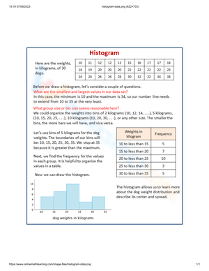
Histogram worksheets ask students to read frequency distributions, identify clusters and gaps, and connect the shape of a distribution to a real context. Box plot worksheets focus on locating the median, quartiles, and IQR, and most include side-by-side comparison tasks where students analyze two distributions and draw a conclusion. Both appear in a strong 7th grade statistics worksheets pdf collection because the two displays serve different instructional purposes — histograms show shape and frequency, while box plots make center and spread visible in a format where direct comparison is immediate.
How do I use these effectively for intervention groups?
Pull worksheets focused on a single concept — mean and median only, or sampling bias only — and reduce the data set size if the numbers are creating a barrier to the reasoning itself. Work through one example together, then have students complete one or two items independently before checking. Statistics intervention moves faster when the numbers are small and the context is genuinely familiar to students. A data set drawn from something students recognize — survey results from their own grade, local weather data, sports statistics — makes the abstract idea of variability land more quickly than a generic list of numbers does.