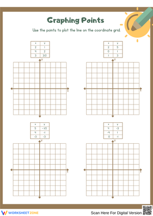
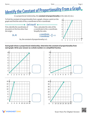
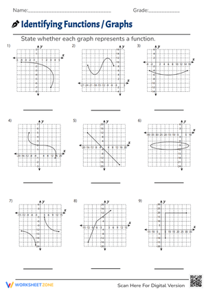
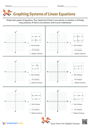
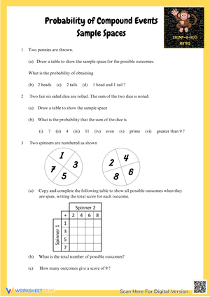
Data and graphing printable worksheets for 7th grade ask students to do three things in sequence: read a visual accurately, calculate from the data it represents, and explain in writing what the numbers suggest. That progression marks the real shift from elementary chart-reading into grade 7 statistical reasoning. The worksheets in this set work across all three moves, using varied graph formats and grounded real-world contexts.
What's Inside the Set
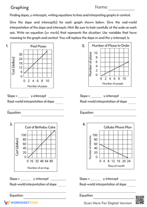
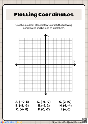
Grade 7 data work sits squarely in the Statistics and Probability domain, and these worksheets address it across five major graph types. Students don't just identify which bar is tallest—they interpret distributions, find measures of center and variability, and compare two data sets to support a written claim.
- Dot plots and line plots: Students identify clusters, gaps, and peaks in smaller data sets and connect those features to spread and center.
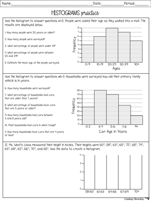
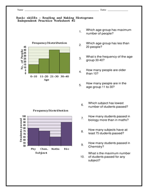
- Histograms: Students read grouped numerical data across intervals, interpret frequency, and learn to distinguish between a bar's height and the values it represents.
- Box plots: Students locate medians, quartiles, and interquartile range, then compare two distributions placed side by side.
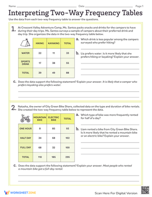
- Frequency tables and stem-and-leaf plots: These bridge raw data to graph construction and give students practice organizing numbers before displaying them visually.
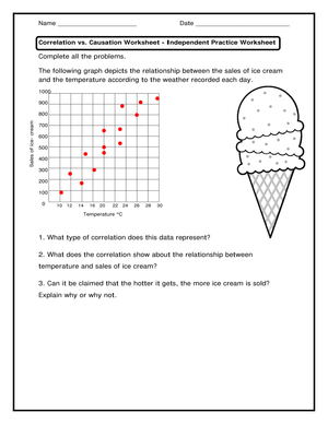
- Bar graphs and circle graphs: Students compare categories, read percent values, and interpret proportional data in formats they encountered in earlier grades.
Several worksheets also ask students to convert one display into another—reading a frequency table, constructing a histogram from it, and answering follow-up questions about distribution shape. That conversion task goes well past recognition and into the kind of multi-step processing grade 7 assessments expect.
Frequent Student Errors Worth Catching Early
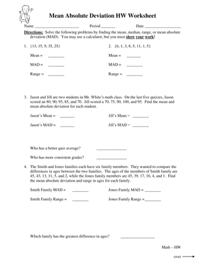
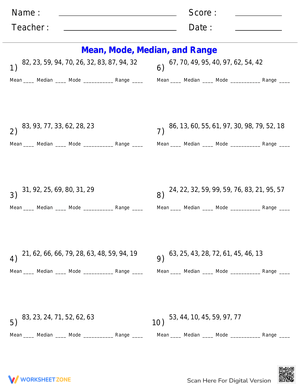
The most persistent mistake in grade 7 data work is not the calculation—it's the interpretation that follows it. A student might correctly identify that the median of Dataset A is 14 and the median of Dataset B is 17, then write that "Dataset B is better" without connecting that conclusion to the actual question. The jump from reading a graph to forming a defensible claim is genuinely hard, and the short constructed-response items on these worksheets address it directly by requiring students to cite specific values from the display.
Histograms produce a second reliable error: students confuse bar height (frequency) with the data values in that interval. A student who reads a bar centered on the 30–40 interval as "the data value is 35" is misreading how grouped data works. This mistake appears especially when students try to find the mean from a histogram—they often average the bar heights instead of using interval midpoints weighted by frequency. Whole-group debrief before independent practice is the best place to surface and correct it.
On box plots, students routinely mix up IQR and overall range. They locate Q1 and Q3 correctly but subtract from the wrong endpoints, especially when the whisker values are numerically close to the quartile markers. A quick annotation step before any calculation—circling Q1, Q3, the median, and both whisker endpoints and labeling each—catches this before it compounds into a wrong comparison across two distributions.
Lesson-Planning Strategies for Getting the Most From These Worksheets
These data and graphing printable worksheets for 7th grade fit several instructional roles without requiring significant setup. The most efficient is a targeted warm-up: two or three graph-reading questions from a dot plot or bar graph to open class, followed by a quick whole-group debrief. That eight-minute routine gives students practice using terms like "cluster," "gap," "spread," and "frequency" before the main lesson begins, which lowers the vocabulary barrier during direct instruction.
For center rotations, pairing one interpret-a-graph worksheet with one create-a-graph worksheet and one compare-two-datasets worksheet gives students three distinct levels of demand in a single math block. Students who move quickly through interpretation can advance to construction; students who struggle with construction return to reading practice before attempting graph creation. That movement is more productive than assigning multiple worksheets at the same level.
For test prep, run a mixed-format sequence in a single sitting—one histogram, one box plot, one frequency table, each on its own worksheet. Students practice shifting strategies, which mirrors what cumulative assessments require. Across any of these formats, one move that consistently reduces careless errors: ask students to annotate before solving. Underline the title, box the scale, mark one notable feature—the highest bar, a visible gap, the approximate median region. It takes under a minute and gives students who freeze on an unfamiliar graph a reliable entry point.
Standard Alignment
These worksheets align to the Statistics and Probability domain of the Common Core State Standards for Grade 7. The core standards addressed are 7.SP.B.3, which asks students to informally assess the visual overlap between two numerical data distributions with similar variabilities, and 7.SP.B.4, which requires using measures of center and variability to draw comparative inferences about two populations. Supporting work also touches 7.SP.A.2, connecting sample data to inferences about a larger population. In most grade 7 pacing guides this domain falls in the second semester, after ratio, proportion, and probability units. That placement means students are expected to arrive with computational fluency—particularly with fractions and percent—before the distribution comparisons begin.
Differentiating the Worksheets Across Your Class
Students working with data and graphing printable worksheets for 7th grade for the first time often do best starting on bar graphs and line plots, where the visual structure is familiar and the vertical axis reads in whole units. Assign those worksheets first, keep the focus on accurate scale reading and data vocabulary, and hold off on histograms and box plots until students can describe what a graph is measuring without prompting. Moving too quickly to statistical graphs before basic reading is secure produces students who guess at shape and spread rather than reason about it.
For students who are ready to go further, the compare-two-datasets worksheets open up meaningful challenge. Require them to go beyond "Group A has a higher median"—ask them to address spread and consistency and to explain what the distribution shape implies about the data. A prompt like "write a claim and support it with two values from the graphs" turns a standard interpretation task into genuine statistical argument. Students who finish early can also be asked to represent the same data in a second format and explain what the new display reveals that the original did not.
Frequently Asked Questions
Which graph types deserve the most practice time in grade 7?
Histograms, box plots, and dot plots deserve priority because they ask students to reason about distributions rather than simply read labeled values. Among the data and graphing printable worksheets for 7th grade in this set, those three graph types appear most frequently and carry the strongest variety of interpretation and comparison tasks. Bar graphs and circle graphs are also included—they remain relevant for category comparison and proportion work—but they generally need less instructional time because students arrive with more prior exposure to both formats.
How long does each worksheet take to complete?
Most worksheets in the set take between 10 and 20 minutes for on-level students working independently. Worksheets that include a constructed-response section run a few minutes longer, especially when students are still developing evidence-based explanation skills. Plan accordingly for timed warm-ups—a pure graph-reading worksheet suits an eight-minute opener far better than one ending with a written comparison of two distributions.
Do the worksheets include answer keys?
Yes. Answer keys matter especially in data work because interpretation questions often have more than one acceptable phrasing. The keys in this set provide correct numerical values and also model the reasoning expected in a written response, so teachers can assess whether a student's explanation reflects genuine understanding or a partially correct guess. That distinction is essential for formative decisions about who needs reteaching before a unit assessment.











 Interactive Worksheet Maker
 Quiz Maker
 Word Search Maker
 Crossword Puzzle Maker
 Word Scramble Generator
 Sentence Scramble Generator
 Handwriting Worksheet Generator
 Name Tracing Generator
 Fill In The Blank Generator