



















7th Grade Data worksheets for Statistics and Graphing Practice
These 7th grade data worksheets give teachers printable, ready-to-use practice across the full scope of Grade 7 statistics — computing mean, median, mode, and range; reading histograms, dot plots, and box plots; and comparing two data sets to draw conclusions about center and spread. What separates a genuinely useful set from a generic one is the balance between calculation tasks and the follow-up questions that require students to explain what a statistical result actually means. These worksheets deliver that combination in a format that prints cleanly and requires no setup time.
Skills and Concepts in Each Worksheet
Grade 7 is the first year the Common Core formally establishes statistics as its own domain (7.SP), and that shift matters instructionally. Students are no longer just finding the mean of a list — they are evaluating which measure of center best represents a data set, interpreting the shape and spread of a distribution, and comparing two populations. Each worksheet addresses both sides of that demand: the computation and the reasoning that follows it.
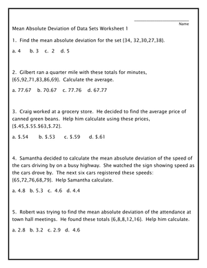
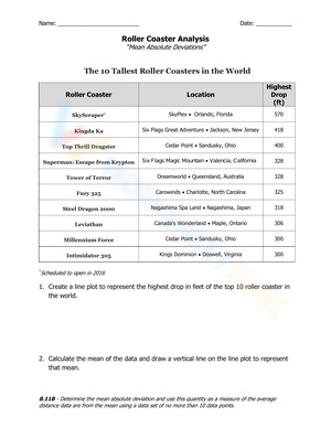
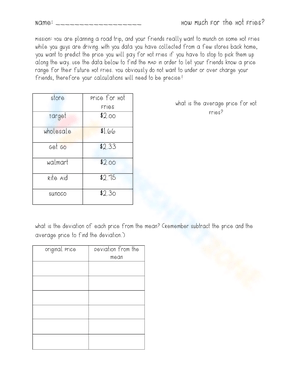
- Measures of center and spread: mean, median, mode, and range with whole numbers, decimals, and real-world data, including questions about what happens to the mean when an outlier is added or removed.
- Dot plots: reading frequency distributions, identifying clusters and gaps, and describing a data set's shape in a written sentence.
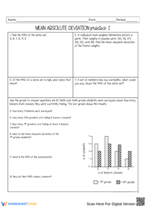
- Histograms: interpreting bar height as frequency, locating where values concentrate, and comparing two histograms built from different sample sizes.
- Box plots: identifying the five-number summary, calculating IQR, and correctly reading what the whiskers represent — a step many students need made explicit before they can handle comparative tasks accurately.
- Two-population comparisons: questions that place two data sets side by side and ask students to compare centers, describe differences in spread, and support conclusions with specific values from the graph.
- Written-response items: short-answer prompts where students justify a statistical claim rather than simply report a number.
Mistakes Students Make That These Worksheets Help You Catch
The most consistent error at this grade level involves the mean and outliers. Present seventh graders with the data set {11, 13, 12, 14, 79} and ask which measure best describes the typical score — most will report the mean of approximately 25.8 without recognizing that four of the five values sit between 11 and 14. They compute correctly and still answer incorrectly, because they have not yet learned to interrogate a statistical result. The outlier-scenario questions in the set surface this gap directly, and they tend to generate some of the most productive whole-class discussions of the unit.
Box plots produce a different and equally predictable misconception: students read whisker length as representing the number of data points in that range. A longer whisker gets interpreted as "more students scored there," which is the inverse of what a box plot communicates. This mistake is hard to catch through a calculation-only format — it surfaces when students are required to explain their reasoning, which the interpretation prompts in these worksheets consistently demand.
Median calculation on even-numbered data sets also catches students off guard with real regularity. Rather than averaging the two middle values, they report the lower one. A brief, explicit reminder before the worksheet session addresses it, but it is worth knowing to look for in student work.
Working These Worksheets Into Your Weekly Lesson Plans
Finding a 7th grade data worksheets that fits a specific instructional purpose is half the job; knowing how to deploy it is the other half. These resources are most effective when the worksheet type is matched to the lesson's goal rather than treated as interchangeable seatwork.
- Bell ringers: A 4- to 5-item measures-of-center or graph-reading worksheet takes about 8 minutes at the start of class — enough time to reactivate prior learning before new instruction begins.
- Mini-lesson follow-up: After modeling a skill explicitly, assign a focused worksheet for immediate practice while you circulate and catch errors before they harden into habits.
- Station rotations: One interpretation worksheet at the teacher table, one calculation worksheet at an independent station, and one partner-check task at a third station. That structure moves students through different levels of cognitive demand within a single class period.
- Sub plans: Single-skill worksheets work well here because they launch without teacher explanation. An included answer key lets any supervising adult provide feedback.
- End-of-unit review: Mixed-review worksheets pull from calculation, graph interpretation, and short-response items in one assignment — most useful in the last class session before a unit assessment.
One routine worth adding to any worksheet session: before students answer the printed questions, ask them to write one sentence describing what they notice about the graph. That 90-second annotation step consistently improves the quality of written explanations that follow, because students who have already committed to an observation are more likely to support it with specific numbers rather than vague generalities.
Standard Alignment
The worksheets align to the Grade 7 Statistics and Probability domain of the Common Core State Standards. Measures-of-center and spread worksheets address 7.SP.B.3 and 7.SP.B.4, which require students to informally assess the visual overlap between two numerical data distributions and use measures of center and variability to make comparative claims. The graph interpretation and inference worksheets connect to 7.SP.A.2, which asks students to draw inferences about a population based on a random sample.
In classroom sequencing, 7.SP.B.3 and 7.SP.B.4 belong in the middle-to-late portion of a statistics unit — after students can compute mean, median, and IQR reliably, because comparative inference assumes those procedures are automatic. Placing two-population comparison tasks before computation is solid tends to split student attention between procedure and reasoning at the same time, which produces explanations that sound analytical but contain arithmetic errors underneath.
Differentiating These Worksheets for a Mixed-Ability Class
For students who are still shaky on the underlying number operations, the most useful adjustment is to start with data sets built from small whole numbers and clearly labeled graph axes. Statistical reasoning is the goal, but if arithmetic is consuming all of a student's working memory, interpretation questions produce guesses rather than genuine thinking. The focused, single-skill worksheets in the set — particularly the mean and median computation worksheets — work better for those students than the mixed-review assignments during initial instruction.
Students who move through computation quickly need the comparative and written-response tasks to stay challenged. A reasonable expectation for that group is two to three sentences of justification per answer using specific values from the graph: not "Group A has a higher median" but "Group A's median of 44 is 12 points above Group B's median of 32, and Group A's IQR of 8 is narrower than Group B's IQR of 19, which suggests Group A's scores were more tightly clustered." That level of specificity is achievable for strong seventh graders, and it turns the 7th grade data worksheets into a vehicle for mathematical argument rather than answer-getting.
For students who process print slowly or are building academic English vocabulary, reducing the number of items per worksheet — without simplifying the math — produces better outcomes than substituting easier content. The statistical reasoning in these worksheets is not inherently language-heavy; what creates barriers is vocabulary embedded in the prompts. Pre-teaching six to eight key terms (median, quartile, interquartile range, distribution, cluster, variability) before the worksheet session removes those barriers without lowering the mathematical demand.
Frequently Asked Questions
What graph types appear in the set?
The worksheets include dot plots, histograms, box plots, and data tables. Circle graphs appear in a smaller number of worksheets. The emphasis stays on the representations that carry the most instructional weight in 7.SP — particularly histograms and box plots, which many students encounter formally for the first time at this grade level.
Are answer keys included?
Yes. Each worksheet comes with a corresponding answer key. For written-response and interpretation items, the key provides a sample acceptable response rather than a single correct answer, which gives teachers flexibility when student phrasing differs but the mathematical reasoning is sound.
Do these work better as classwork or homework?
Focused calculation worksheets — mean, median, and mode from a list or table — travel home cleanly because students can work through them independently. Graph interpretation worksheets tend to work better as in-class assignments, because the follow-up discussion is part of the learning. When students annotate a box plot and write a comparative claim without any conversation to follow, the written explanations often stay at a surface level.
Is there a suggested order for using the worksheets across a unit?
A natural sequence is measures of center and spread first, then single graph-type interpretation (dot plots, then histograms, then box plots), then two-population comparison worksheets as students move toward the end of instruction. Any teacher looking for a 7th grade data worksheets to carry a full statistics unit will find the mixed-review worksheets most useful in the days immediately before a benchmark or unit assessment, when the goal shifts from building individual skills to demonstrating transfer across problem types.
Clear All