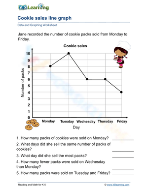
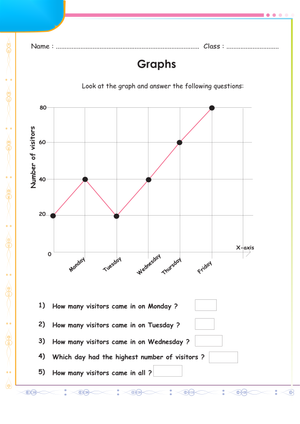
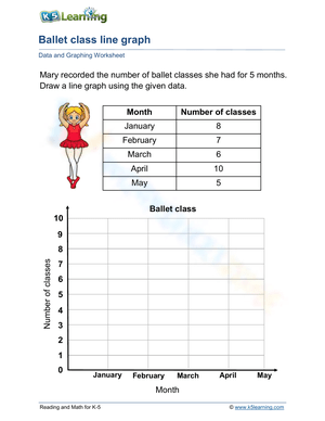
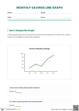
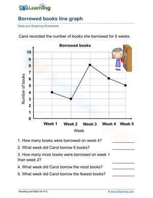
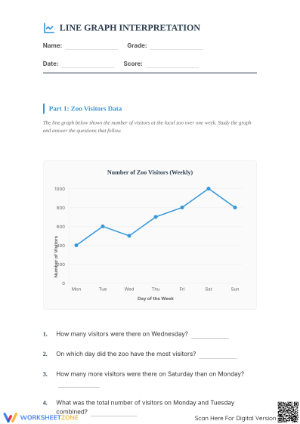
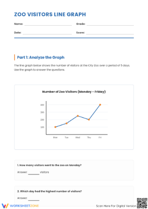
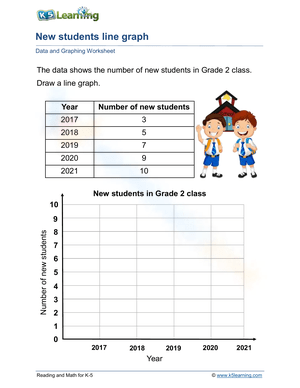
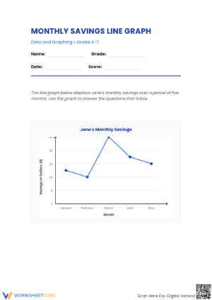
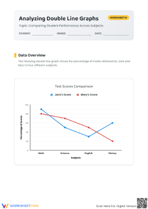
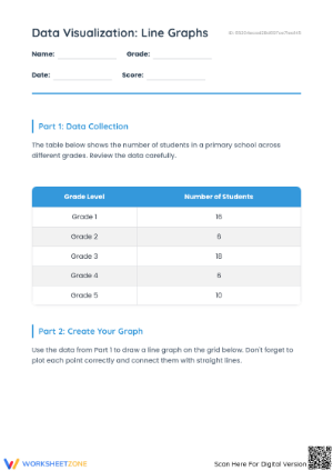
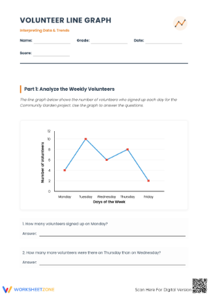
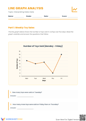
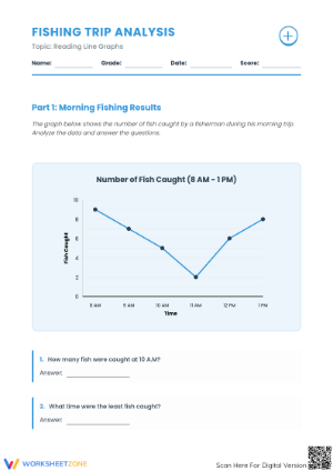
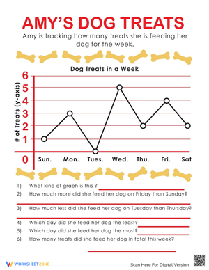
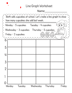
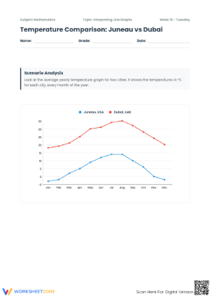
These 4th grade line graphs printable worksheets give teachers a set of standalone worksheets covering the complete skill arc — reading a completed graph, plotting data from a raw table, choosing an appropriate scale, and analyzing trends across connected data points. Each worksheet targets continuous data interpretation, which is what students need when they shift from bar graphs and tally charts to representing change over time.
What the Worksheets Ask Students to Do
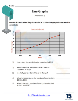
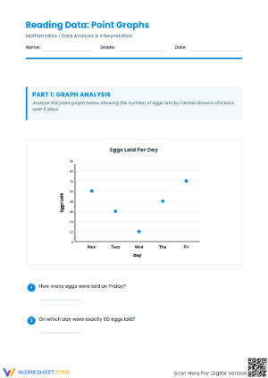
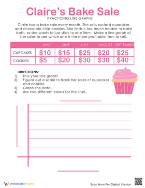
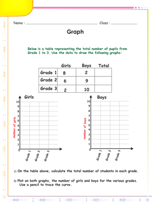
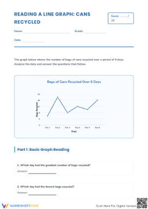
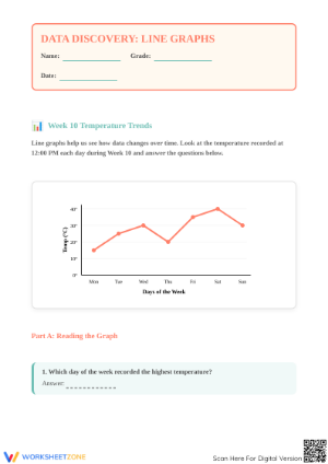
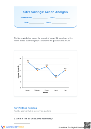
The tasks move from receptive to generative across the set. Reading worksheets ask students to identify specific values, calculate the difference between two data points (how much did the temperature rise between Tuesday and Thursday?), and describe a trend in a sentence or two. Construction worksheets provide a raw data table and a blank or partially labeled grid — students choose the scale, label both axes, plot each point at the correct intersection, and connect them in order using a ruler. Several worksheets involve double line graphs, where two data sets appear on the same grid using different line styles, and students must compare them: which quantity grew faster between which intervals, and what might explain the gap.
A portion of the set uses an error-analysis format. Students receive a completed graph containing deliberate mistakes — a misplotted point, an inconsistent y-axis interval, a missing axis title — and write a correction and explanation for each one. That format requires a more complete mental model of graphing conventions than straightforward construction does, and the written responses function as formative data.
Mistakes Students Make That These Worksheets Help You Catch
Scale selection causes more re-dos than any other part of the task. A student whose data ranges from 5 to 85 will often start counting by ones, realize halfway down the y-axis that the grid cannot accommodate all 85 rows, and then either compress the intervals unevenly or erase everything and guess again. The worksheets where students choose their own scale — rather than receiving a pre-labeled y-axis — surface this problem on the first attempt and give teachers a concrete teaching moment before it reappears on an assessment. The fix is procedural: find the maximum value in the data table, count the available grid rows, divide, and round to the nearest friendly interval. Students who learn that sequence stop treating scale as guesswork.
Axis assignment is the second consistent error. Most 4th graders can recite that time belongs on the x-axis, but when a data table lists "books read" in the left column and "week" in the right column, many students plot books horizontally because they follow column order rather than axis convention. The resulting graph looks plausible at a glance but is fundamentally inverted. That confusion surfaces in actual student work with surprising regularity — far more than the textbook examples would suggest.
A third pattern worth watching: students who score well on reading tasks will place individual points and stop. They understand dot placement but haven't yet internalized that the connecting line represents continuous change between measured moments, not just visual decoration. Asking "what do you think the temperature was at noon, between these two measurements?" opens that conceptual gap without turning it into a lecture.
Standard Alignment
The primary alignment is to CCSS.MATH.CONTENT.4.MD.B.4, in the Measurement and Data domain. That standard focuses on line plots for fractional measurement data, but most state curricula and district pacing guides include line graphs as part of the broader data-display expectations at this grade level — the two displays are typically taught in the same unit, not in isolation. The worksheets also connect to the mathematical practice standards: MP.2 (reason abstractly and quantitatively) when students interpret trend direction and draw conclusions from a graph, and MP.6 (attend to precision) when they maintain consistent intervals, label axes correctly, and connect points in order. Teachers working in CCSS-aligned districts who supplement with line graph instruction will find the set integrates naturally into the Measurement and Data unit, typically placed in the second or third quarter after bar graph work is solid.
How to Work These Worksheets Into Your Lesson-Planning Rotation
The most effective entry point is a whole-class reading session before students touch any worksheet. Project a completed line graph — real data works best, something like daily high temperatures over two weeks pulled from a local weather service — and model annotation out loud: read the title, identify what each axis measures, locate a specific value, describe the overall trend in one sentence. That five-to-eight minute modeling session turns the first reading worksheet into consolidation rather than cold introduction, and it sets a clear standard for what a fully labeled, correctly scaled graph looks like.
The 4th grade line graphs printable worksheets in this set also work well as Monday warm-ups. Posting a short graph on the board and asking students to answer three quick questions before morning meeting ends gives the skill distributed practice without requiring a full lesson slot. Students who encounter line graphs in many short, low-stakes exposures across several weeks retain the reading skills more reliably than students who see them only during a concentrated graphing unit.
For construction worksheets, a brief whole-class scale-selection discussion before independent work eliminates the most common source of frustration. Write the data table's maximum value and the grid's row count on the board, work through the interval calculation together, and then send students off. That two-minute step — done publicly — removes the decision that causes the most erasing.
Connecting Graphing Practice to Science and Social Studies
Line graphs have a natural home in science classrooms. If students are running a plant growth experiment — measuring height in centimeters every three days — the data table in their science journals maps directly onto a construction worksheet. The question "did the plant grow faster in week 2 or week 3?" becomes genuinely interesting when the data belongs to the class. Daily temperature tracking across a month works the same way and ties into weather or climate content running concurrently. The 4th grade line graphs printable worksheets that ask students to build a graph from a provided data table are easy to adapt: swap the printed data table for real collected data, and the format stays the same while the context becomes meaningful.
Differentiating These Worksheets Across Ability Levels
For students who need more support, start with worksheets where the y-axis is pre-labeled and the scale is already set. That removes the two decisions that create the most confusion — scale selection and axis labeling — without changing the spatial task of locating and plotting each point. Once students can plot consistently and describe the trend they've drawn, move to worksheets where the axes are drawn but unlabeled, so students assign the correct variable and write the labels themselves.
Students who are still building skip-counting fluency will struggle with scale selection regardless of the format. A one-minute number-line warm-up at the top of the period — counting by fives, tens, or twenty-fives depending on the day's data — prevents scale confusion from stalling the entire worksheet. That brief step is worth the time for students who freeze every time they reach the y-axis.
For students who finish construction tasks quickly, the error-analysis format is the strongest extension. These 4th grade line graphs printable worksheets ask students to find and correct two or three deliberate mistakes in a completed graph, then write a sentence explaining why each error matters. The writing requirement shifts the task from mechanical to evaluative, and the responses show whether students are applying memorized rules or genuinely understanding why the conventions exist.
Frequently Asked Questions
What is the difference between a line graph and a line plot, and do 4th graders need both?
Yes, both appear in 4th grade instruction. A line graph uses connected points to show how a quantity changes over time — daily temperature, weekly savings, plant height over a month. A line plot uses a number line with marks to show frequency — how often each value appears in a data set, such as pencil lengths measured to the nearest quarter inch. CCSS.MATH.CONTENT.4.MD.B.4 specifically targets line plots with fractional data, but most curricula cover both displays in the same unit. Without explicit side-by-side comparison, students regularly confuse them — on assessments and in classroom work.
How do I help students choose an appropriate scale for the y-axis?
Teach a three-step check: identify the maximum value in the data table, count the available grid rows on the worksheet, divide, and round to the nearest friendly interval — a multiple of 2, 5, 10, or 25. If the maximum value is 75 and the grid has 10 rows, the division gives 7.5, which rounds to 10. Walking through that calculation publicly, with numbers on the board, makes the process replicable rather than intuitive. Students who learn the procedure apply it to new data sets because the steps stay the same regardless of the numbers.
When in the school year do line graphs typically fit best?
Most teachers place line graph instruction in the second or third quarter, after students are confident reading bar graphs. Bar graph work establishes axis vocabulary and the idea of reading a single value at a specific position. Line graphs add the layer of change over time, which requires thinking about the relationship between consecutive points rather than reading each one in isolation. Construction worksheets fit best after two or three reading-focused sessions — once students have seen enough completed examples to know what a well-formed graph looks like before they try to build one from scratch.









 Interactive Worksheet Maker
 Quiz Maker
 Word Search Maker
 Crossword Puzzle Maker
 Word Scramble Generator
 Sentence Scramble Generator
 Handwriting Worksheet Generator
 Name Tracing Generator
 Fill In The Blank Generator