Cursive v pdf worksheets for 2nd grade address a letter that trips up more students than teachers typically expect — not because the shape is complicated, but because the lowercase exit stroke leaves the letter at the midline rather than returning to the baseline, which breaks the muscle habit beginners have built with every previous letter they've learned. This set gives teachers printable resources covering both uppercase and lowercase v, moving from traced stroke diagrams to independent word and sentence practice. The worksheets fit cleanly into a standard second-grade handwriting block as morning warm-up, direct-instruction follow-up, or literacy center work.
The Skills Each Worksheet Develops
The set moves through a deliberate progression because students who skip to sentence writing before the individual letter is automatic tend to pick up timing errors that are harder to undo later. Each worksheet targets a distinct stage rather than repeating the same tracing row across the full set.
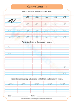
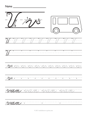
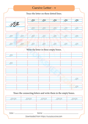
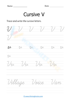
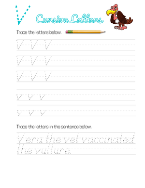
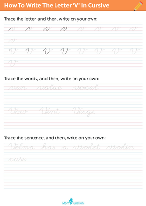
- Stroke diagrams with directional arrows show the exact starting point and movement for both forms. The uppercase V begins with a slanted downstroke to a sharp baseline point, then angles back up to the topline; the lowercase v drops to a sharp point and rides back up to an elevated midline exit.
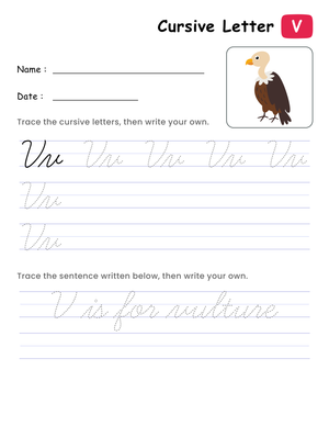
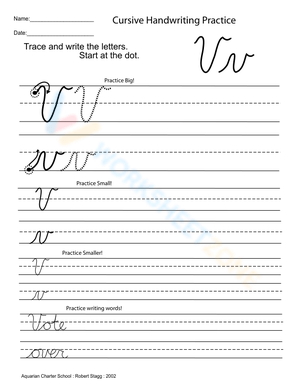
- Isolated letter tracing on large lines, then standard lines — students feel the stroke motion at full scale before working at the size they'll use in everyday writing.
- Letter-comparison rows placing cursive v beside cursive u and cursive w, so students can see the sharp baseline point of the v against the rounded scoop of the u and the double-valley shape of the w.
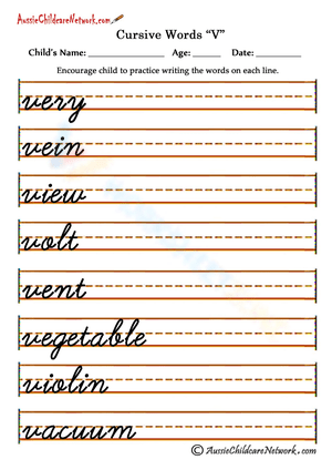
- Word-level practice using high-frequency and content vocabulary — vine, vest, vivid, velvet, village — so the midline connection gets practiced in realistic writing contexts, not just in abstract letter rows.
- Sentence-level practice that builds writing stamina by asking students to apply the letter across a complete thought.
Errors to Watch For When Teaching Cursive V
The most consistent problem in actual student work is rounding the bottom of the v into a u shape. This happens because second graders have spent months writing manuscript letters where rounded bases are acceptable or even expected. When they move to cursive, that habit carries over, and van, vet, and vine start reading as uan, uet, and uine. Asking students to pause deliberately at the baseline — almost a brief stop — before reversing direction and pushing the stroke back upward trains the sharp pivot the letter requires. It helps to describe the difference bluntly: the v has a corner, the u has a scoop. Students who hear that once and trace both letters side by side will catch the difference faster than students who read a description without the comparison practice.
The exit stroke is the second sticking point. Because the lowercase v leaves at the midline, students who haven't built this into their motor pattern drop the stroke back down to the baseline before connecting to the next letter. In a word like very, the e should connect at mid-height off the v's bridge; when it connects from the bottom instead, the letter spacing collapses and legibility drops noticeably. Cursive v pdf worksheets for 2nd grade that isolate the v-to-vowel pairings — ve, vi, va — give students concentrated repetition on exactly that transition, which is where the error actually lives.
A third issue, less frequently discussed, involves the uppercase V: students often make it too small, using lowercase proportions, so it doesn't clear the topline consistently. Worksheets that show both a midline and a topline — not just a baseline — address this visually without requiring verbal reminders every session.
Fitting These Worksheets Into the Day
Ten to twelve minutes of focused practice across multiple sessions builds more reliable formation accuracy than a single long handwriting period once a week. Letter formation lives in motor memory, and motor memory strengthens through distributed repetition — the same reason spelling words are reviewed across a week rather than in one sitting. One worksheet fits comfortably into the warm-up window after morning meeting, that eight-to-ten minute stretch before the first content lesson, without running into reading or math time.
For direct instruction, model the stroke on the board, have students mirror the motion in the air using their full arm — the gross motor movement reinforces the concept of the elevated exit before the hand is managing a pencil — then move to guided tracing on the worksheet before releasing students to independent rows. This sequence keeps cognitive load manageable: students aren't simultaneously problem-solving letter shape, pencil pressure, and line placement. Using cursive v pdf worksheets for 2nd grade as the guided-practice anchor in this sequence means students work from a consistent printed model rather than trying to hold in memory whatever you wrote on the board before erasing it.
Connecting the word-level and sentence-level worksheets to current vocabulary — v words from a science unit, vivid adjectives from a mentor text, verbs from the week's writing lesson — makes the handwriting practice feel purposeful rather than mechanical. Students who perceive handwriting as disconnected from real writing tend to rush through it. That one adjustment in how the worksheets are framed changes the pace of work noticeably.
Adjusting the Work for the Range of Writers in Your Room
Students who are still managing pencil grip and letter sizing need extended time on the large-format tracing rows before moving to word-level work. For these writers, having them trace with a finger on the printed model before picking up the pencil adds a physical rehearsal step that doesn't require any extra materials. Keep them on isolated letter work until the sharp baseline point appears consistently — that's the diagnostic detail that signals readiness to move forward.
Students who are moving through letter formation quickly and already connecting letters fluidly can skip the tracing rows and work directly from the word and sentence worksheets. A useful extension is to have them write each sentence twice — once slowly with attention to form, once at their natural writing pace — then compare the two for consistency in letter shape and slant. That self-evaluation task shifts the challenge from copying to monitoring quality, which is the right level for writers who've already internalized the stroke.
For students who are mixing cursive and manuscript mid-word — one of the messier habits that shows up in second-grade writing — the word-level worksheets work as reset practice. Keep those students on word tracing longer than their isolated letter formation would otherwise require; the goal isn't the v standing alone but the v connected inside a running cursive word.
Standard Alignment
Handwriting instruction at second grade connects to CCSS Language standards for writing production, with the expectation of legible handwriting; many states and districts extend this to introductory cursive at grades 2 or 3 depending on their adopted scope and sequence. Schools using Zaner-Bloser or D'Nealian frameworks follow explicit letter-by-letter instruction at this stage, with isolated practice as the standard delivery method during initial learning. These worksheets support that introductory phase — the point in instruction where direct modeling and repeated structured practice are the primary tools before students move to connected-word and sentence-level fluency.
Frequently Asked Questions
How does the lowercase cursive v connect to the following letter?
The lowercase v exits with a short horizontal bridge stroke — sometimes called a tow-line — that extends to the right at midline height. The following letter begins from that elevated position, not from the baseline. In vine, the i attaches to the bridge of the v at mid-height; dropping to the baseline before starting the i creates a visible gap and breaks the flow of the word. Practicing the specific v-to-vowel transitions on the word-level worksheets is the most direct way to build this connection as a habit rather than a rule the student has to recall mid-word.
My student's cursive v and u look identical. What actually fixes this?
This is the most common issue at this grade level, and it responds well to side-by-side comparison work rather than repeated correction. Have the student trace both letters slowly on the comparison worksheet, then identify the bottom of each: the u curves through a rounded scoop; the v requires a near-stop at the lowest point and a sharp direction reversal back upward. Some students respond to a tactile cue — pressing the pencil slightly at the baseline pivot of the v creates a perceptible difference in how the two letters feel to write, not just how they look. Students who produce the contrast through their hands learn it more reliably than students who only see it described.
Do these worksheets work for both Zaner-Bloser and D'Nealian instruction?
The two styles differ in slant angle and stroke continuity — D'Nealian uses a consistent rightward slant with flowing strokes meant to ease the transition from manuscript; Zaner-Bloser tends toward a more upright posture with cleaner, more geometric letter shapes. The uppercase forms differ more noticeably than the lowercase, particularly in how the starting stroke is approached. Cursive v pdf worksheets for 2nd grade that identify their style clearly on the resource are worth confirming before printing, since students who are still building visual templates for the letters get confused when the model on a worksheet doesn't match what their teacher demonstrated.