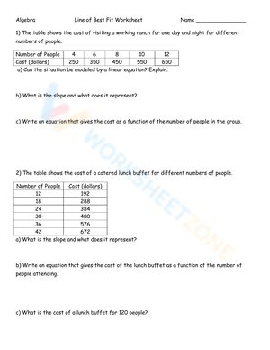
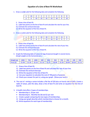
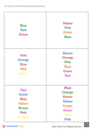
These 9th grade line of best fit worksheets printable give teachers a ready-built sequence that moves students from visual intuition to formal equation-writing within a single unit. Each worksheet targets a distinct stage of the skill — identifying correlation type, placing a manual trend line, selecting two points on that drawn line to calculate slope, writing the equation in slope-intercept form, and using that equation to make predictions. The set holds up as initial instruction, as a formative check before a unit test, or as reteach support after a graphing calculator lesson doesn't stick.
What Students Practice in Each Worksheet
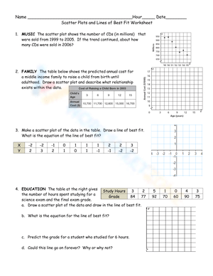
The work opens with correlation recognition: students look at a scatter plot and decide whether the relationship is positive, negative, or nonexistent before they draw anything. That step matters more than it looks. Students who skip straight to placing a line frequently produce one that contradicts the data's general direction — especially when the cloud of points is dense in the middle and sparse at the edges — because they haven't stopped to actually read the relationship.
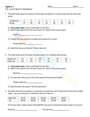
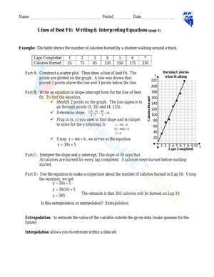
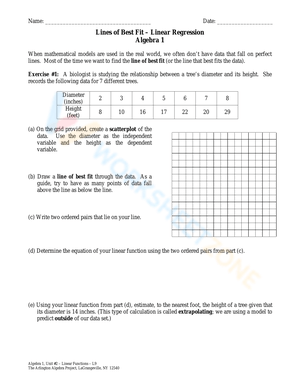
Each worksheet in this 9th grade line of best fit worksheets printable set then moves into trend line placement, slope calculation, y-intercept identification, and equation writing. Two skills receive heavier emphasis than they typically get in a textbook chapter. First, point selection: students must choose two points that lie exactly on their drawn line — not original data points from the scatter plot — and use those to calculate slope. Second, contextual interpretation. Finding that m = 4 is one task; writing that "for each additional hour of practice, the predicted score increases by 4 points" is a different task, and both appear in the exercises. Later worksheets introduce interpolation and extrapolation, asking students to substitute x-values into their equations and explain whether each prediction falls inside or outside the original data range — and what that means for how much they should trust it.
Where Student Thinking Breaks Down in This Unit
The most consistent error is students treating original data points as points on the line. A student circles the leftmost and rightmost dots on the scatter plot and calculates slope between them, never actually using the trend line they drew. The result is an equation that describes a segment of the data cloud, not the overall trend. Catching it is quick: check whether the two points a student chose actually lie on the drawn line. Ten seconds per desk answers that for an entire class period.
Anchoring the line to the origin is a related but distinct problem. Students who built their number sense through proportional reasoning sometimes carry the assumption that lines "start at zero." When the scatter plot data clearly doesn't pass through the origin, they'll still force the line there out of habit. The prompt "What would x = 0 mean in this situation?" usually surfaces the error fast and breaks the pattern more effectively than restating the rule.
The correlation-to-causation leap lives longer in student thinking than either of those mechanical errors. When points cluster tightly and the r-value sits close to 1 or negative 1, students conclude one variable drives the other. The most reliable intervention is requiring them to name a plausible lurking variable before they finish writing their interpretation. If they can't name one, they haven't understood why a strong correlation alone proves nothing. That prompt takes three minutes; a lecture on it takes fifteen and holds less.
Making These Worksheets Work in Your Lesson Plans
The most natural entry point is the Monday after students first see a scatter plot. Put one on the board, run a 90-second whole-class vote on correlation type, then hand out the first worksheet. That warm-up primes students for the task and eliminates the confusion that otherwise eats the first five minutes of independent work.
Pairing students for the manual estimation exercises produces a specific classroom payoff: two students working the same scatter plot will almost always draw slightly different trend lines and arrive at slightly different equations. When you ask both to predict the y-value at the same x-value, the discrepancy makes concrete why a mathematically determined method — least squares, via calculator — exists. One physical swap that consistently improves manual line placement: replace the wooden ruler with a clear plastic coffee stirrer or a length of thread. Students can see the data points through the tool as they adjust, which leads to far more accurate placement than anything an opaque ruler allows.
The 9th grade line of best fit worksheets printable set also works well as a targeted formative check two days before the unit test. Assign one worksheet, collect, and sort into three groups: students who write and interpret the equation correctly, students who write it correctly but interpret it vaguely, and students still making mechanical errors in slope calculation. That sort takes about eight minutes and tells you exactly what to prioritize in the review block the next day.
Standard Alignment
These worksheets address CCSS.Math.Content.HSS.ID.B.6, which requires students to represent data on two quantitative variables on a scatter plot and describe how the variables are related. Substandard HSS.ID.B.6a covers fitting a function to data and using it to solve problems in context; HSS.ID.B.6c specifically targets fitting a linear function when the scatter plot suggests a linear association. Exercises involving the correlation coefficient connect to HSS.ID.C.8, which asks students to interpret r in context. In Algebra 1 pacing, this standard typically falls late in the first semester or early in the second — after students have solid command of slope-intercept form. These worksheets assume y = mx + b is familiar territory and place their instructional weight on the statistical reasoning that sits on top of it.
Tailoring the Set for Mixed-Ability Classrooms
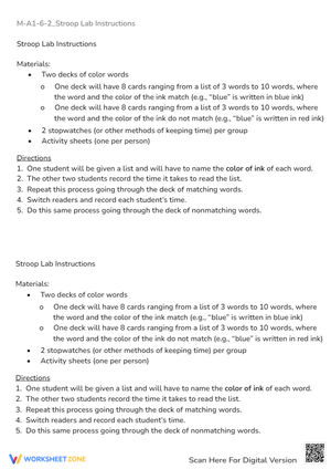
Students who need additional support work most effectively with worksheets that pre-label axes, supply a pre-plotted scatter plot, and reduce the task to drawing the trend line and using two clearly identified grid intersection points to write the equation. That structure removes three competing demands — reading the scale, plotting the data, and interpreting the axes — without changing what the core skill assessment is actually measuring.
For students working ahead of grade level, 9th grade line of best fit worksheets printable exercises extend naturally through a few add-ons that require no extra materials. Ask them to estimate the correlation coefficient before checking with a calculator and explain their reasoning. Have them calculate a residual for one specific data point and describe what a large residual would reveal about that observation. Or ask them to construct a scenario different from the one on the worksheet in which the same trend line pattern would appear but where the lurking variable is obvious. These extensions push into genuine data literacy without requiring a separate worksheet for the top group or slowing the rest of the class down.
Frequently Asked Questions
Should students draw the trend line before or after calculating the equation?
Draw first. Students who attempt to write an equation without first placing a physical line on the scatter plot end up selecting two arbitrary data points and calling that a trend. The physical process of adjusting the line — seeing points balance above and below — is what builds the spatial understanding the algebra needs to mean something. The equation should come out of that placement, not ahead of it.
How do students decide which two points to use when calculating slope from a hand-drawn line?
They should look for places where the drawn line passes through a clean grid intersection — a point where both coordinates are whole numbers they can read with certainty. Those two intersections become the inputs for rise over run. Students who select original scatter plot data points instead will almost always calculate a slope that misrepresents their actual line. This is worth stating explicitly before students begin any worksheet that asks them to write an equation from a hand-drawn trend line.
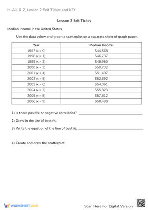
What is the practical difference between interpolation and extrapolation for 9th graders?
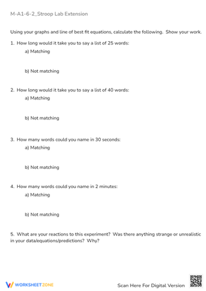
Interpolation predicts a y-value for an x-value that falls inside the range of the existing data. If the data spans x = 10 to x = 50, predicting at x = 30 is interpolation. Extrapolation predicts outside that range — at x = 80, for instance. The further you extend beyond the data boundary, the greater the risk that the linear trend doesn't hold. A useful classroom illustration: use growth data collected from ages 5 to 15 to predict height at age 40. Students immediately see that the trend can't continue at the same rate, which makes the reliability distinction stick far better than a definition does.
How much can a single outlier shift the trend line in a small data set?
Substantially. In the 8-to-15-point data sets that most worksheets use, one outlier sitting far from the main cluster contributes a large squared deviation to the total the calculator minimizes — which pulls the slope toward the outlier and away from the center of the remaining data. A concrete classroom move: have students record the calculator's equation with all points included, delete the outlier and recalculate, then compare the two slopes. The difference is often dramatic enough that students remember it without being told a second time.