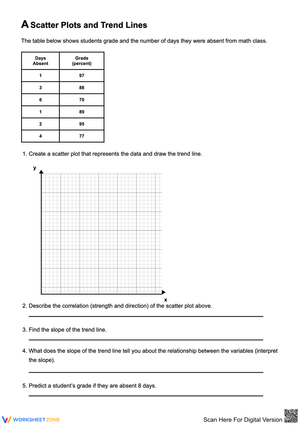
Trend Lines and Predictions Printable Worksheets for 9th Grade
These trend lines and predictions worksheets for 9th grade give teachers ready-to-use scatter plot practice that moves students from visual guessing to writing and applying linear equations. Each worksheet pairs a real-world data set with a structured sequence of tasks — draw the line of best fit, calculate slope using two points on that line, write the equation in slope-intercept form, then answer prediction questions — so the algebraic and statistical reasoning develop together rather than in separate units.
What Each Worksheet Builds
The set addresses the full arc of scatter plot reasoning at the Algebra 1 level. Students begin by identifying whether a data set shows positive, negative, or no correlation before any line is drawn — a step that matters because students who skip it often place a line through data that doesn't support a linear model at all. From there, the work progresses through these skills:
- Drawing a line of best fit by visual balance: roughly equal numbers of points above and below, with the line passing through the middle of the cluster rather than anchoring to the endpoints.
- Selecting two points on the drawn line (not original data points) and applying the slope formula — a distinction students frequently miss the first time they do this work.
- Writing the equation in y = mx + b form, then interpreting slope and y-intercept in the context of the scenario (cost per unit, growth rate, starting value).
- Making interpolation and extrapolation predictions by substituting x-values into the equation, with questions that ask students to evaluate whether their extrapolated answer is reasonable.
- Identifying outliers and explaining why a single distant point shouldn't redirect the line across the entire data set.
Standard Alignment
These worksheets address CCSS.MATH.CONTENT.HSS.ID.B.6, which calls for students to represent data on two quantitative variables on a scatter plot and describe how the variables are related, including fitting a function to the data. The subset standard HSS.ID.B.6a covers fitting a linear function to data that suggest a linear association, and HSS.ID.B.6c specifically targets fitting a linear function to a scatter plot — both of which map directly to the draw-and-write sequence in each worksheet. The prediction tasks (interpolation and extrapolation) address the application layer of this standard, where students use the fitted function to solve problems in context. These skills appear on Algebra 1 end-of-course assessments in most states, typically as multi-part questions that require both a graphical and an algebraic response — the same format these worksheets practice.
Frequent Student Errors Worth Watching For
The most persistent error at this level is calculating slope from two data points from the table rather than from two points on the student's drawn line. Because the data points are already labeled with coordinates, students grab them for convenience — but a data point often sits off the line, so the slope calculation reflects the data's scatter rather than the trend. The fix is to make students mark their chosen calculation points directly on the line with a small circle before they write any numbers down.
A second consistent problem involves the y-intercept. Students who correctly identify slope will still back-calculate the y-intercept using a point that is near the y-axis but not on it, or they'll extend the line visually to the axis and read off a rough value instead of solving algebraically. On worksheets where the y-axis doesn't appear within the plotted region — a deliberate design feature in some of the real-world data sets here — this shortcut fails entirely, and students have to use the point-slope method. That constraint is intentional.
Extrapolation predictions also produce a recognizable error: students substitute values into the equation correctly but then evaluate the result as unreasonable without being able to say why. A student predicting that a car driven 200,000 miles has a resale value of −$4,000 will often write the number without flagging the problem. Worksheet questions that ask "Does your prediction make sense in this context? Explain." push students to develop that evaluative habit alongside the calculation.
Lesson-Planning Ideas to Get the Most From These Worksheets
A gradual release structure works well here. On the first day, project a scatter plot and have students place a physical piece of uncooked spaghetti across the data before drawing anything — it adjusts without erasing and makes the "balance" criterion visible when two students compare their placements. Once the class settles on a reasonable line, everyone draws it and works the algebra together. The collaborative line-placement conversation is where the conceptual reasoning gets voiced; the worksheet work that follows applies it individually.
After that anchoring activity, one worksheet makes a strong warm-up for the next two or three class meetings — enough to hit spaced retrieval without making scatter plots the only thing happening in the room. The Friday review block is a natural home for the extrapolation-heavy worksheets, where students have enough equation-writing fluency that the prediction questions get the cognitive attention they need rather than being rushed.
These worksheets also serve well as formative checkpoints. A quick scan of whether students marked calculation points on their lines (rather than in the data table) tells you immediately who hasn't yet separated the line model from the raw data — and that's the diagnostic that drives the next day's instruction.
Adapting the Set for Mixed-Ability Classrooms
Students who are still consolidating the slope formula benefit from worksheets where the two calculation points are pre-marked on the line — they practice the substitution and equation-writing without the additional decision of which points to choose. Remove that scaffold once slope calculation is automatic.
For students who are ready to push further, the extrapolation worksheets can be extended by asking them to identify a domain restriction: at what x-value does the linear model stop making practical sense, and why? That question requires them to interpret slope and y-intercept together in context rather than treating the equation as a purely algebraic object. It's also a natural bridge toward the limitations-of-linear-models discussion that appears in later statistics work.
Students who struggle with the physical graphing — imprecise line placement that then cascades into slope errors — can work with graph paper overlays that include a faint midline through the data cluster as an anchor. That support keeps the focus on the algebraic reasoning when the visual task is the bottleneck, not the learning objective.
Frequently Asked Questions
Should students use a ruler or a straight edge when drawing the line of best fit?
Yes — and a clear plastic ruler is preferable to an opaque one because students can see the data points beneath it as they adjust the angle. Before drawing, have students slide the ruler around until the points above and below appear roughly balanced. The physical adjustment process builds the "visual balance" intuition faster than any explanation.
Why do the worksheets ask students to choose points on the line rather than from the data table?
The equation students write should model their line, not the raw data. If a student uses two data points that happen to sit off the line, their slope calculation describes the data's scatter — not the trend they drew. Choosing points on the line keeps the visual model and the algebraic model consistent with each other, which is the conceptual point of the whole exercise.
How should I handle a student whose line of best fit is noticeably off, producing a slope that doesn't match the trend at all?
Treat the algebra as correct relative to the line and address the line placement separately. Mark it as a graphing revision rather than a calculation error. The most common cause is a line anchored to an outlier or to the first and last data points rather than to the cluster's center — having the student count points above and below usually reveals the problem immediately.
Are these worksheets appropriate for students who have already used a graphing calculator to find lines of best fit?
They work well as a conceptual follow-up. Students who have only used regression technology often have no sense of why the calculator produces the equation it does. Working through the manual process — even after seeing the calculator output — builds the understanding that the line is a model and that its equation has an interpretable meaning. The worksheets can also highlight where the calculator's least-squares line and the student's hand-drawn line diverge, which is a useful discussion point about mathematical precision versus visual estimation.
Clear All