






















Choosing Line of Best Fit Practice That Actually Fits Grade 8
These line of best fit pdf worksheets for 8th grade cover the full arc of scatter plot instruction — from identifying association to sketching a trend line to explaining what a prediction means in context. In most printable scatter plot sets, practice ends when students place the line on the graph. This set keeps going: each worksheet includes interpretation and written-response prompts that require students to use the model, not just draw it.
The Specific Skills Students Work Through
Each worksheet targets a tightly linked set of moves that mirrors how this topic unfolds across a Grade 8 unit. Students begin by examining scatter plots and categorizing the type of association before doing any drawing — that step keeps them from rushing to place a line before they've thought about what the data is doing. From there, each task moves toward sketching or evaluating a trend line, estimating values from that line, and explaining what those estimates mean in the situation the scatter plot describes.
- Identifying positive, negative, and no association from a scatter plot
- Sketching a balanced trend line that accounts for the full data cluster
- Estimating interpolated and extrapolated values from the line
- Explaining what slope suggests about how one variable relates to another in context
- Comparing two candidate lines and defending which better represents the data
- Describing what the y-intercept means when its value is meaningful in the situation
The real-world contexts built into each worksheet matter more than they might seem. When the scatter plot shows hours of sleep versus reaction time, or number of absences versus quiz average, students have something concrete to write about when asked what the line tells them. Scatter plots with unlabeled or abstract axes push students back into mechanical behavior — draw the line, move on — and that is exactly the habit this set works against.
Student Error Patterns Worth Anticipating Before You Grade
The most consistent error at Grade 8 is drawing the trend line through the two extreme points in the cluster — connecting the leftmost and rightmost dots visible on the graph. That line often points in the right direction, but it sits far above or below where the data actually concentrates. Students who do this are thinking geometrically about two points defining a line, not statistically about representing a trend. The most effective correction is built into the worksheet itself: asking students to check whether roughly equal numbers of data points fall above and below their line turns the task from drawing into balancing, and that habit builds better model sense than a rule copied from the board.
A second pattern surfaces during prediction. Students who draw a reasonable line will estimate a value from it — say, about 82 — and record just that number, dropping the context entirely. A prompt that asks "what does that estimate suggest about the situation?" forces the sentence that ties the number back to the variables. Without that prompt, students treat the coordinate as the finished answer.
Causation confusion appears often too. A scatter plot showing a positive trend between two variables that share a common driver — shoe size and reading score measured across multiple grade levels, for instance — prompts students to write that one variable causes the other. The worksheets include follow-up questions after interpretation prompts that ask whether the relationship makes sense or might have another explanation. That question doesn't require formal statistical vocabulary; it just asks students to think before they conclude.
Standard Alignment
These worksheets address two linked expectations from the Common Core State Standards for Mathematics, Grade 8 Statistics and Probability. 8.SP.A.2 asks students to informally fit a straight line to scatter plot data showing a linear association and assess how well that line fits. 8.SP.A.3 asks them to use the slope and intercept of that line to describe the relationship in context. A worksheet that covers only the graphing move satisfies 8.SP.A.2 while leaving 8.SP.A.3 unaddressed. Each worksheet in this set includes both a drawing or evaluation task and at least one written interpretation prompt so neither standard gets skipped in the lesson.
Grade 8 is the first point in the CCSS progression where students work formally with bivariate data — before this grade, they analyze single-variable distributions. The shift to two variables and a linear model is conceptually significant, and it connects directly to the slope and rate-of-change work students develop in 8.EE and 8.F. Teachers often find that scatter plot instruction lands more smoothly when students can already articulate what slope means in a linear equation, because that understanding gives them language for the interpretation questions each worksheet requires.
Where These Worksheets Fit in Your Unit and Your Week
In a first lesson on this topic, project a scatter plot and think aloud while placing a trend line — narrate the balancing process, show what "roughly even above and below" looks like in practice, and note that the goal is not to pass through any particular point. Then release students to a worksheet for guided practice while that model is still fresh. That sequence runs about 25 minutes including the whole-group demonstration and leaves time for a brief discussion of where different students placed their lines and why.
Mid-unit, these worksheets work well as partner tasks. Two students comparing where they drew a trend line and explaining their reasoning generates a more substantive conversation than most discussion prompts on this topic — the disagreement is visible on the graph and immediately arguable. A single prediction question pulled from one worksheet also makes a clean exit ticket: it's specific enough to show whether a student can read and use the model, and it takes under three minutes to answer.
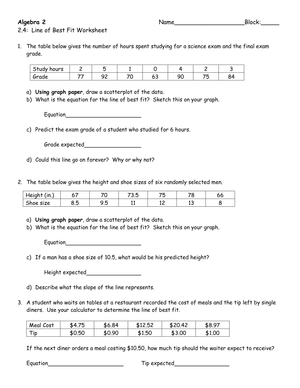
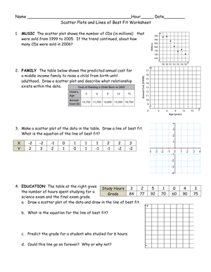
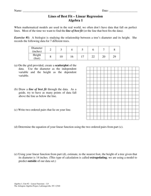
When choosing among the worksheets in the set, match task demand to the moment in the unit. If the class is just beginning line of best fit pdf worksheets for 8th grade work, select one with a tight, clear cluster and a strongly positive or negative trend so students can focus on balancing the line rather than deciding what direction it should run. Later in the unit, move to worksheets that include prediction, written interpretation, and the comparison-of-two-lines task.
Adjusting the Set for Mixed-Ability Classes
For students still building confidence with scatter plots, reduce visual density first. Fewer data points, a tighter cluster, and an obvious trend direction let those students practice the core balancing move without getting lost in noise. Pair the drawing task with a sentence frame for the interpretation question — something like "As _____ increases, _____ tends to _____" — so the writing task doesn't block access to the statistical reasoning underneath it.
On-level groups handle the full worksheet independently, including prediction and written explanation. Stronger students benefit from the comparison prompts: given two lines drawn on the same scatter plot, which is more reasonable and why? That task asks students to evaluate a model rather than produce one, which demands a different and higher-order kind of reasoning about fit. Extend it further by asking those students how different the prediction would be if they used the alternate line — that question connects model choice to practical consequence in a way that deepens understanding of what the line is actually doing.
Across ability levels, the exit-ticket use of line of best fit pdf worksheets for 8th grade practice is worth building into the unit routine. Pull a single prediction question, give students two minutes to respond, and read the answers before the next class. Students who write only a number without any contextual explanation haven't finished the task. That tells you something useful about where instruction needs to go next — faster than a formal quiz and without giving up an entire period to assessment.
Frequently Asked Questions
What should 8th graders be able to do with a line of best fit?
At Grade 8, students should identify whether a scatter plot shows positive, negative, or no association; sketch or evaluate a trend line that balances the full data cluster; use the line to estimate values at unplotted inputs; and explain what the slope and any predictions mean in the real-world context. These are the tasks that well-constructed line of best fit pdf worksheets for 8th grade support through each stage of the drawing-to-interpretation sequence. Formal regression procedures — least squares, correlation coefficients — are not Grade 8 expectations. The emphasis stays on informal modeling and meaningful explanation in words.
How is a line of best fit different from a line through two specific points?
A line through two specific points passes through exactly those points and may not represent the remaining data at all. A line of best fit represents the overall trend — it may not pass through any individual data point, but it sits as close as possible to all of them considered together. At Grade 8, students develop that understanding through the visual balancing work on the worksheet, not through formal computation.
What should teachers look for in scatter plot worksheets at this level?
A readable coordinate grid with enough spacing to see the cluster, a real-world context students can write about, prompts about association type before any drawing task, space to sketch or assess a trend line, and questions about prediction and what that prediction means in the situation. If the worksheet ends after the drawing step, it covers roughly half the instructional target for this standard — the graphing move without the interpretation move.
How do slope and y-intercept work in this context at Grade 8?
Students use slope to describe how one variable tends to change as the other increases — "for each additional hour of practice, the model suggests about three more points scored." The y-intercept gets more careful treatment: it's only meaningful to discuss when a value of zero on the horizontal axis makes sense in the real-world situation. In Grade 8, the expectation is informal explanation grounded in the context, not formula-based computation from regression output.
Clear All