These 8th grade data printable worksheets give teachers a set of task-specific resources for the statistics and graphing skills that define grade 8 math — scatter plots, two-way tables, box plots, histograms, and short written reasoning prompts that push students beyond simple calculation. Each worksheet targets one or two closely related ideas, which keeps instruction focused and makes it easier to pinpoint exactly where a student's understanding breaks down. The set covers both interpretation and construction, because grade 8 students often handle one confidently while struggling with the other.
The Specific Skills Targeted
When reviewing 8th grade data printable worksheets, the clearest sign of a well-built set is that each worksheet has a defined skill target rather than a grab-bag of question types. The resources here are organized around six core areas:
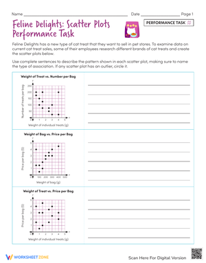
- Scatter plot analysis: Students identify positive, negative, or no association; sketch informal trend lines; and interpret slope within the given context.
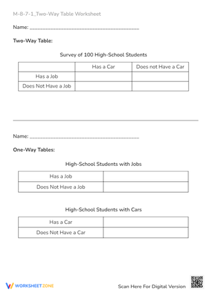
- Two-way table interpretation: Students read joint and marginal frequencies, compare row and column categories, and draw conditional conclusions from grouped data.
- Box plot comparison: Students read quartile values, calculate the interquartile range, and compare two distributions placed side by side on the same scale.
- Histogram reading: Students describe distribution shape — symmetric, skewed left, or skewed right — locate the modal class, and estimate where the median falls relative to the mean.
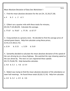
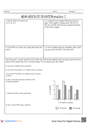
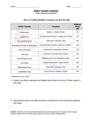
- Center and spread: Some worksheets ask students to compute mean, median, range, and interquartile range from small data sets and connect those values back to a visual display.
- Written reasoning: Every worksheet includes at least one item asking students to cite specific evidence from the graph or table to support a claim in their own words.
That last category deserves extra attention. A student who circles the correct cluster on a scatter plot but cannot write one sentence explaining what it shows has a gap that computation-only practice will never surface. The written items make that gap visible.
Frequent Errors Worth Watching and Correcting
The most persistent scatter plot error is conflating correlation with causation. Students who correctly identify a "positive association" between hours of sleep and test scores will still write "more sleep causes higher scores" without hesitation — treating "is related to" and "causes" as interchangeable. A direct prompt built into the worksheet — Can you prove from this graph alone that one variable causes the other? Explain your reasoning. — exposes that confusion immediately and gives the class something real to discuss before moving on.
Two-way table errors cluster around proportional reasoning. Students compare raw counts across groups of unequal size without converting to rates. If 30 students in Group A prefer Option 1 and only 20 students in Group B prefer it, a student will often declare Group A "more likely" to prefer that option — without noticing that Group B has half as many members, which means the rate in Group B is actually higher. Anticipating that error before the lesson lets teachers ask the right follow-up question during whole-class review rather than discovering the misconception on the quiz.
Box plot misreading tends to run deeper than it first appears. The most common misconception is that a wider section of the box holds more data points than a narrower one. Students have usually encountered histograms first, where bar height does correspond to frequency, and that visual logic carries over incorrectly. Reminding students that each quartile section holds approximately the same proportion of the data — regardless of how wide it spans on the number line — is worth a brief explicit discussion before any box plot worksheet goes out.
How to Work These Worksheets Into Your Lesson Plans
Bell ringer use fits the two-way table and histogram worksheets especially well. A single display with four to six interpretation questions fills the first 8 to 10 minutes of class without any setup beyond distribution. Students work independently, then compare briefly before direct instruction begins — which gives a live read on prior knowledge before any new content is introduced.
For direct instruction days, the most effective sequence is one teacher-modeled example followed by immediate independent work on a worksheet that mirrors that structure. The temptation to walk through the worksheet together as a class delays the moment when students must produce their own thinking. Collecting written explanation items at the door and sorting them into three quick piles — solid, partial, not yet — drives the next day's small-group planning more reliably than a formal end-of-unit quiz.
Station rotations also benefit from these 8th grade data printable worksheets. A three-station structure works consistently well: scatter plot interpretation at one table, two-way table comparison at another, box plot analysis at the third. Each station holds one worksheet and a posted discussion prompt. Students rotate every 12 to 15 minutes, and the teacher positions at whichever station needs live support rather than circulating constantly. The rotation keeps engagement up and gives the teacher a clearer window into which skill area needs the most follow-up.
For sub days, worksheets that provide a completed graph and ask students to annotate and describe it are the most reliable option. No login, no device, no setup — students pick up the worksheet and work.
Adjusting the Set for a Range of Student Readiness Levels
Scatter plot and box plot worksheets adapt naturally for mixed-ability groups. Students who need additional structure work with a completed graph and a focused set of questions: identify the trend, mark one outlier, describe the association in one sentence. Students who are ready for a greater challenge work from raw data — they build the scatter plot from a table, sketch the trend line, and write a paragraph interpreting the association and acknowledging its limitations. The core skill is identical; the entry point and demand level differ without requiring two separate lesson plans.
For students significantly below grade level in data literacy, narrowing the task does more than simplifying the numbers. Instead of assigning a full worksheet with five question types, select two items: one that asks students to locate a specific value and one that asks them to compare two values from the same display. That narrow focus gives the teacher cleaner evidence about where understanding stops and keeps students from shutting down under too many unfamiliar demands at once.
The written explanation items are the most flexible part of the set without changing the worksheet itself. Students at grade level write two to three sentences that reference specific features of the graph. Students who need more support write one sentence using a frame: The data show ___ because ___. Students working above grade level write a second claim and address at least one limitation of the data — for example, noting that a school survey sample might not represent a broader population. Three different expectation levels, one worksheet.
Standard Alignment
These worksheets address CCSS 8.SP.A.1 through 8.SP.A.4, the Statistics and Probability cluster for grade 8. The four standards in that cluster ask students to construct and interpret scatter plots (8.SP.A.1), describe patterns of association including clustering, outliers, and linearity (8.SP.A.2), use equations of linear models to solve problems in context (8.SP.A.3), and read two-way tables as tools for examining patterns of association between categorical variables (8.SP.A.4).
In most grade 8 pacing guides, this cluster falls in the second semester, after students have worked through linear equations and functions. That sequencing matters. Interpreting a trend line's slope or y-intercept in context requires the language of linear relationships to already be familiar. Teachers who assign scatter plot worksheets early in the year — before linear functions — regularly find that students can plot points accurately but cannot explain what the trend line represents. Using these resources after linear content is established produces noticeably stronger written responses and makes the instruction feel connected rather than isolated.
Frequently Asked Questions
Do these worksheets include answer keys?
Yes. Each worksheet comes with a full answer key that includes worked answers for calculation items and sample responses for written explanation prompts. The sample written responses are particularly useful for calibrating how much detail is reasonable to expect from students at different points in the unit — early exposure to data skills calls for shorter, more direct responses, while end-of-unit work should yield more precise, evidence-based writing.
Are these resources appropriate for both on-grade students and those who need intervention support?
Yes. The set includes worksheets at different complexity levels within the same skill area. A teacher running a small intervention group on box plots can assign the worksheet focused on reading values from a completed display, while on-grade students work on the comparison worksheet that requires both reading and written interpretation. Nothing in the design forces every student to work on the same item type at the same time.
How do these worksheets fit into test preparation?
Grade 8 standardized assessments aligned to CCSS regularly include scatter plots, two-way tables, and distribution comparisons — often in the same section. Using 8th grade data printable worksheets as a review rotation in the two to three weeks before testing gives students repeated exposure to the display types and written reasoning demands they will encounter. Mixed-skill worksheets that combine multiple graph formats in one sitting are especially useful at that stage, because assessments rarely present one display type in isolation.
Can these be used effectively for homework?
Shorter mixed-review worksheets work well for homework, particularly those that revisit one skill from the current week alongside one skill from an earlier unit. Worksheets that include graph construction tasks are better kept for in-class use, where students have access to rulers and the teacher can address procedural questions in real time rather than students reinforcing a plotting error through 20 minutes of unsupervised practice at home.