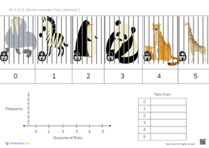
Histograms printable worksheets for 7th grade give teachers a ready-made progression of practice tasks — from reading a finished graph to drawing one from scratch — that covers the full scope of data and graphing instruction expected at this level. Each worksheet follows consistent formatting so students can direct their attention to the math rather than deciphering directions. The set works across the lesson cycle: initial introduction, guided practice, independent work, and quick assessment.
What Each Worksheet Asks Students to Do
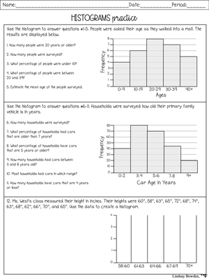
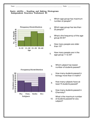
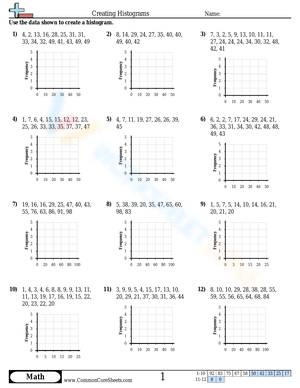
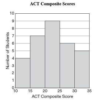
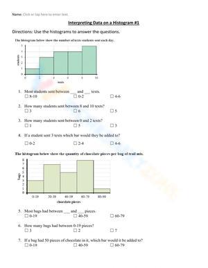
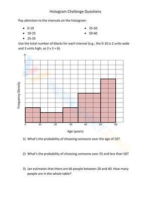
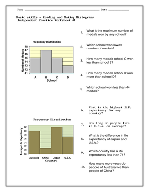
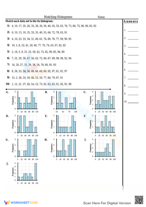
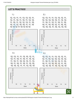
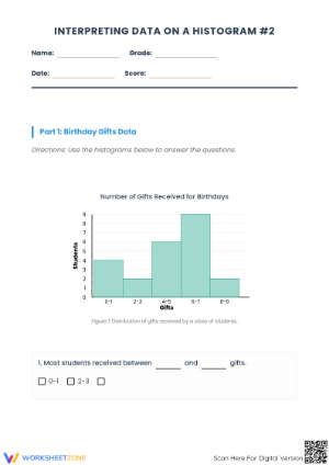
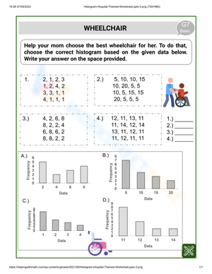
The tasks across the set build on each other deliberately. Earlier worksheets ask students to read an existing histogram and answer interpretation questions — identifying the interval with the highest frequency, comparing totals across adjacent bins, and describing the overall shape of the distribution. Later worksheets shift to construction: students receive raw data, sort values into equal-width intervals, complete a frequency table using tally marks, and draw bars that touch one another on a labeled pair of axes.
- Reading frequency from a histogram: Students identify bar heights and answer questions about which intervals fall above or below a given value.
- Sorting values into intervals: Students assign raw numbers to bins and decide where boundary values belong.
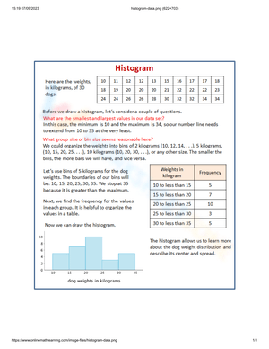
- Completing a frequency table: Students organize data with tally marks before transferring values to graph form.
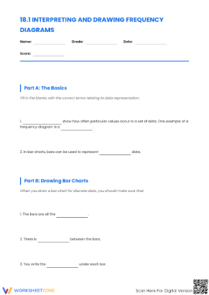
- Drawing a correctly labeled histogram: Students mark equal-width intervals on the x-axis, plot frequencies on the y-axis, and draw bars without gaps between them.
- Interpreting the distribution: Students describe clusters, peaks, gaps, and overall spread using a completed graph.
Mistakes Students Make That These Worksheets Help You Catch
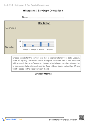
The error that appears most reliably is the histogram-versus-bar-graph confusion. Students who have spent time on categorical bar graphs know to leave space between bars, so they carry that habit directly into histogram work. The gap looks minor on paper, but it reflects a real misunderstanding: those students are still thinking of intervals as separate categories rather than consecutive ranges along a number line. That distinction is worth addressing before students practice independently — not as a footnote but as the central idea of the first lesson.
Boundary values cause a separate and equally common problem. A student sorting data into the intervals 10–20, 20–30, and 30–40 will often place the value 20 in both the first and second bin, or skip it entirely. That error is invisible in a finished histogram unless the worksheet also includes a prompt like Where does 20 belong, and how do you know? A short written question does more diagnostic work than the bar graph alone.
Three additional patterns come up often enough to anticipate:
- Unequal bin widths: When students choose their own intervals, they sometimes make the widths different, which distorts the shape of the graph in ways they don't recognize as a problem.
- Unlabeled axes: Students who plot the bars accurately still skip axis titles and interval labels, leaving a graph that no one else can interpret.
- Describing only the tallest bar: When asked what the graph shows, students focus on the peak interval and say nothing about spread, gaps, or clusters.
How to Work These Worksheets Into Your Lesson Plans
These worksheets fit several moments in the 7th grade math block, and teachers who plan units around histograms printable worksheets for 7th grade consistently find that distributing practice across multiple short sessions outperforms a single extended activity. Students need repeated exposure to interval thinking — sorting, plotting, reading — before the process becomes fluent enough to apply independently.
One limitation worth naming up front: construction worksheets handed out before any teacher modeling tend to produce guessing rather than learning. Students who have never seen a complete move from raw data to a labeled histogram will invent their own conventions, including unequal bins and disconnected bars. Save construction tasks for after direct instruction, when students have a worked model they can reference.
- Monday warm-up: Give students one finished histogram and three quick interpretation questions during the first seven minutes of class. Use the brief discussion to surface leftover confusion from the prior week before the lesson continues.
- Mini-lesson follow-up: Immediately after modeling bins and frequency tables, assign a guided construction worksheet so students attempt the same process with a new data set while the model is still visible.
- Math stations: Run one station for sorting raw data into a frequency table and a second for reading and annotating a finished histogram. Students encounter both sides of the skill in one class period.
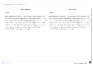
- Exit ticket: A short construction worksheet at the end of class shows immediately which students can choose appropriate intervals independently and which still need a targeted reteaching conversation before the next lesson.
- Spiral review: After moving into box plots or scatter plots, pull one histogram worksheet for a five-minute review during the Friday block to keep the skill from fading.
One technique worth trying before independent practice: have students highlight each row of the frequency table in a distinct color, then shade the corresponding histogram bar the same color. That visual connection between table and graph sharply reduces the errors where students skip an interval or misread a bar height.
Adjusting the Set for Mixed-Ability Classrooms
For students who need more structured support, reduce the number of decisions they have to make before practice begins. Use worksheets where the x-axis intervals are pre-labeled so students focus entirely on counting and plotting rather than choosing bin sizes. A partially completed frequency table — with the interval column already filled in — narrows the task to tallying and transferring values, which is where these students need to build fluency first. Placing a worked example alongside the blank practice graph also gives them something concrete to check their own bar heights against.
On-level students benefit most from the full sequence: read one histogram, then construct another from a related raw data set. That pairing checks both interpretation and application in the same worksheet and gives students a reason to care about the graph they are building.
For students ready for more, the most effective extension involves comparison rather than repetition. Present two histograms built from related data — quiz scores from two different class periods, for example — and ask which distribution has greater spread, where the data clusters, and whether narrower intervals would make the pattern clearer or harder to read. A single prompt like Which graph gives you a clearer picture of the data, and why? pushes students to evaluate the choices built into a histogram rather than simply read the result.
Standard Alignment
These worksheets align most directly with CCSS.MATH.CONTENT.6.SP.B.4, which requires students to display numerical data using histograms and interpret those displays in context. Many 7th grade teachers use histogram instruction as a targeted review of this standard before extending into box plots and measures of variability addressed under the 7.SP cluster. The interpretation questions built into these worksheets — asking students to describe distribution shape, identify clusters, and compare intervals — match the 6.SP.B expectation that students comment on the overall pattern of the data, not just isolated values. In classrooms following the Common Core sequence, histograms typically appear in sixth grade and return in seventh as students learn to compare data sets, so these resources serve both initial instruction and consolidation depending on where a class is in the unit.
Frequently Asked Questions
What should students already know before working with these worksheets?
Students need to be comfortable reading a number line, counting to organize data, and labeling an axis with equal intervals. Prior experience with bar graphs helps because teachers can use the side-by-side comparison — bars that touch versus bars with gaps — to anchor the most important distinction. Students who have worked with tally charts also tend to move through the frequency table steps with fewer stops.
How do I explain why histogram bars touch?
The most durable explanation connects directly to the number line: histogram data is numerical and continuous, meaning there are no natural gaps between possible values. Each bar covers a range along that continuous line, and the next bar begins exactly where the last one ends. A categorical bar graph shows separate groups with no inherent order or connection, so gaps between bars are appropriate there. Once students understand the underlying reason, they can apply the rule rather than just memorize it.
Can these worksheets function as formative assessment?
Yes, and the construction tasks are especially useful for that purpose. A student's finished histogram reveals several decisions at once: whether they used equal intervals, whether they handled boundary values correctly, whether they labeled both axes, and whether the bar heights match the frequency table. A teacher can scan a set of finished worksheets in a few minutes and identify who is ready to move forward and who needs a reteaching conversation before the next lesson. Histograms printable worksheets for 7th grade that include a brief written reflection — asking students to describe the shape of their data in a sentence or two — add one more layer of evidence about whether students are genuinely reading the distribution or just completing the graph mechanically.
What kinds of data sets work best for 7th grade practice?
Familiar contexts lower the entry barrier and make interpretation more meaningful. Quiz scores, weekly reading minutes, daily step counts, and heights measured in centimeters all produce numerical data that sorts naturally into equal-width intervals. Data sets with 15 to 25 values and three to five intervals tend to strike the best balance — large enough to show a visible distribution pattern, small enough that counting doesn't become the main obstacle. Once students are confident with smaller sets, you can move to histograms printable worksheets for 7th grade that use larger or messier data and ask students to select appropriate interval widths on their own.







 Interactive Worksheet Maker
 Quiz Maker
 Word Search Maker
 Crossword Puzzle Maker
 Word Scramble Generator
 Sentence Scramble Generator
 Handwriting Worksheet Generator
 Name Tracing Generator
 Fill In The Blank Generator