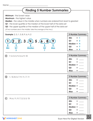
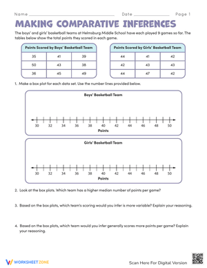
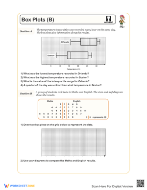
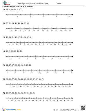
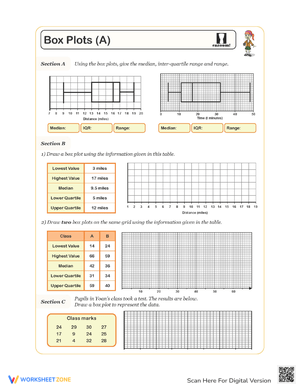
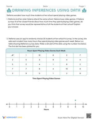
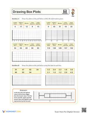
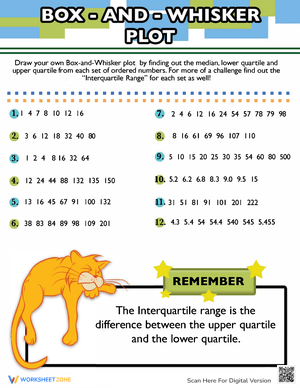
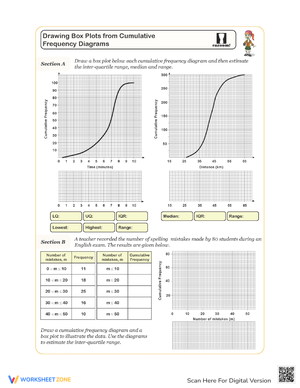
These box plots worksheets for 7th grade give teachers exactly what they need for a data distribution unit — pre-formatted number lines, intentionally unordered data sets, and practice sequences that move from five-number summary calculations to reading and comparing finished plots. They print without distortion, which matters when students need to place points precisely on a scaled axis where a small placement error produces a visible mistake.
The Specific Skills These Worksheets Build
Each worksheet targets a distinct moment in the learning arc. Early practice tasks students with ordering raw data from least to greatest, then locating the minimum, maximum, and median before they approach the quartiles at all. That sequence matters — students who anchor the median first make fewer errors when they split the lower and upper halves to find Q1 and Q3.
Later worksheets introduce the interquartile range as a measure of variability and ask students to interpret what a wide versus narrow box actually signals about a dataset. Several place two box plots on the same number line, requiring students to draw comparative inferences: which population has the higher median, which has more spread in the middle fifty percent, and what those differences suggest about the two groups. A few worksheets reverse the task entirely — students receive a completed plot and reconstruct the five-number summary from the graph rather than produce the graph from raw data. That backward direction exposes gaps that forward practice alone misses.
Student Errors Worth Anticipating Before You Teach This
The most consistent mistake isn't mislabeling Q1 and Q3 — it's skipping the sort. Students who see an unordered list and immediately scan for a middle value pull the wrong number nearly every time. The worksheets in this set intentionally present raw, unsorted data to force that first step. If you're running these as guided practice, pausing to ask "has everyone ordered their data?" before anyone calculates prevents the most common error from compounding into three wrong values downstream.
The even-number problem creates a second, subtler issue. A student might correctly average the two central values to find the median of an eight-value set, then turn around and pick a single number for Q1 without checking whether the lower half also has an even count. The result is a box that looks plausible but is visibly off — and students rarely catch it on their own without a verification prompt. Problems that ask students to confirm whether their IQR makes sense relative to the total range build that self-checking habit before it becomes necessary on an assessment.
A third error appears at the drawing stage. Some students extend whiskers to Q1 minus 1.5 times the IQR on the low end and Q3 plus 1.5 times the IQR on the high end by default — that's the outlier fence formula, not the whisker rule. Conflating those two produces plots where whiskers stretch beyond the actual minimum and maximum. Calling it out during whole-class discussion of the first comparative worksheet tends to stick better than re-explaining the distinction in isolation.
Standard Alignment
These worksheets align to CCSS 7.SP.B.3 and 7.SP.B.4. The first standard asks students to assess the degree of visual overlap between two numerical distributions while accounting for variability. The second requires students to use measures of center and variability to draw informal comparative inferences about two populations. In classroom terms, that means students must look at two side-by-side box plots and make a supported claim — not just read off numbers, but interpret what differences in median and IQR reveal about the groups being compared. The comparative double-plot worksheets in this set give students repeated practice with exactly that reasoning pattern before they encounter it on a unit assessment or state exam.
Building These Worksheets Into a Data Unit That Holds Together
Before students open box plots worksheets for 7th grade for the first time, run a five-minute kinesthetic setup: have the class line up by birth month, then physically divide the line into halves and quarters. The moment students stand in four equal groups and realize the box would represent the two middle groups is worth more than any labeled diagram. When they sit down and pick up a pencil, "the middle fifty percent" is already a physical memory rather than an abstract phrase on a page.
After that opener, use the sorting-and-calculating worksheets as whole-class guided work for the first day or two. Reserve the comparative double-plot worksheets for independent practice or partner work once students can identify the five-number summary without prompting. The exit-ticket format works well here — hand students a short five-value data set with five minutes left in class and ask for just the five-number summary, not the full plot. That quick check reveals who needs re-teaching before the next lesson without cutting into instruction time.
Station rotations also fit this set naturally. Posting different data scenarios at four or five stations lets students construct multiple plots in a single period without the monotony of one long unbroken task. Pairing each station with a peer-review step — students trade papers and verify each other's median before graphing — catches errors early and gets students talking about the math in concrete, specific terms rather than simply copying a procedure.
Adjusting the Set for a Range of Learners
For students who are still shaky on where the median falls, start with datasets of five or seven values — odd counts only — before introducing even-number sets. The averaging step for even datasets is a separate cognitive demand, and layering it in before the basic logic is solid tends to produce students who have memorized a two-step rule they don't understand well enough to apply when the numbers change.
Students who move through the five-number summary quickly are ready for the outlier detection work. Any value that falls more than 1.5 times the IQR below Q1 or more than 1.5 times the IQR above Q3 qualifies as an outlier and gets marked as a separate dot beyond the whisker. The box plots worksheets for 7th grade in this set include problems where outliers are present, and stronger students can work through the formal fence calculation, re-draw the affected whisker, and then explain in writing why the IQR is more informative than the range in those cases.
For students who struggle specifically with the graphing step — not the calculation, but placing points precisely on a pre-drawn number line — allow them to work with a ruler alongside the printed worksheet. The five-number summary calculation is the priority skill. Fine-motor precision in drawing a clean, narrow box is a secondary concern and shouldn't be the reason a student disengages from the underlying math.
Frequently Asked Questions
How do you find the median when a dataset has an even number of values?
With an even-count dataset, there is no single middle value. Students identify the two central numbers, add them, and divide by two. The same process applies when finding Q1 or Q3 if the lower or upper half of the data also has an even count — a step many students miss entirely the first time. Working a specific example aloud, such as finding Q1 from a six-value lower half, is generally more effective than restating the rule in the abstract a second time.
What is the difference between the range and the IQR?
The range measures total spread: maximum minus minimum. Because it includes every value in the dataset, a single extreme outlier inflates it dramatically. The IQR measures only the spread of the middle fifty percent — Q3 minus Q1 — and ignores those extremes entirely. That makes the IQR the more useful measure when students are comparing two populations and want to know which group is more consistent in its central values, which is precisely what 7.SP.B.4 asks them to do.
How do outliers appear on a finished box-and-whisker plot?
The whisker extends only to the last non-outlier data point — not to the outlier itself. Any value beyond the outlier fences gets plotted as a separate dot or asterisk. Students frequently draw the whisker all the way to the outlier and then add a dot on top of the endpoint, which is a direct signal that they haven't connected the fence calculation to what the whisker actually represents. Asking those students to explain aloud where their whisker endpoint came from usually surfaces the confusion faster than marking the plot incorrect without discussion.
Are these worksheets usable for both instruction and assessment?
The box plots worksheets for 7th grade in this set work as guided instruction, independent practice, or short formative checks depending on how you deploy them. A single shorter worksheet used as an exit ticket gives a clean read on whether students can produce the five-number summary accurately. The comparative double-plot worksheets are better suited to summative tasks, since they require the full inferential reasoning chain that the Grade 7 statistics standards call for.












 Interactive Worksheet Maker
 Quiz Maker
 Word Search Maker
 Crossword Puzzle Maker
 Word Scramble Generator
 Sentence Scramble Generator
 Handwriting Worksheet Generator
 Name Tracing Generator
 Fill In The Blank Generator