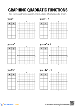
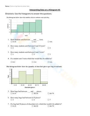
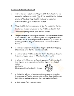
These data and graphing worksheets for 9th grade give teachers ready-to-use practice for the statistical concepts that define the jump into high school math — scatter plots with written interpretation, lines of best fit, box-and-whisker plots, histograms, and a first encounter with standard deviation. Students don't just read finished graphs here; they build them from raw data sets and explain in writing what the patterns mean.
What the Set Covers
Five skill areas run across the worksheets, each building on the linear algebra students have already worked through earlier in the year.
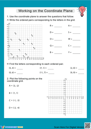
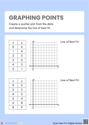
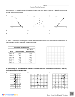
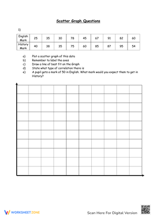
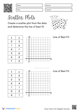
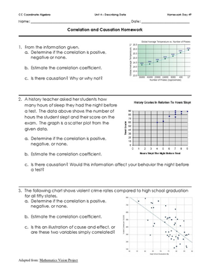
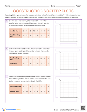
- Scatter plots and correlation: Students plot ordered pairs on a coordinate grid, classify the relationship as positive, negative, or none, and write a sentence interpreting what the pattern means in the context of the data set.
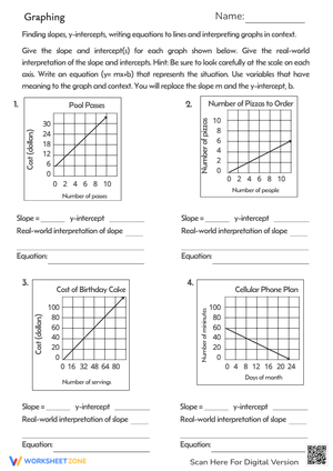
- Lines of best fit: After plotting, students position a trend line, calculate slope and y-intercept from two labeled points on that line, and use the resulting equation to make a prediction. One worksheet specifically asks students to predict a value beyond the plotted data range, which opens a real conversation about what extrapolation means and when it's defensible.
- Box-and-whisker plots: Students calculate the five-number summary from an unordered list, then construct the plot on a provided number line. A companion exercise asks them to compare two box plots side by side and draw a written conclusion about the difference in spread.
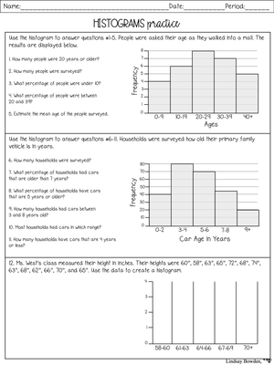
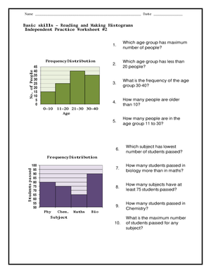
- Histograms: Students group raw data into equal-width intervals, settle on an appropriate bin size, build a frequency table, and transfer that table into a labeled histogram. The step from table to graph — choosing axis labels and deciding where each interval begins and ends — is where most errors surface.
- Measures of center and spread: Mean, median, interquartile range, and standard deviation, the last of which students calculate step by step using a pre-formatted table with a labeled column for each stage of the computation.
Error Patterns Teachers Should Anticipate in This Unit
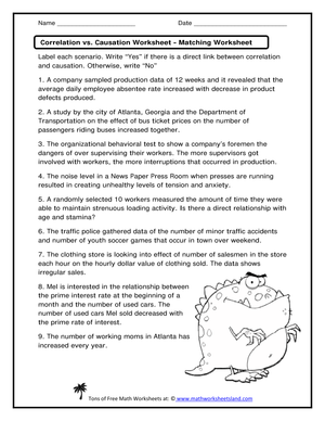
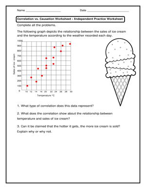
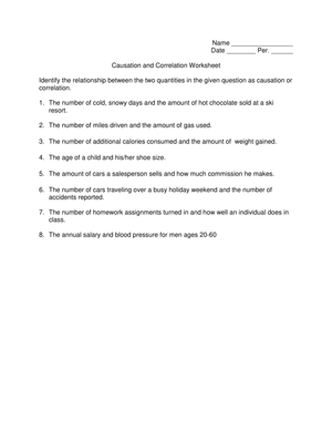
The error that creates the most instructional work is students conflating correlation with causation. A student who correctly identifies a strong positive correlation on a scatter plot will still write "X causes Y to increase" as their interpretation sentence — sometimes even after you've addressed the distinction directly. A reliable fix is to open the scatter plot unit with a deliberately absurd pairing before introducing serious academic data. Ice cream sales and drowning rates is the classic example; once students see that a strong positive correlation can connect two completely unrelated trends, the logical gap becomes hard to ignore.
Histogram construction reveals a different category of error. Students who handle bar graphs confidently will still label histogram bars at the center rather than at the interval boundaries. Writing "20–30" in the middle of a bar is not the same as marking 20 and 30 as the left and right edges of an interval. That distinction doesn't feel significant to a 9th grader until you demonstrate how a mislabeled histogram misrepresents the actual distribution of the data.
Standard deviation catches students who rush the column structure. The most common mistake is squaring a data value before subtracting the mean — a sequencing error, not an arithmetic one. The labeled columns in these worksheets — value, deviation (value minus mean), squared deviation — enforce the correct order visually. That structure reduces the error without requiring repeated re-explanation at the board.
Fitting These Worksheets Into Your Lesson Sequence
These resources work best when each worksheet follows a direct-instruction block rather than replacing one. A practical pattern: introduce scatter plots with a projected example on Monday and release students to the plotting worksheet for the last 15 minutes of class. By Wednesday, when you hand out the line-of-best-fit worksheet, students aren't learning what scatter plots are — they're only learning the new layer on top. That separation keeps cognitive load manageable and error rates lower on both skills.
The spaghetti technique is worth keeping in your toolkit. Before students draw a trend line in pencil, give each one a piece of dry spaghetti to lay across the printed grid. They rotate the stick until it roughly balances the points above and below, then trace along the edge. It sounds low-tech because it is — but it gives students a physical sense of minimizing distance to points before they commit anything to paper, and it cuts down on the frustrated erasing that tends to end with torn grids and reluctant students.
For warm-up use, the box plot worksheet pulls double duty: calculating a five-number summary from a raw data set takes about eight minutes, which fills the gap between the bell and when whole-class instruction realistically starts. The data and graphing worksheets for 9th grade suits this kind of modular classroom use because each worksheet targets a single, bounded skill rather than stringing multiple concepts together in one sitting.
Standard Alignment
The worksheets address four standards from the CCSS Statistics and Probability domain: HSS.ID.A.1 (representing data with plots on real number lines, including dot plots, histograms, and box plots), HSS.ID.A.2 (using statistics to compare center and spread of two or more distributions), HSS.ID.B.6 (representing data on two quantitative variables on a scatter plot and describing how the variables relate), and HSS.ID.B.6.A (fitting a function to data and using it to solve problems in context).
In a standard Algebra 1 or Integrated Math 1 course, these standards land in the final major unit of the year, after students have spent months working with linear equations and functions. A data and graphing worksheets for 9th grade used at this point in the calendar finds students who already know slope-intercept form — so the line-of-best-fit worksheet extends existing algebraic fluency rather than requiring students to learn new equation mechanics at the same time as new statistical concepts.
Adjusting These Worksheets for a Mixed-Ability Class
For students who struggle with arithmetic demands, reducing the data set size is the most direct adjustment. A standard deviation worksheet built around 12 data points can be cut to 6 without changing the skill being assessed. Students still complete every column in the table; they just work with fewer rows. Similarly, box plot worksheets with smaller data sets reduce the effort of ordering values before any statistical work begins.
Students who move quickly through the core practice have a natural extension in outlier identification. After constructing a box plot, they can apply the standard rule: any value greater than Q3 plus 1.5 times the IQR, or less than Q1 minus 1.5 times the IQR, qualifies as an outlier. Most 9th graders who have mastered the five-number summary can handle this additional step with minimal instruction, and it connects directly to what they'll encounter in AP Statistics.
The scatter plot worksheets accommodate a range of learners because the visual element gives students who struggle with abstraction something concrete to interpret before they write. The interpretation sentences, though, vary sharply in quality across ability levels. Developing students write "the dots go up," while stronger students connect slope to rate of change in the context of the problem. Comparing both against the same rubric makes the difference visible and gives you specific language to push students toward more precise statistical reasoning. The data and graphing worksheets for 9th grade surfaces this range in a way that makes differentiated feedback manageable, not just conceptually appealing.
Frequently Asked Questions
What's the difference between a bar graph and a histogram, and how do I explain it clearly?
Bar graphs display categorical data — types of pets, survey responses, favorite genres — and have visible gaps between bars because the categories are separate and discrete. Histograms display continuous numerical data grouped into intervals, and the bars touch because no natural gap exists between adjacent values. These worksheets present both graph types, so students encounter the distinction through practice rather than only through a definition they're likely to forget.
How should I sequence the worksheets across the unit?
Start with scatter plots before moving to lines of best fit — students need plotting confidence before making decisions about trend line placement. Box plots and histograms can run as a parallel thread since they draw on different skills than bivariate data analysis. Standard deviation works best near the end of the unit, once students are comfortable with mean and IQR, because it extends both ideas rather than introducing entirely new conceptual ground.
Do these worksheets cover the difference between population and sample standard deviation?
At the 9th grade level, the focus stays on the conceptual mechanics — why deviations get squared, why you take the square root at the end — rather than the population/sample distinction, which is better addressed in a dedicated statistics course. The worksheets use the population formula to keep the arithmetic manageable. If a student asks, it's worth noting that two formulas exist and that the choice depends on whether the data represents an entire population or a subset drawn from one.
Can these worksheets double as test-prep materials?
The skills covered — reading and constructing scatter plots, interpreting lines of best fit, comparing distributions using box plots — appear consistently on state end-of-course assessments for Algebra 1 and Integrated Math 1. Repeated practice through these worksheets builds the fluency those assessments require, which means the test-prep value accumulates through normal classroom use rather than a separate review cycle bolted on before the exam.













 Interactive Worksheet Maker
 Quiz Maker
 Word Search Maker
 Crossword Puzzle Maker
 Word Scramble Generator
 Sentence Scramble Generator
 Handwriting Worksheet Generator
 Name Tracing Generator
 Fill In The Blank Generator




 BACK TOSCHOOL