


1 / 4
0
Views
0
Plays


0.0
0
Save
0 Likes
Reading Strategies: Comprehension and Analysis
0 Views
0 Plays
Paste this activity's link or code into your existing LMS (Google Classroom, Canvas, Teams, Schoology, Moodle, etc.).
Students can open and work on the activity right away, with no student login required.
You'll still be able to track student progress and results from your teacher account.
Information
Description
What It Is:
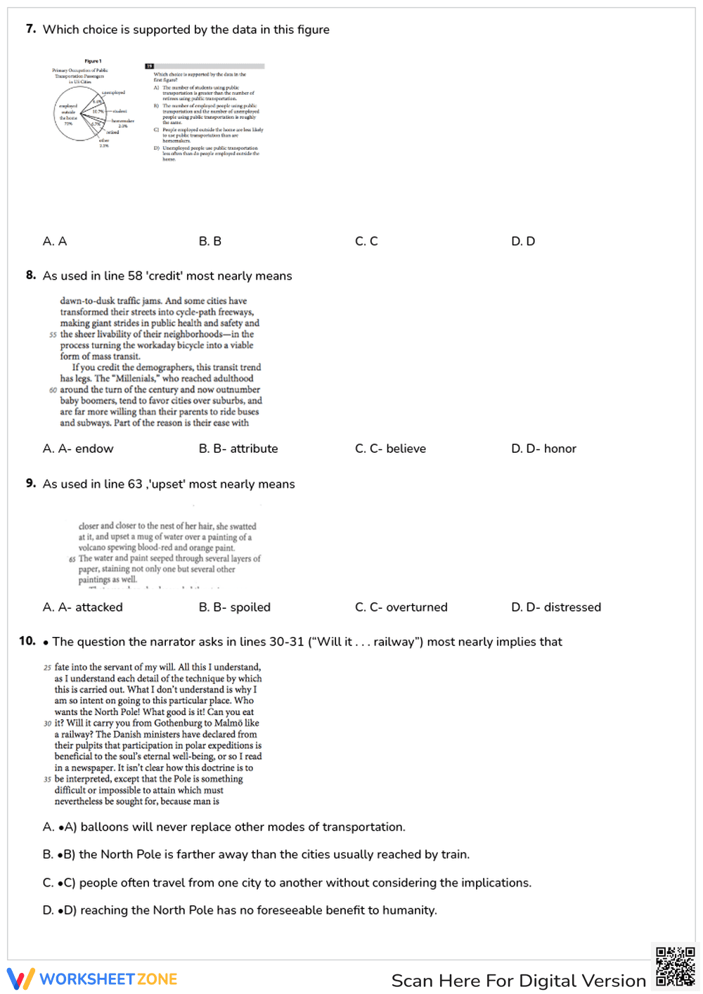
This is a worksheet featuring a pie chart titled 'Primary Occupation of Public Transportation Passengers in US Cities.' The pie chart shows the percentage of passengers who are employed outside the home (72%), students (10.7%), unemployed (6.4%), retired (6.7%), homemakers (2.0%), and other (2.2%). Below the chart, there is a multiple-choice question asking which choice is supported by the data in the figure. The choices compare the usage of public transportation by different occupation groups.
Grade Level Suitability:
This worksheet is suitable for grades 6-8. The data analysis and interpretation of the pie chart are appropriate for middle school students. The multiple-choice question requires reading comprehension and the ability to draw conclusions based on the presented data.
Why Use It:
This worksheet helps students develop skills in data interpretation, reading comprehension, and critical thinking. It allows them to practice analyzing a pie chart and drawing conclusions based on the provided information. It also reinforces the ability to relate data to real-world scenarios.
How to Use It:
Students should first carefully examine the pie chart and understand the percentage breakdown of different occupations among public transportation users. Then, they should read each multiple-choice option and determine which one is most accurately supported by the data in the chart. Students may need to compare the percentages of different groups to answer the question correctly.
Target Users:
The target users are middle school students (grades 6-8) who are learning about data analysis, pie charts, and reading comprehension. It is also suitable for students preparing for standardized tests that include data interpretation questions.