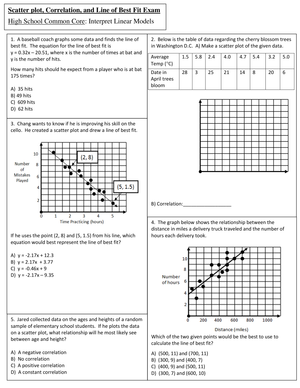
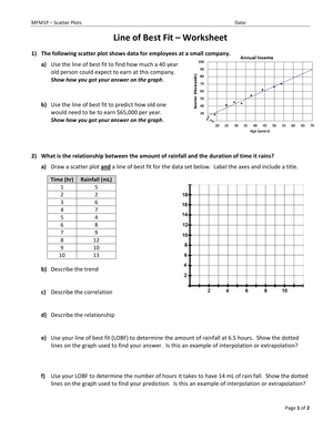
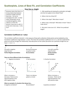
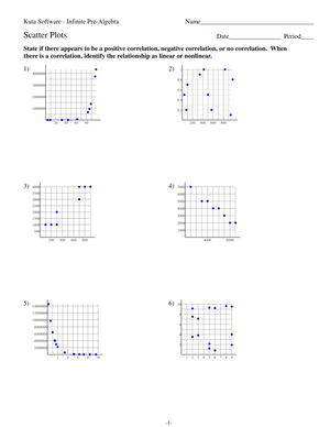
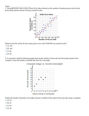
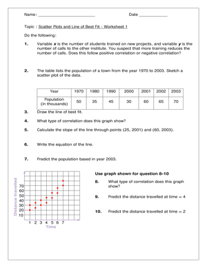
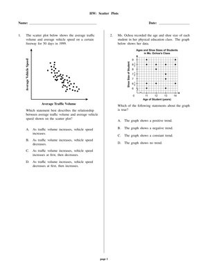
By the time your students reach bivariate data, they can already plot ordered pairs and read a coordinate grid. Scatter plots and lines of best fit worksheets push past that into something harder: looking at a cloud of real points and deciding what story the data tells. Good practice pages ask students to construct a plot from a data table, judge whether the association is positive, negative, or nonexistent, and then draw an informal line that summarizes the trend. For a US 8th grade classroom, this is the heart of the Statistics and Probability work in the 8.SP domain, and it is one of the last major skills before students move into Algebra 1 linear modeling.
The best worksheets keep the arithmetic light so the reasoning can be heavy. Students should spend their energy on whether a line truly fits rather than on tedious calculation, which means the numbers in each data set should be friendly and the grids should be pre-labeled when you first introduce the skill. Save the messier data for after the concept lands.
Sequencing a scatter plot unit
A scatter plot unit works best in three clear stages, and your worksheets should map to each one. Start with construction: give students a data table and have them place points on a labeled grid. Next, move to association: students describe the relationship in words before they touch a ruler. Only then should they fit a line and interpret it.
- Stage 1 — Construct: plot points from a table, choose sensible scales, and label axes with units.
- Stage 2 — Describe: identify positive, negative, or no association, and whether the pattern looks linear or nonlinear.
- Stage 3 — Fit and interpret: draw an informal line of best fit, then read slope and intercept in context.
Splitting the unit this way lets you use short worksheets as checkpoints. If a student cannot yet describe association reliably, drawing a trustworthy line of best fit is out of reach, and you will want to catch that gap before the graded work begins.
Interpreting slope and intercept in context
Once a line is drawn, the payoff is interpretation. In a plant-growth data set, the slope tells students how many centimeters the plant grows per hour, and the y-intercept estimates its starting height. Worksheets that force students to write a sentence, not just a number, for slope and intercept are doing the real 8th grade work.
CCSS.Math.Content.8.SP.A.3 asks students to use the equation of a linear model to solve problems with bivariate measurement data, interpreting slope and intercept in context. In a plant-growth model, a slope of 1.5 cm per hour is not just a number; it is a rate students should be able to explain, defend, and use to predict a future height.
Push students to use the equation of their line to make a prediction, then ask whether that prediction is reasonable given the range of the data. This is where interpolation, and the limits of a model, become concrete instead of abstract.
Common misconceptions to catch early
Three predictable errors show up on almost every set of scatter plot papers, and naming them for students shortens the reteach cycle.
- Connecting the dots: students draw a jagged path from point to point instead of a single straight trend line.
- Forcing the line through the origin: students assume the line must start at (0, 0), even when the data never approaches it.
- Chasing outliers: students let one stray point drag the whole line off the trend.
Here is the check that separates a guessed line from a defensible one: a well-fit line of best fit should leave roughly equal numbers of data points above and below it. Teach students to literally count the points on each side after they draw. If nine points sit above the line and two sit below, the line is too low, no matter how neat it looks. This one counting habit turns a subjective sense that a line looks about right into a criterion students can apply on their own, and it quietly previews the residual thinking they will formalize in later statistics courses.
Classroom Implementation
Use these worksheets as more than homework. For formative assessment, a half-page with one data table makes a fast exit ticket: students plot, fit, and write one interpretation sentence in about five minutes, and you sort the stack into ready and reteach piles before the next period walks in.
For small-group intervention, hand out plots that are already constructed so students practice only the fitting and interpreting step. For enrichment, give messier real-world data such as sports statistics, science-experiment measurements, or weather readings, where the association is real but noisy, and ask students to justify their line in writing.
- Warm-up: one quick association plot to open class.
- Guided practice: construct and fit together, narrating each decision aloud.
- Independent check: an exit ticket that ends in an interpretation sentence.
Bridging scatter plots into Algebra 1
The informal line students draw by eye in 8th grade becomes the formal line of regression in Algebra 1. When students later meet the correlation coefficient and least-squares regression, the intuition they built here, that a good line balances the points around it, is exactly what the technology is computing for them. Worksheets rooted in the Grade 8 Statistics and Probability progression give students that conceptual anchor, so the algebra feels like a refinement rather than a brand-new topic.
Keeping this bridge visible also helps you explain to families and colleagues why informal fitting matters. It is not a throwaway skill but the foundation of every scatter plot students will read in science, social studies, and eventually college coursework.
Frequently Asked Questions
1. What grade level are scatter plots and lines of best fit taught?
In the US, scatter plots and informal lines of best fit are core 8th grade math content, sitting in the Statistics and Probability (8.SP) domain. Many students then revisit and formalize the skill in Algebra 1, often in 9th grade.
2. What is the difference between a line of best fit and linear regression?
A line of best fit in 8th grade is drawn informally by eye to summarize a trend. Linear regression is the formal procedure, usually done with technology, that calculates the single line minimizing the distance from the points. Students meet regression in later courses.
3. How do teachers assess whether a student's line of best fit is reasonable?
Check that the line follows the overall direction of the data and leaves roughly equal points above and below it. If most points cluster on one side, the line needs adjusting, even when the drawing looks tidy.
4. What real-world data sets work well for scatter plot practice?
Data with a clear but imperfect relationship works best: plant height over time, study minutes versus quiz scores, temperature versus cold-drink sales, or sports statistics. These give genuine positive or negative associations without being perfectly linear.
5. How do these worksheets align with 8.SP.A.2 and 8.SP.A.3?
Construction and informal fitting target 8.SP.A.2, which covers building scatter plots and assessing fit. Interpreting slope and intercept to solve problems targets 8.SP.A.3. A complete worksheet set moves students through both in order.













 Interactive Worksheet Maker
 Quiz Maker
 Word Search Maker
 Crossword Puzzle Maker
 Word Scramble Generator
 Sentence Scramble Generator
 Handwriting Worksheet Generator
 Name Tracing Generator
 Fill In The Blank Generator