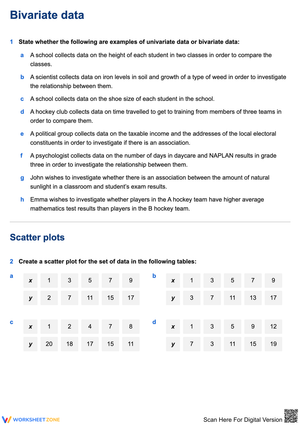
























Bivariate Data Printable Worksheets for 9th Grade
These bivariate data printable worksheets for 9th grade give students repeated practice plotting paired data, drawing trend lines, and reading two-way frequency tables — the skills that show up in the second half of an Algebra 1 statistics unit. The set runs from straightforward scatter plot construction up through interpreting relative frequencies and reasoning about correlation versus causation.
What Students Work On
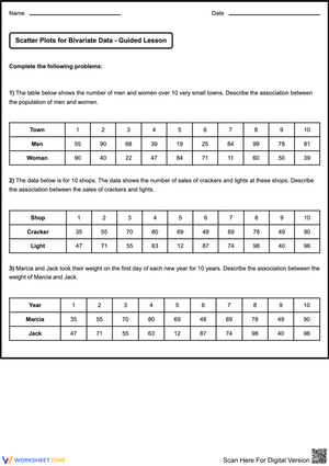
The core of the work sits in four places. First, students plot ordered pairs on a coordinate plane and decide whether the cloud of points drifts up, drifts down, or shows no pattern at all. From there they draw a line of best fit and start describing the relationship in words, not just slope numbers.
- Scatter plots and trend lines: Students mark independent and dependent variables, plot the points, and sketch a line that balances the data above and below it. Several worksheets ask them to predict a value using their line rather than just drawing it and stopping.
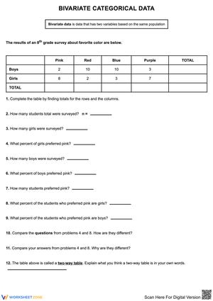
- Two-way frequency tables: For categorical pairs — say, grade level crossed with whether a student rides the bus — students fill in joint counts, total the margins, and convert to relative frequencies to check whether two categories are associated.
- Correlation versus causation: Each scenario forces a judgment. Does more time on a phone cause lower grades, or is something else driving both? Students write out their reasoning instead of circling an answer.
- Reading the correlation coefficient: Students match values near 1, near negative 1, and near 0 to the shape of the scatter. Hand calculation isn't the point here; interpreting what the number says about strength and direction is.
Working These Into Your Statistics Unit
One trick that pays off the first day of the line-of-best-fit lesson: hand each student a piece of uncooked spaghetti. They lay it across their printed scatter plot and slide it around until roughly the same number of points sit above and below before anything gets drawn in pencil. Students who would otherwise jam their line through the two highest points slow down and actually balance the spread. It costs nothing and the visual sticks.
I open the unit with the simpler scatter plot worksheets as whole-class guided practice, narrating how to spot the independent variable and where the points should land. Once that's steady, the two-way table worksheets move well as partner work — students argue about whether a relative frequency means an association exists, and the disagreements are where the learning happens. The correlation-versus-causation worksheets make sharp exit tickets: a short paragraph at the end of the block tells me fast who still thinks a tight scatter proves cause. Many teachers pair the bivariate data printable worksheets for 9th grade with a short video assigned the night before, then use class time for the plotting and the arguing.
Mistakes to Watch For and Head Off
The most common error has nothing to do with arithmetic. Students draw a line of best fit that touches as many points as possible instead of one that balances the residuals — they treat it like connect-the-dots. You'll see lines that hug the top edge of the cloud because two points up there pulled the pencil. Point them back to the spaghetti idea: equal weight above and below.
The second predictable slip is reading a two-way table down the wrong axis. A student computes a relative frequency using the grand total when the question asked about a row total, and the percentage comes out plausible enough that they don't catch it. I make them label every fraction with what the denominator represents before they divide. The causation confusion is the third one — a strong, clean scatter feels like proof, and students will write "studying causes higher scores" without considering that motivated students both study more and test better. These worksheets give them enough varied scenarios to build the habit of pausing on that claim.
Outliers and When a Line Doesn't Belong
A linear model anchors the Grade 9 unit, but students also need to recognize when a straight line is the wrong tool. Some worksheets in the set drop in an obvious outlier and ask students to describe how it tugs the line of best fit and weakens the correlation coefficient. Others present data that bends — points that curve upward like an exponential pattern — so students practice saying "a line fits poorly here" instead of forcing a regression onto everything. They don't need to find the equation of the curve at this level. They need to look before they fit.
Adjusting the Set for a Range of Learners
For students who need more support, start them on worksheets where the axes are already scaled and labeled so the only job is plotting and describing. For students ready to push further, hand them the versions with blank axes that require choosing an appropriate scale, plus the two-way table problems that ask for conditional relative frequencies rather than simple ones. The bivariate data printable worksheets for 9th grade span enough difficulty that one class can run three tiers off the same topic without anyone feeling parked. A quick extension for early finishers: have them invent a scenario that would produce a negative correlation and sketch what its scatter would look like.
Standard Alignment
The set targets the High School Statistics and Probability strand of the Common Core, specifically the cluster on interpreting bivariate measurement and categorical data (S-ID.6 through S-ID.9). That cluster expects students to represent data on two quantitative variables, fit a function to the data, and — the part textbooks often rush — interpret the slope and intercept in the context of the situation. The two-way table worksheets map to the categorical side of the same cluster, where students summarize data and recognize associations. These bivariate data printable worksheets for 9th grade keep the contextual interpretation front and center, because that's the piece students lose first when a unit moves too fast through plotting.
Frequently Asked Questions
What separates univariate from bivariate data at this grade?
Univariate data tracks one variable — the test scores for a class, summarized by mean and spread. Bivariate data records two variables for the same subjects, like each student's study time and that student's score. The Grade 9 goal shifts from describing one variable to asking whether the two move together, and how strongly.
How do students decide whether a line is actually a good fit?
They start by eyeballing the scatter for a roughly straight-line shape with no obvious curve. Then they check the residuals — the vertical gaps between the real points and their trend line. When those gaps stay small and the points don't fan out or bend, the linear model holds up. A clear curve or a widening spread is the signal to reject the line.
Why is correlation not the same as causation here?
Two variables can track together tightly without one causing the other. A hidden third factor might drive both, or the match could be coincidence. Drilling this distinction keeps students from writing conclusions their data can't support — which is exactly the kind of reasoning error that shows up on assessment free-response items.
How are marginal and joint frequencies calculated in a two-way table?
Joint frequencies are the counts inside the body of the table, where one category from each variable intersects. Marginal frequencies are the row and column totals sitting in the margins. Students get a marginal frequency by adding all the joint frequencies across a row or down a column for one category.
Clear All