


0
Views
0
Downloads
0.0
0
Save
0 Likes
Comparing Sets of Data Worksheet
0 Views
0 Downloads
Paste this activity's link or code into your existing LMS (Google Classroom, Canvas, Teams, Schoology, Moodle, etc.).
Students can open and work on the activity right away, with no student login required.
You'll still be able to track student progress and results from your teacher account.
Information
Description
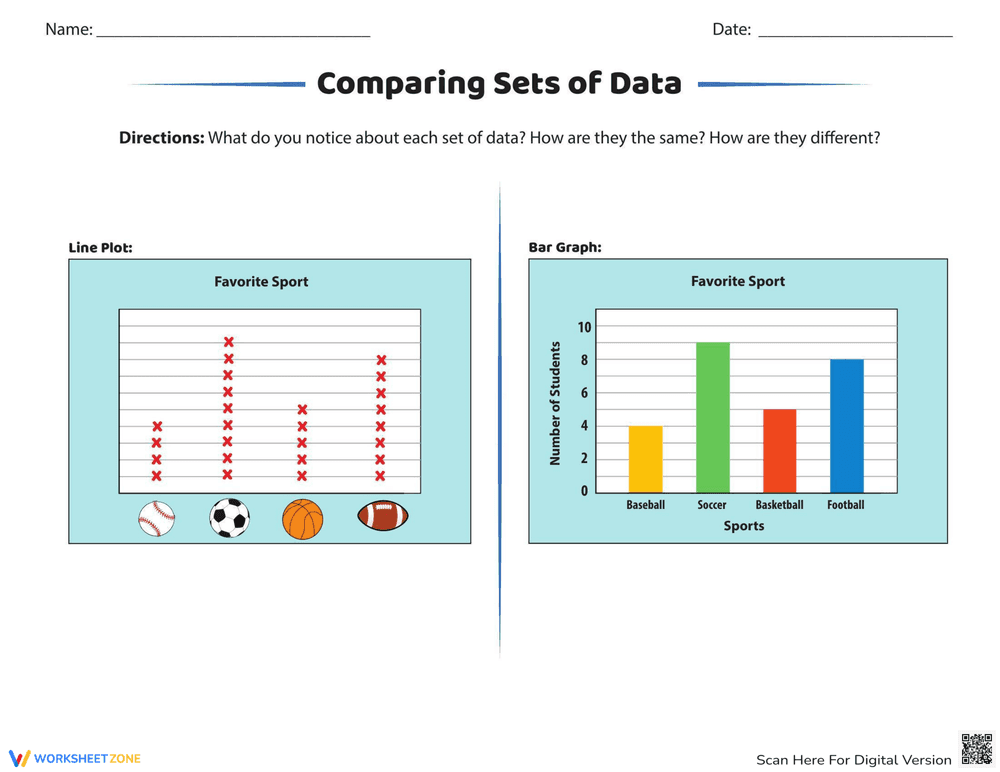
What It Is:
This is a worksheet designed to help students compare sets of data presented in different formats. It features a line plot and a bar graph, both displaying data about favorite sports (baseball, soccer, basketball, and football). The worksheet asks students to observe and compare the data in both graphs, noting similarities and differences.
Grade Level Suitability:
This worksheet is suitable for grades 3-5. It requires students to understand basic graphing concepts, including bar graphs and line plots, and to be able to compare and contrast data. It is appropriate for students learning about data analysis and representation.
Why Use It:
This worksheet helps students develop critical thinking skills by analyzing and comparing data presented in different visual formats. It reinforces the understanding of bar graphs and line plots and promotes data interpretation skills. It also encourages students to identify patterns and relationships within the data.
How to Use It:
Students should first examine the line plot and the bar graph individually, noting the scale, labels, and the data represented. Then, they should compare the two graphs, identifying similarities in the data (e.g., which sport is most popular) and differences in how the data is displayed. Students can write their observations and comparisons directly on the worksheet.
Target Users:
This worksheet is beneficial for elementary school students learning about data analysis, graphing, and data interpretation. It is also useful for teachers looking for activities to reinforce these concepts and assess students' understanding of different data representations.