






















Scatter Plot Prediction PDF Worksheets for 9th Grade
These scatter plot prediction pdf worksheets for 9th grade give students repeated practice doing the thing they actually struggle with: drawing a defensible line of best fit and then using it to forecast values they can reason about. The set moves from plotting bivariate data and naming the direction of the correlation, through writing the equation of a trend line, and on to interpolation and extrapolation word problems that ask students to judge whether their prediction holds up.
What the Set Covers
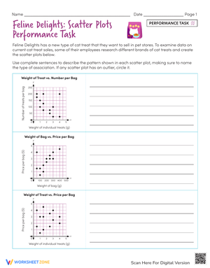
Each worksheet isolates a piece of the prediction process so students aren't doing everything at once. Some sheets stop at recognizing whether a relationship is positive, negative, or shows no pattern. Others hand students a plotted set and ask them to draw the trend line so that roughly equal points sit above and below it. The later worksheets push into the algebra — finding the slope between two points the line passes through, reading the y-intercept off the graph, and assembling those into a y = mx + b model students can plug new x-values into.
- Identifying and describing correlation direction and strength from a plotted set
- Drawing a line of best fit that balances the data points
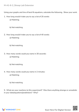
- Calculating slope and y-intercept to write the trend-line equation
- Making interpolation predictions inside the data range
- Evaluating extrapolation predictions and explaining why they get shaky
- Distinguishing correlation from causation in word-problem contexts
The contexts pull from things ninth graders already have opinions about — a basketball player's height against rebounds per game, monthly temperature against a household heating bill, years of schooling against starting salary. When a student can argue about whether the relationship makes sense, they engage with the math differently than they do with abstract x and y columns.
The Interpolation and Extrapolation Distinction
This is where the prediction work earns its keep. Interpolation means predicting inside the observed range — if a data set runs from one to five hours studied, asking about three hours stays on safe ground. Extrapolation reaches past the data, and that's where students get overconfident. The scatter plot prediction pdf worksheets for 9th grade include problems that deliberately ask for a prediction far outside the range, then ask students to write a sentence about why that number deserves suspicion. Trends flatten, hit ceilings, or reverse. A student who predicts a test score above 100 for ten hours of study has found the limit of their model the hard way, which is exactly the moment worth catching.
Frequent Student Errors Worth Watching For
The most common mistake we see is the line forced through the origin. Students assume the trend line must start at zero, so they pin one end at (0,0) and rotate the rest to fit, which throws off both the slope and every prediction that follows. Several worksheets use data where a zero y-intercept makes no sense — heating costs don't drop to zero dollars at zero degrees — so the error becomes visible to the student rather than something you have to lecture about.
Outliers cause the second predictable problem. Students either ignore an extreme point entirely or let it drag the whole line toward it. The set includes plotted data with one obvious outlier and asks students to find predictions both with and without that point, so they can see in their own numbers how much a single value tilts the slope. A third error is subtler: students draw a reasonable line but then read predictions off the data points instead of off the line itself, defeating the purpose of fitting a model at all.
Working These Into Your Week
Start with a plotted example on the board and one question — does this go up or down? Once students can name the direction, hand out the correlation-and-line-drawing worksheets before touching any equations. A trick that saves a lot of eraser shavings: give each student a piece of uncooked spaghetti to lay across the plot. They roll it until it visually balances the points, test a few slopes, and only commit to pencil once they're satisfied. It separates the judgment of where the line goes from the mechanics of drawing it.
The hand-drawn nature of these lines is a feature, not a flaw. Because no two students will draw exactly the same line, the equation worksheets make good partner work — pair students, have them compare slopes and y-intercepts, and ask which line is the better fit and why. That conversation is more valuable than any answer key. Save the interpolation and extrapolation word problems for independent work; they tell you cleanly whether a student can carry the method through to a defensible prediction. The scatter plot prediction pdf worksheets for 9th grade fit a Friday review block well, since the drawing and the discussion both take time you don't always have mid-week.
Standard Alignment
This work sits squarely on HSS.ID.B.6 from the High School Statistics and Probability strand — representing two quantitative variables on a scatter plot, describing how they relate, and fitting a linear function to data that suggests a linear association. In a typical Algebra 1 sequence this lands after students have already worked with slope-intercept form, which is intentional. The standard asks them to apply linear-equation skills to messy, real data rather than clean coordinate pairs, and the prediction step is where they connect a graph to an equation to a forecast. The worksheets keep the focus on that full chain rather than on any single isolated skill.
Adjusting the Set for a Range of Learners
For students who freeze at the algebra, stay on the worksheets that only ask for the line and the direction of correlation, and let them describe predictions qualitatively — higher, lower, about the same — before introducing the equation. Strong students can move faster into the extrapolation problems and the correlation-versus-causation tasks, where the reasoning matters more than the arithmetic. A good stretch question for them: two variables show a strong relationship, so name a third factor that might be driving both. That pushes past the trend line into the kind of thinking that separates a strong statistics student from one who just computes slope.
Frequently Asked Questions
How reliable is a prediction made from a hand-drawn line of best fit?
It depends on two things: how tightly the points cluster around the line, and whether the prediction is interpolation or extrapolation. A strong correlation with points hugging the trend line gives a dependable forecast, especially inside the observed range. Predictions reaching well past the data carry far more risk regardless of how neatly the line was drawn.
Should students include outliers when drawing the trend line?
There's no single rule, which is the point. An outlier can pull the slope and y-intercept noticeably, so students need to decide whether the extreme point is a genuine anomaly or a valid observation that should shape the model. The worksheets have them compute predictions both ways so the decision is grounded in what actually changes.
Why does extrapolation get flagged as unreliable so often?
Because it assumes the pattern keeps going outside the range you actually measured, and real situations rarely cooperate. Limits get hit, conditions shift, new factors enter. A line that fits study hours from one to five perfectly may predict nonsense at ten, so extending it that far past the known points produces numbers students should distrust.
Clear All