


Views
Downloads
Essential Dot Plot Practice | Grade 6 Math Worksheet
Paste this activity's link or code into your existing LMS (Google Classroom, Canvas, Teams, Schoology, Moodle, etc.).
Students can open and work on the activity right away, with no student login required.
You'll still be able to track student progress and results from your teacher account.
This comprehensive Grade 6 math worksheet provides students with targeted practice in data handling through the creation and interpretation of dot plots. By engaging with real-world scenarios, learners transform raw numerical data into visual representations, allowing them to identify patterns and calculate statistical measures like mode and range. This resource ensures students achieve mastery in statistical displays.
At a Glance
- Grade: 6 · Subject: Math
- Standard:
CCSS.MATH.CONTENT.6.SP.B.4— Display numerical data in plots on a number line, including dot plots- Skill Focus: Creating and interpreting dot plots
- Format: 3 pages · 12 problems · Answer key included · PDF
- Best For: Core instruction on statistical data displays
- Time: 25–35 minutes
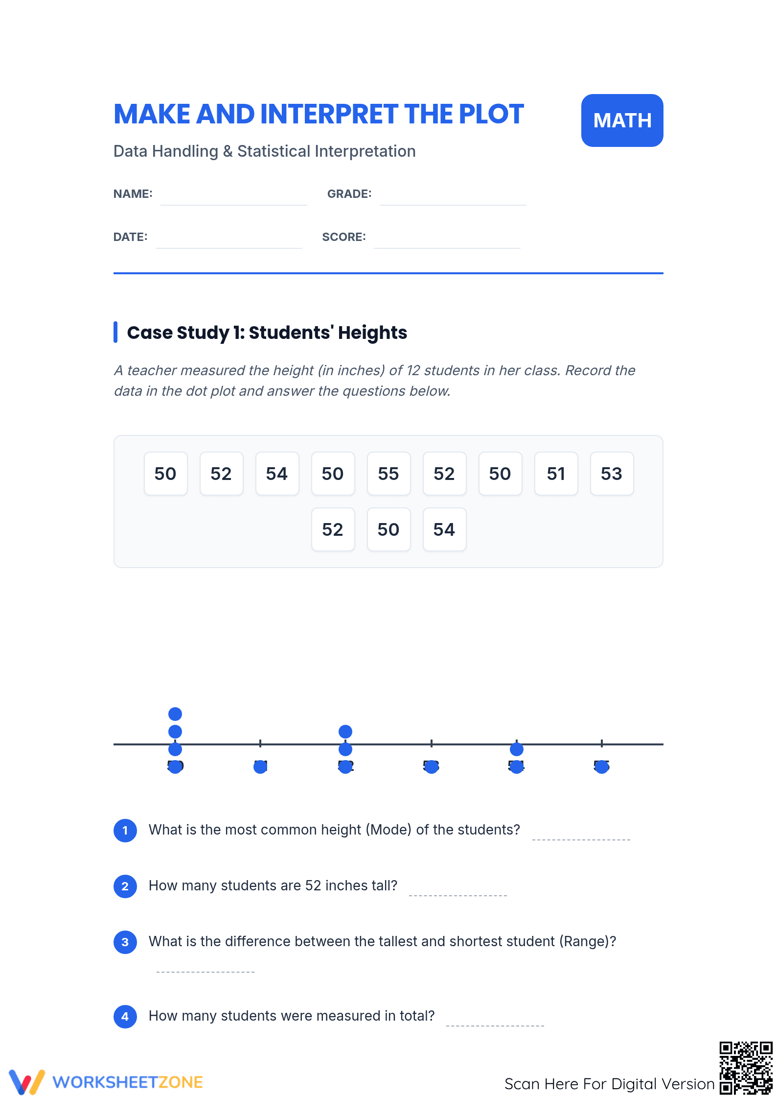
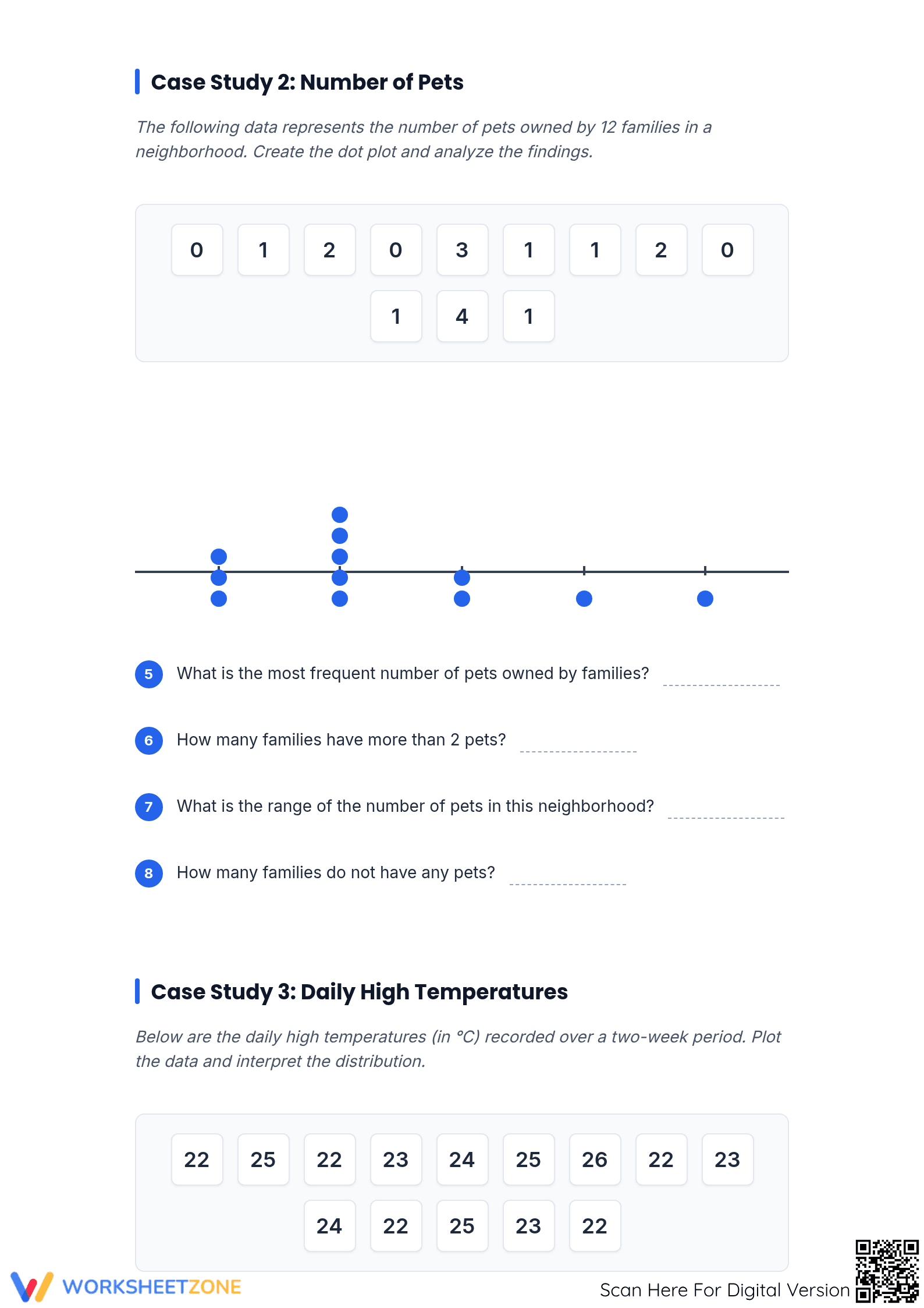
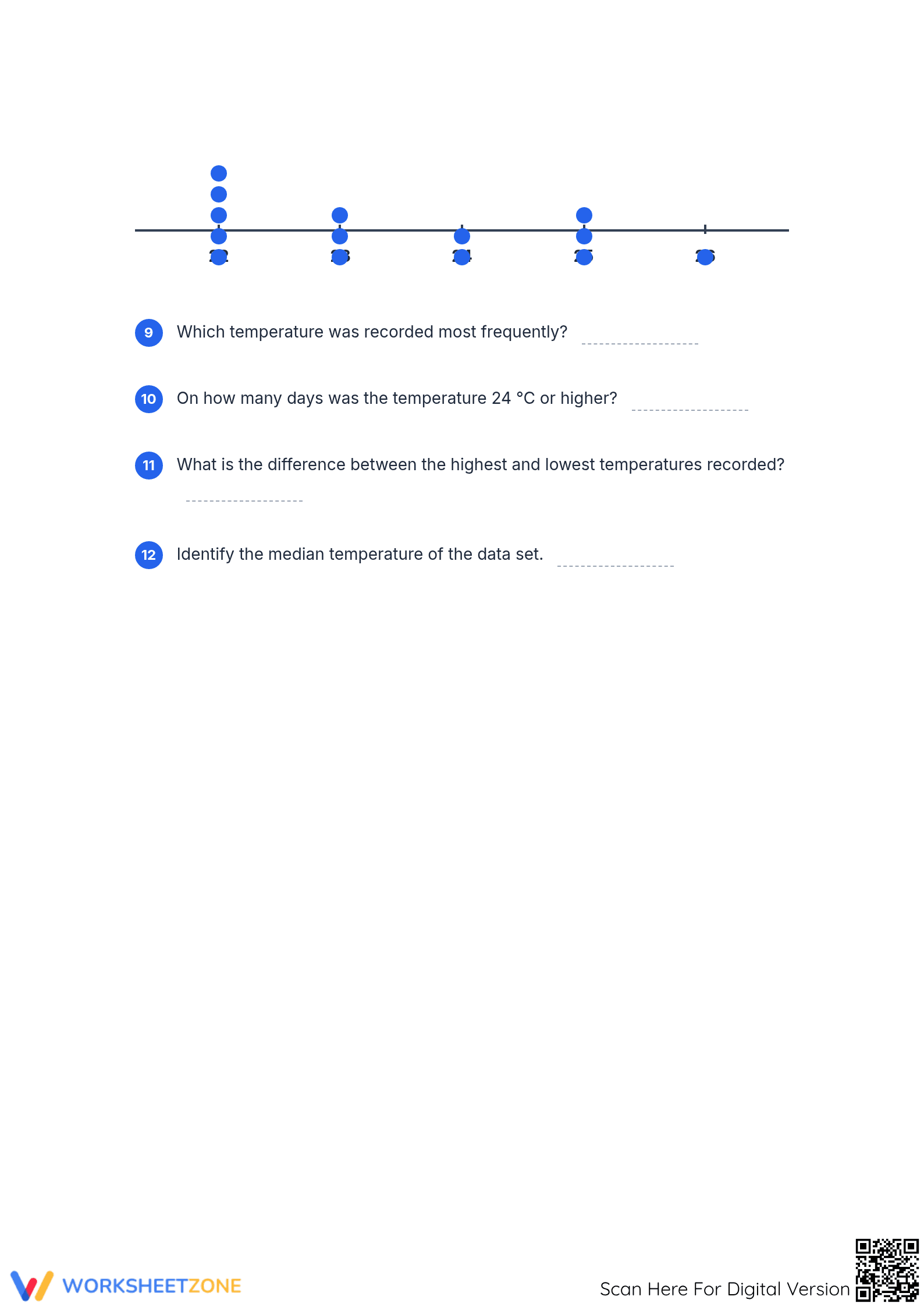
What's Inside: This 3-page printable pack features 12 structured problems divided into three distinct case studies: Students' Heights, Number of Pets, and Daily High Temperatures. Each section provides a clear data set, a pre-labeled number line for plotting, and four specific analytical questions. A full answer key is included to facilitate quick grading or student self-correction.
Skill Progression
- Guided Practice: The first case study provides a partially completed dot plot, allowing students to focus on interpreting specific data points and identifying the mode.
- Supported Practice: In the second section, students receive raw data for 12 families and must populate the dot plot independently before analyzing distribution and frequency.
- Independent Practice: The final case study challenges students to organize temperature data, identify the median, and determine the range without visual cues.
This structured approach follows a gradual-release model, moving from observation to total independent application of statistical concepts.
Standards Alignment
Primary Standard: `CCSS.MATH.CONTENT.6.SP.B.4`. Students will display numerical data in plots on a number line, specifically focusing on dot plots. Supporting Standard: `CCSS.MATH.CONTENT.6.SP.B.5`. Summarize numerical data sets in relation to their context. Both standard codes can be copied directly into lesson plans, IEP goals, or district curriculum mapping tools.
How to Use It
This worksheet is ideal for use during the direct instruction phase of a statistics unit. Teachers can use Case Study 1 as a whole-class demonstration to model how to tick off data points while plotting. Case Studies 2 and 3 serve as excellent formative assessments. Assign them as independent work to observe if students accurately translate raw numbers into the correct number of dots on the line. Expect completion in approximately 30 minutes.
Who It's For
This resource is designed for Grade 6 students but is highly effective for Grade 5 enrichment or Grade 7 review. The heavy visual component makes it accessible for English Language Learners (ELL) and students with IEPs who require clear data organization. It pairs perfectly with an introductory lesson on measures of center and variability.
According to Fisher & Frey (2014), the gradual release of responsibility is fundamental for students mastering new mathematical representations such as dot plots. This worksheet embodies that methodology by transitioning learners from interpreting pre-populated plots to independently organizing raw data sets into visual displays. By engaging with `CCSS.MATH.CONTENT.6.SP.B.4`, students develop the ability to see patterns in data distribution—identifying clusters, gaps, and outliers within a context-driven framework. Research from NAEP suggests that visual data literacy is a primary predictor of success in higher-level algebra and statistics. This resource provides the necessary scaffolding to bridge the gap between abstract numbers and meaningful interpretation. Teachers can utilize these three case studies to ensure that the class achieves baseline competency in summarizing numerical data sets. The inclusion of measures such as median and mode directly supports the development of statistical reasoning required for secondary education.