

























1 / 2
0
Views
0
Downloads


0.0
0
Save
0 Likes
Share
Line Plots – Analyzing Data with Line Plot
0 Views
0 Downloads
Paste this activity's link or code into your existing LMS (Google Classroom, Canvas, Teams, Schoology, Moodle, etc.).
Students can open and work on the activity right away, with no student login required.
You'll still be able to track student progress and results from your teacher account.
Information
Description
What It Is:
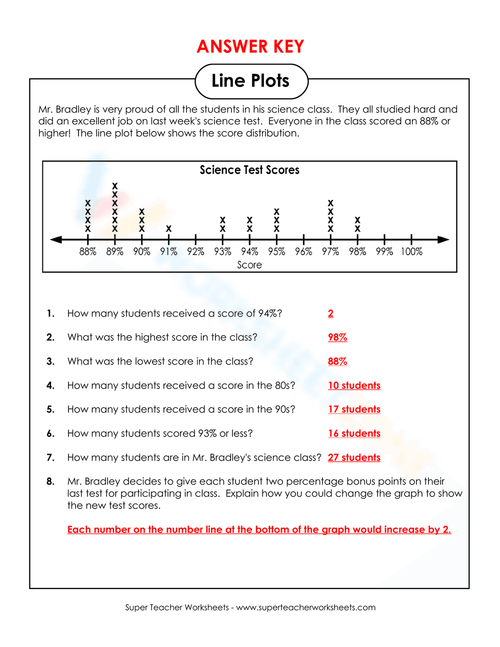
This worksheet teaches students how to interpret and analyze data from a line plot. It provides a scenario based on test scores and includes questions about the data, asking students to identify various statistics such as the highest score, the lowest score, and the number of students in different score ranges.
Why Use It:
This activity helps students practice their skills in reading and interpreting data represented on a line plot. It also reinforces concepts related to statistics, such as frequency, range, and averages.
How to Use It:
• Look at the line plot to understand the distribution of test scores.
• Answer the questions based on the data shown in the line plot.
• For the bonus question, think about how adding bonus points could affect the distribution and explain it.
Grade Suitability:
Best suited for Grade 3 to Grade 5 students.
• Ideal for teaching basic data analysis and graph reading.
• Useful for reinforcing concepts of statistics in elementary classrooms.
Target Users:
• Teachers focusing on math or data analysis.
• Students learning about data interpretation and graphing.
This worksheet teaches students how to interpret and analyze data from a line plot. It provides a scenario based on test scores and includes questions about the data, asking students to identify various statistics such as the highest score, the lowest score, and the number of students in different score ranges.
Why Use It:
This activity helps students practice their skills in reading and interpreting data represented on a line plot. It also reinforces concepts related to statistics, such as frequency, range, and averages.
How to Use It:
• Look at the line plot to understand the distribution of test scores.
• Answer the questions based on the data shown in the line plot.
• For the bonus question, think about how adding bonus points could affect the distribution and explain it.
Grade Suitability:
Best suited for Grade 3 to Grade 5 students.
• Ideal for teaching basic data analysis and graph reading.
• Useful for reinforcing concepts of statistics in elementary classrooms.
Target Users:
• Teachers focusing on math or data analysis.
• Students learning about data interpretation and graphing.


