


Views
Downloads
Printable Grade 3 Science: Graphing Weather Data Worksheet
Paste this activity's link or code into your existing LMS (Google Classroom, Canvas, Teams, Schoology, Moodle, etc.).
Students can open and work on the activity right away, with no student login required.
You'll still be able to track student progress and results from your teacher account.
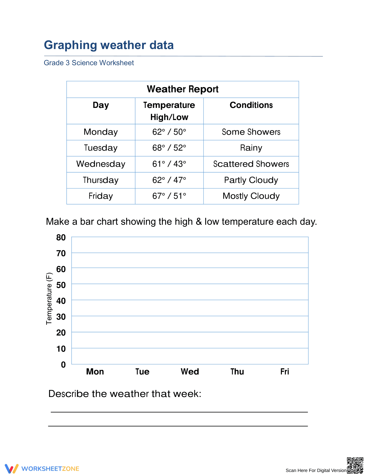
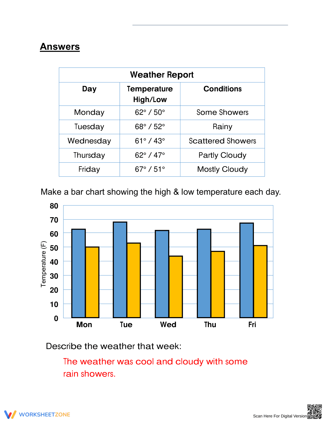
This Grade 3 science worksheet empowers students to translate raw meteorological observations into clear visual representations. By constructing a dual bar graph of daily high and low temperatures, learners identify patterns in local weather conditions. This practical activity bridges the gap between data collection and scientific analysis, ensuring students master graphical data interpretation effectively.
At a Glance
- Grade: 3 · Subject: Science
- Standard:
3-ESS2-1— Represent data in graphical displays to describe typical weather conditions- Skill Focus: Bar Graph Construction
- Format: 1 page · 10 data points · Answer key included · PDF
- Best For: Weather unit assessment or independent practice
- Time: 20–30 minutes
This single-page resource features a structured "Weather Report" table containing five days of temperature and sky condition data. Students are provided with a labeled graph grid with a temperature scale (0–80°F) and daily intervals. The worksheet concludes with a writing prompt for qualitative synthesis, requiring students to summarize the week's weather patterns. A complete answer key is provided for rapid grading.
Zero-Prep Workflow
The zero-prep design allows teachers to transition from instruction to independent practice in under 2 minutes. Simply print the PDF, distribute one copy per student, and allow them to begin plotting the high and low points. The clear layout and pre-labeled axes eliminate common student setup errors, making this an ideal resource for emergency sub plans or quick formative checks during a weather and climate unit.
Standards Alignment
Aligned primarily to 3-ESS2-1, which requires students to represent data in tables and graphical displays to describe typical weather conditions expected during a particular season. The activity also supports CCSS.MATH.CONTENT.3.MD.B.3 regarding the construction of scaled bar graphs. Both standard codes can be copied directly into lesson plans, IEP goals, or district curriculum mapping tools.
How to Use It
Use this worksheet as a mid-unit formative assessment after teaching the difference between daily weather and long-term climate. As students work, observe their ability to correctly align the bar height with the numerical scale on the Y-axis. The descriptive writing task at the bottom serves as an excellent check for scientific literacy and the ability to synthesize quantitative data into qualitative descriptions.
Who It's For
Designed for Grade 3 students, this resource is suitable for general education classrooms, small group intervention, or ESOL students who benefit from visual data representations. It pairs naturally with a daily weather log or a teacher-led demonstration using a digital thermometer to show real-time temperature fluctuations before students engage with the static data provided on the page.
Constructing graphical displays of weather data is a foundational competency in elementary science, directly addressing the 3-ESS2-1 standard. Research from EdReports 2024 emphasizes that students who engage in regular data-to-graph translation develop stronger spatial reasoning and analytical skills than those who only read pre-made charts. By requiring students to plot both high and low temperatures, this worksheet encourages a deeper understanding of diurnal cycles and weather variability. ScienceDirect TpT Analysis suggests that providing pre-labeled axes significantly reduces cognitive load, allowing third-grade learners to focus on the accuracy of the data representation rather than the mechanics of grid construction. This structured approach follows the gradual release of responsibility model, ensuring that students can move from observing a table to producing a scientific visualization with confidence. The integration of a summary response further reinforces the transition from raw numbers to meaningful scientific conclusions, a key goal in NGSS-aligned curriculum.