























Views
Downloads

Misleading Data Displays: Printable Grade 6 Math Worksheet
Paste this activity's link or code into your existing LMS (Google Classroom, Canvas, Teams, Schoology, Moodle, etc.).
Students can open and work on the activity right away, with no student login required.
You'll still be able to track student progress and results from your teacher account.
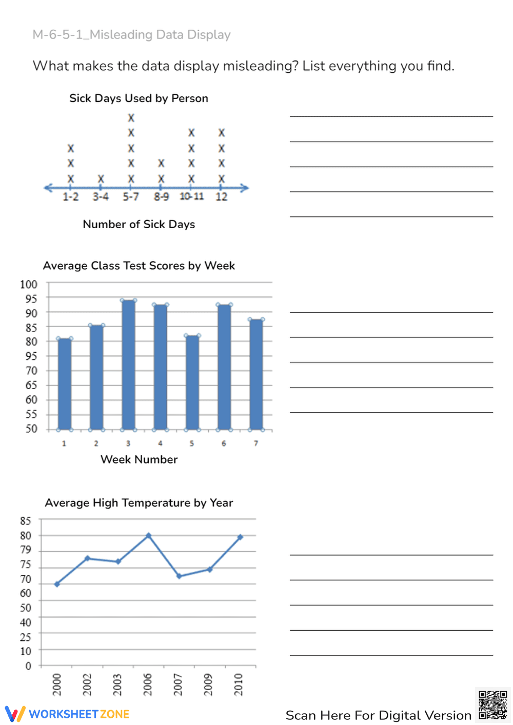
This printable worksheet helps sixth-grade students identify and analyze misleading data displays. Students examine three distinct graphs—a dot plot, a bar graph, and a line graph—to detect errors in scales, intervals, and labels. By evaluating these visual representations, learners develop critical data literacy skills for real-world statistics.
At a Glance
- Grade: Grade 6 · Subject: Math
- Standard:
CCSS.MATH.CONTENT.6.SP.B.5— Summarize numerical data sets in relation to their context- Skill Focus: Identifying misleading graph scales and intervals
- Format: 1 page · 3 problems · Answer key not included · PDF
- Best For: Independent practice or quick formative assessment
- Time: 15–20 minutes
This single-page PDF features three realistic data displays containing common graphical distortions. The first task presents a dot plot with inconsistent interval spacing. The second task displays a bar chart with an out-of-order vertical scale. The third task shows a line graph with irregular intervals. Writing lines allow students to explain their findings.
This resource is designed for an efficient, zero-prep classroom workflow. First, print the single-page PDF, which takes less than one minute. Next, distribute the worksheet to students for a 15-minute independent activity. Finally, review the answers as a group in five minutes. The entire setup requires under two minutes of teacher preparation.
Standards Alignment
This activity aligns with Common Core State Standard CCSS.MATH.CONTENT.6.SP.B.5, which requires students to summarize numerical data sets in relation to their context. By analyzing how data displays distort information, students learn to evaluate the validity of statistical representations. Both standard codes can be copied directly into lesson plans, IEP goals, or curriculum mapping tools.
How to Use It
Use this worksheet during the independent practice portion of a lesson on statistical displays. Alternatively, assign it as a formative assessment exit ticket. While students work, observe whether they check the axis labels and scale increments systematically. This activity takes approximately 15 to 20 minutes to complete and discuss.
Who It's For
This resource is tailored for sixth-grade math students learning statistics. It provides excellent practice for general education students, while offering visual support for English language learners. Pair this worksheet with a direct instruction lesson on constructing proper graphs to reinforce correct graphing techniques.
According to research in the EdReports 2024 evaluation of middle school mathematics, developing data literacy is essential for student success in secondary statistics. This worksheet supports this goal by targeting common misconceptions associated with CCSS.MATH.CONTENT.6.SP.B.5. By prompting students to analyze flawed visual representations, the activity fosters higher-order evaluation skills. Research from Fisher & Frey (2014) on checking for understanding highlights that analyzing non-examples—such as these misleading graphs—deepens conceptual understanding and prevents the internalization of incorrect graphing habits. Teachers can confidently integrate this resource into their curriculum, knowing it aligns with evidence-based practices for mathematical reasoning and data interpretation. The structured layout ensures students focus on the mathematical errors, making it a highly effective tool for diagnostic and formative purposes.


