


0
Views
0
Downloads
0.0
0
Save
0 Likes
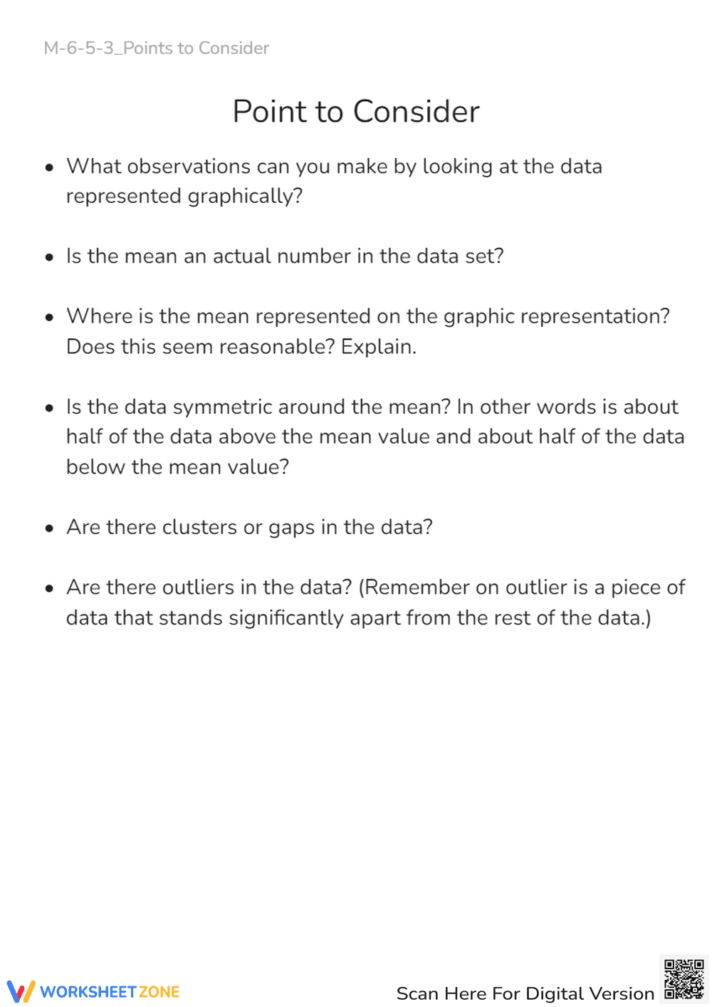
Data Analysis Worksheet: Mean, Outliers, & Graph Observations
0 Views
0 Downloads
Paste this activity's link or code into your existing LMS (Google Classroom, Canvas, Teams, Schoology, Moodle, etc.).
Students can open and work on the activity right away, with no student login required.
You'll still be able to track student progress and results from your teacher account.
Information
Description
What It Is:
This is an educational worksheet titled 'Point to Consider' focused on analyzing data represented graphically. It presents a series of questions designed to prompt students to think critically about the data's observations, the mean, symmetry, clusters, gaps, and outliers.
Grade Level Suitability:
This worksheet is suitable for grades 6-8. The concepts of mean, data symmetry, clusters, gaps, and outliers are typically introduced and explored in middle school mathematics. The questions require analytical thinking about data representation, making it appropriate for this age group.
Why Use It:
This worksheet encourages students to develop critical thinking skills when interpreting graphical data. It helps them understand the concept of the mean and its representation, analyze data symmetry, and identify clusters, gaps, and outliers. It also promotes explanation and reasoning skills.
How to Use It:
Provide students with a graphical representation of data (e.g., a histogram, scatter plot, or box plot). Have them answer the questions on the worksheet based on their observations of the provided graph. Encourage discussion and justification of their answers.
Target Users:
This worksheet is designed for middle school students (grades 6-8) who are learning about data analysis, statistics, and graphical representation. It can also be used for students who need to practice critical thinking and interpretation skills related to data.