


Views
Downloads
Printable Interpreting Pie Charts Worksheet | Grade 6-7 Math
Paste this activity's link or code into your existing LMS (Google Classroom, Canvas, Teams, Schoology, Moodle, etc.).
Students can open and work on the activity right away, with no student login required.
You'll still be able to track student progress and results from your teacher account.
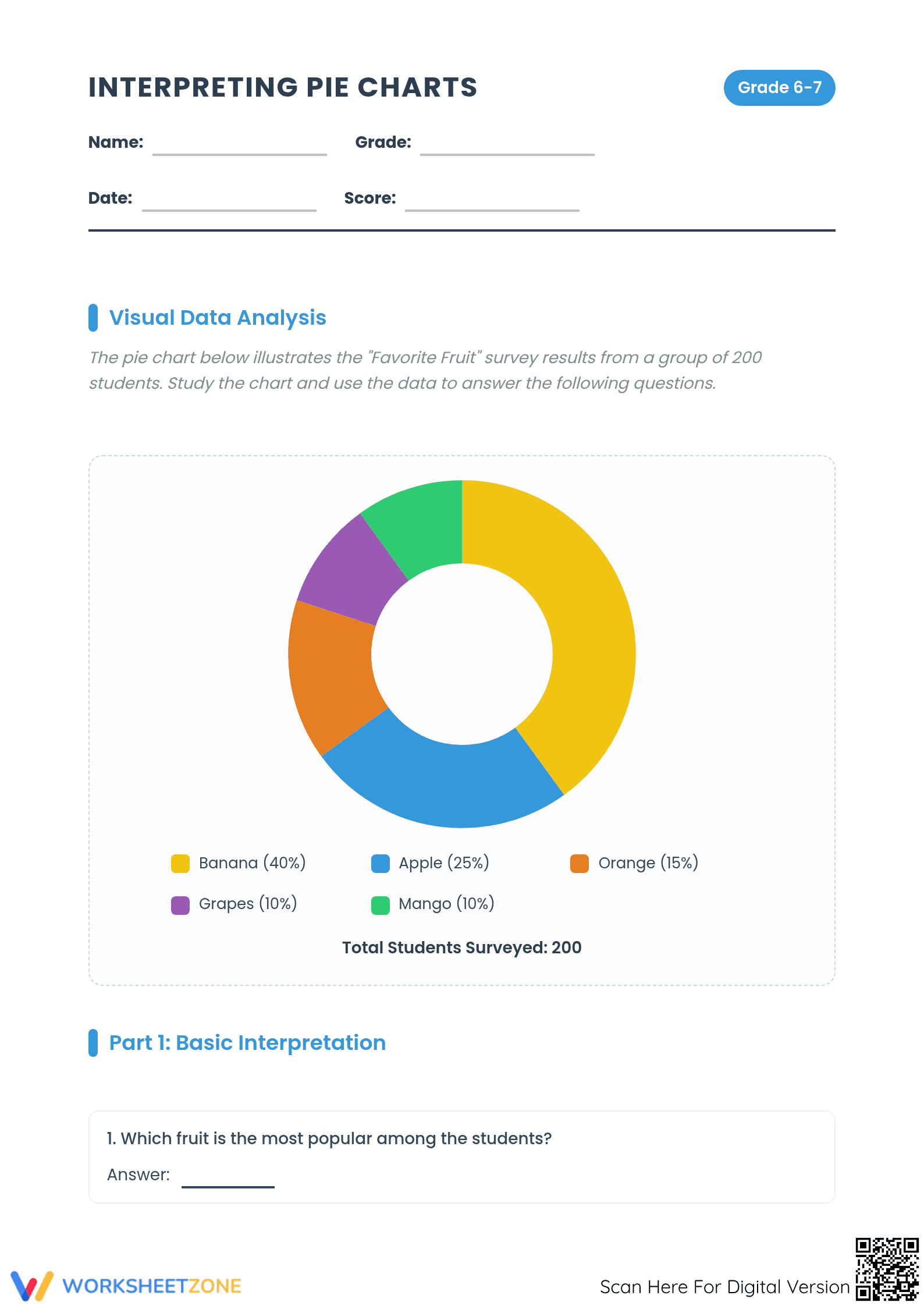
This Grade 6-7 Math worksheet provides a comprehensive approach to interpreting pie charts through real-world data analysis. Students study a "Favorite Fruit" survey to identify trends, calculate student counts from percentages, and apply findings to hypothetical larger populations. It builds essential statistical literacy and proportional reasoning skills for middle school learners.
At a Glance
- Grade: 6-7 · Subject: Math
- Standard:
CCSS.MATH.CONTENT.6.RP.A.3— Use ratio and rate reasoning to solve real-world mathematical problems involving percentages- Skill Focus: Interpreting pie charts and percentage-to-number conversion
- Format: 3 pages · 10 problems · Answer key included · PDF
- Best For: Small group instruction or independent data practice
- Time: 25–35 minutes
What's Inside
This three-page resource features a clear pie chart illustrating survey data from 200 students. It contains ten questions split into basic interpretation, data calculations, and hypothetical scenarios. A final critical thinking prompt asks students to apply data as a manager, while a full answer key ensures rapid grading.
Skill Progression
- Guided practice: Students begin by identifying "most" and "least" popular categories, using the visual segments to verify their findings for the first four retrieval questions.
- Supported practice: Middle tasks require students to convert percentages into counts using a population of 200, with calculation scaffolds provided for each fruit category.
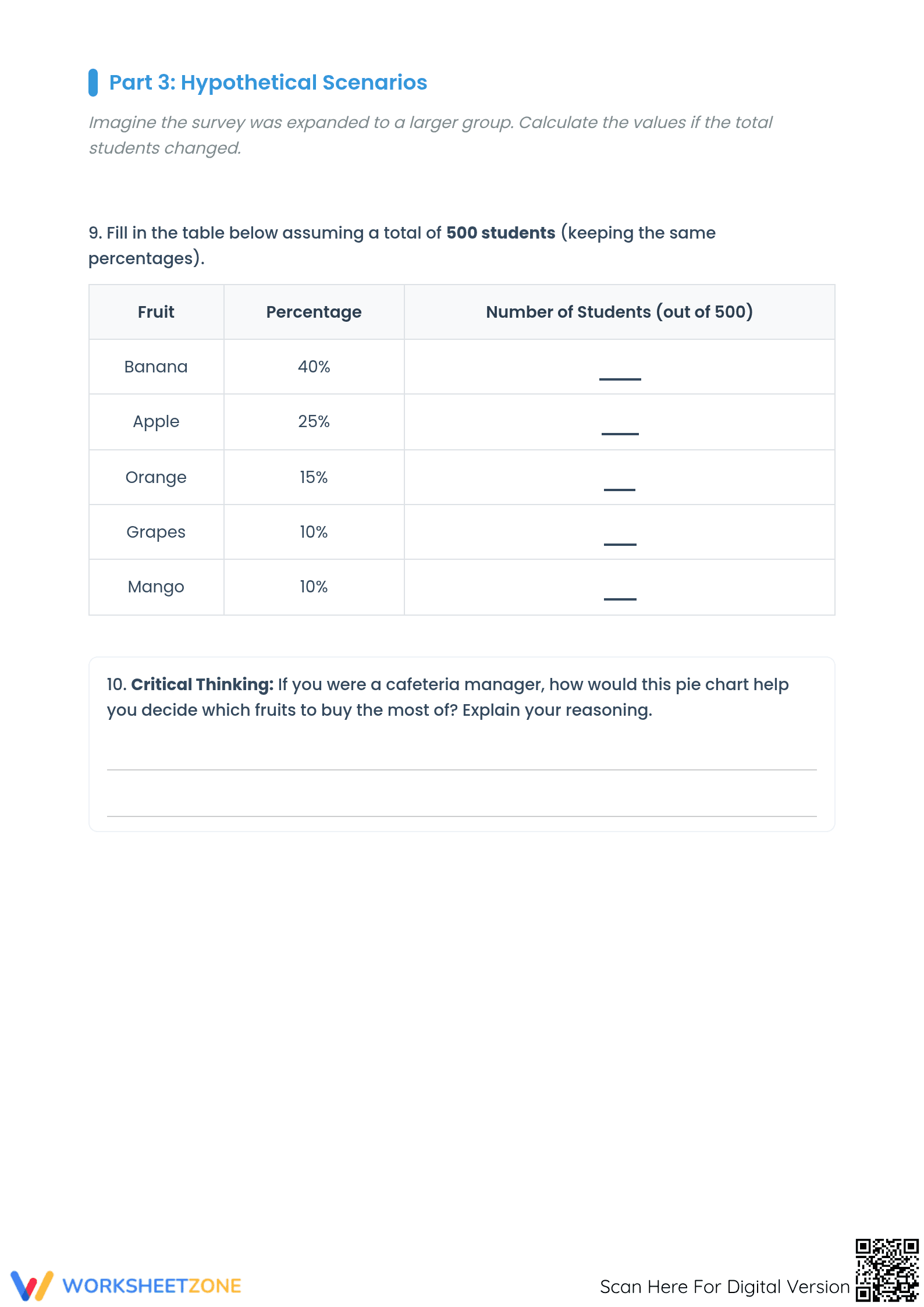
- Independent practice: The final page challenges students to scale data for 500 students and justify a business decision based on the trends.
This progression follows a gradual-release model, transitioning from teacher-led modeling to independent student application.
Standards Alignment
Aligned to CCSS.MATH.CONTENT.6.RP.A.3, students find a percent of a quantity and solve problems involving finding the whole. This also supports CCSS.MATH.CONTENT.6.SP.B.5 by summarizing numerical data sets. Both standard codes can be copied directly into lesson plans, IEP goals, or district curriculum mapping tools.
How to Use It
Use this as a formative assessment to check for misconceptions regarding percentages versus raw numbers. Assign it as a high-engagement station during "math menu" rotations. Observe if students correctly use the total population as their calculation base. Expected completion time is 30 minutes.
Who It's For
Designed for Grade 6-7 students mastering proportions and statistics, this is effective for visual learners. Pair this with a blank chart template to allow students to conduct their own surveys and create comparative data sets based on their class interests.
Interpreting data visualizations like pie charts is a critical component of 21st-century statistical literacy, directly addressed by the CCSS.MATH.CONTENT.6.RP.A.3 standard. Research from the RAND AIRS 2024 study emphasizes that students who engage in multi-step data interpretation—moving from visual identification to proportional calculation—demonstrate significantly higher retention of percentage concepts compared to those who only perform abstract arithmetic. This worksheet facilitates that transition by requiring students to extract data from a survey of 200 individuals and apply it to a larger hypothetical population of 500. By combining basic retrieval tasks with complex scaling and critical thinking prompts, the resource ensures that learners do not just read a chart, but truly understand the underlying mathematical relationships between parts and wholes. Such evidence-based practice is essential for preparing students for high-stakes assessments and real-world data consumption where interpreting graphical representations of information is a daily requirement for informed decision-making and professional success.