


1 / 2
0
Views
0
Downloads
0.0
0
Save
0 Likes
Line of Best Fit: Data Analysis Worksheet
0 Views
0 Downloads
Paste this activity's link or code into your existing LMS (Google Classroom, Canvas, Teams, Schoology, Moodle, etc.).
Students can open and work on the activity right away, with no student login required.
You'll still be able to track student progress and results from your teacher account.
Information
Description
What It Is:
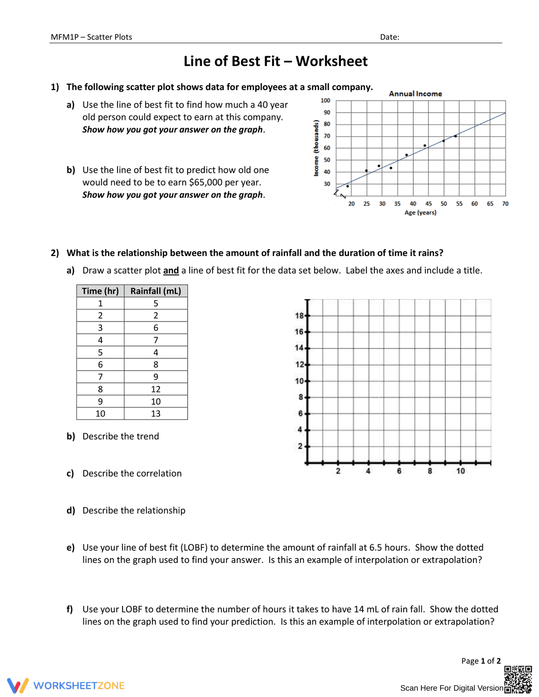
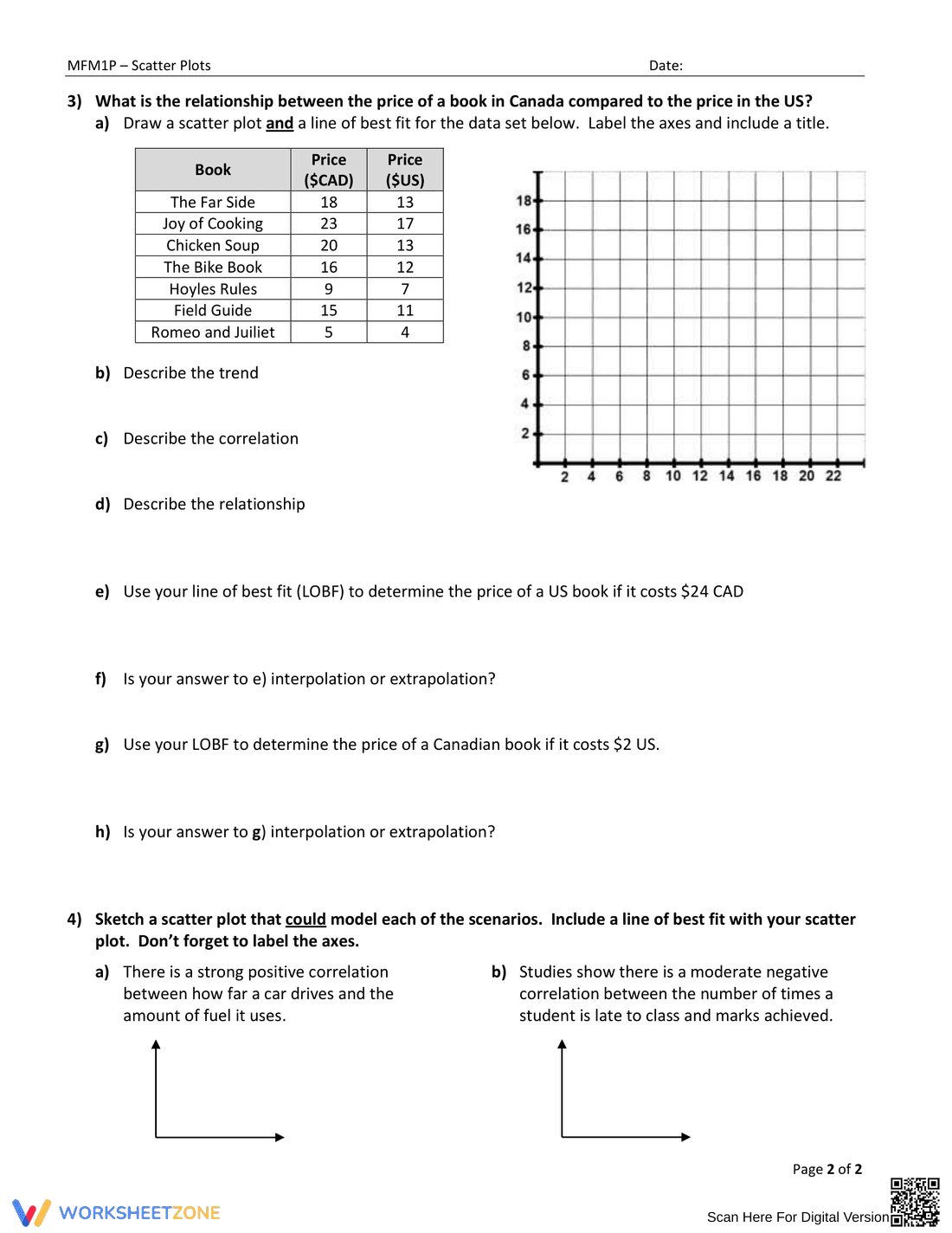
This is a math worksheet focusing on line of best fit and scatter plots. It includes two main problems. The first problem provides a scatter plot showing annual income versus age for employees at a small company. Students are asked to use the line of best fit to estimate income for a 40-year-old and to predict the age needed to earn $65,000 per year, showing their work on the graph. The second problem provides a table of data showing the relationship between time and rainfall. Students are asked to draw a scatter plot and a line of best fit for the data, label the axes, and include a title. They are then asked to describe the trend, correlation, and relationship. Finally, they need to use the line of best fit to determine rainfall at 6.5 hours and the time it takes to have 14 mL of rainfall, indicating if these are examples of interpolation or extrapolation.
Grade Level Suitability:
This worksheet is suitable for grades 8-10. It requires understanding of scatter plots, lines of best fit, correlation, interpolation, and extrapolation, which are typically covered in middle and early high school math curricula.
Why Use It:
This worksheet helps students develop skills in interpreting scatter plots, drawing lines of best fit, and using these tools to make predictions. It reinforces understanding of correlation and the difference between interpolation and extrapolation. The problems provide real-world contexts to make the concepts more relatable.
How to Use It:
Students should first review the concepts of scatter plots and lines of best fit. For the first problem, they can visually estimate values from the provided graph. For the second problem, they need to create their own scatter plot from the given data, draw a line of best fit, and then use this line to answer the questions, showing their work with dotted lines on the graph.
Target Users:
This worksheet is designed for students learning about scatter plots, lines of best fit, and correlation in math classes, particularly in pre-algebra, algebra 1, or introductory statistics courses. It can also be used as a review activity for students who have already learned these concepts.